Cactus in Bloom
24 x 36 in.
Oil
$3,900
Available through Marta Stafford Fine Art, Marble Falls, Texas
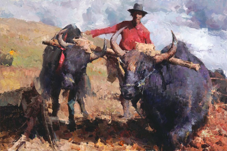
Mitch Caster: There is great beauty to be found in the arid west. I was reminded of that during a hike near St. George, Utah, during the spring. Amid intense sienna-colored rock and soil, contrasted by varied green plant life, I found some little flowering prickly pear cactus growing. Incredible lighting from behind illuminated the translucent flowers and plants and created a bright corona around the cacti in a perfect arrangement — a real gift from nature. To that, add wonderful childhood memories of my grandmother cooking nopalitos — the stems of prickly pear cactus — and how could I not paint this scene?
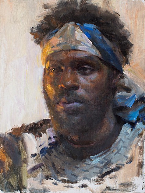
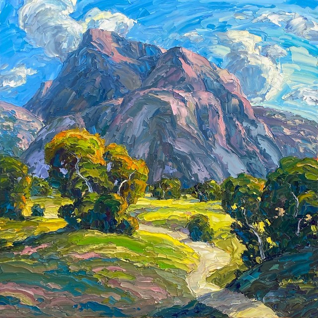
I always enjoy painting light and shadow, whether it is landscape or figurative. Lately, I have been particularly drawn to nature and wildlife. This painting came from one of those special moments when you are left breathless and in love with the beauty of your surroundings.
This desire and commitment to paint subjects of beauty is quite a departure from my previous work as a courtroom artist for some of the nation’s most notorious trials. After years of hearing grisly details from heinous crimes, I wanted to instead focus on capturing bits and piece of good in the world and bring joy to my viewers.
To that end, I paint what makes me happy. From nature and wildlife to dance and seascapes, they all boost my serotonin level — and hopefully that of my viewers! (Serotonin is the hormone that stabilizes our sense of well-being and happiness.) I even have a special series of “Serotonin Paintings” on my website…a virtual exhibition of some of my favorite feel-good works.
I hope you will visit one of my fine galleries and my website, sign up for my e-newsletter, and follow me on social media. As a Signature Member of Oil Painters of America, the National Oil & Acrylic Painters’ Society, and the American Society of Marine Artists, I’ve been fortunate to have my paintings included in many of their exhibitions, as well as in collections throughout the United States and the world.
Website: https://mitchcasterfineart.com
Serotonin paintings: https://mitchcasterfineart.com/serotonin
Instagram: https://www.instagram.com/mitchcasterfineart/
Facebook: https://www.facebook.com/mitchcasterfineart
LinkedIn: https://www.linkedin.com/in/mitch-caster-2a96931b3/
Galleries:
• Marta Stafford Fine Art, Marble Falls, Texas
• Heritage Fine Arts, Taos, New Mexico
• Spirits in the Wind Gallery, Golden, Colorado
• Santa Fe Art Collector, Santa Fe, New Mexico
• Castle Gallery Fine Art, Fort Wayne, Indiana
• Principle Gallery, Charleston, South Carolina
Upcoming Shows:
Oil Painters of America Western Regional Exhibition, Oct. 15 – Nov. 17, 2021
Mary R. Koch Arts Center (Mark Arts), Wichita, Kansas
American Society of Marine Artists 18th National Exhibition, Oct. 22, 2021 – Feb. 27, 2022
Chesapeake Bay Maritime Museum, St. Michaels, Maryland