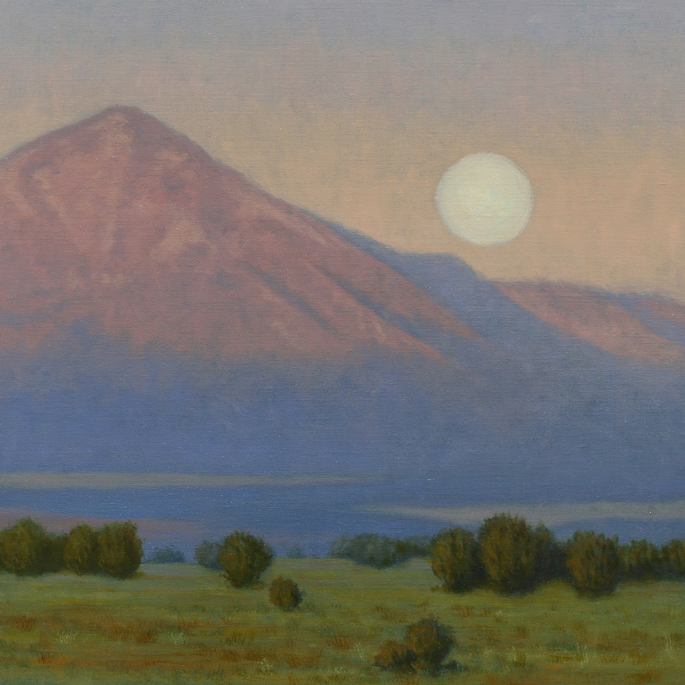
The artist Mary Pettis cherishes her relationship with the verdant valley of the St. Croix River, which graces the states of Minnesota and Wisconsin, and where she and her husband, Randy, moved in 1979.
“As a young artist,” she recalls, “I struggled to explain the magnetic pull of the river and its watershed. Now, after four decades, I recognize that I had fallen in love with the abstract shapes of the valley: the silhouette of the white pines against a vast sky, the contrast of natural stands of birch groves against the deep forest, the musical structural rhythms formed by the river pressing against its banks. I love its story, the historical and geological narrative stored in the layers of rocky sentinels lining the river. I care now more than ever that this thriving, wild, and scenic watershed be preserved and protected.”
Pettis is exhibiting more than 50 oil paintings depicting the St. Croix National Scenic Riverway at the headquarters of the Wild Rivers Conservancy in Osceola, Wisconsin.
Ranging from field studios to larger paintings completed in the studio, many are annotated with the latitude and longitude coordinates where they were initiated. Pettis will donate a quarter of each sale’s proceeds to the conservancy.
A self-described expressive realist, Pettis has drawn inspiration from various traditions, including her classical training and the legacy of Russian painting. Early on, she studied with the Hungarian artist Belo Petheo, Richard Lack in Minneapolis, and Daniel Graves, who later founded the Florence Academy of Art.
In the 1990s, Jim Wilcox introduced Pettis to the “wet-in-wet” plein air approach, which led her to paint outdoors. Today she divides her time equally between nature and the studio.
> Visit EricRhoads.com to learn about more opportunities for artists and art collectors, including retreats, international art trips, art conventions, and more.
> Sign up to receive Fine Art Today, our free weekly e-newsletter
Christine Graefe Drewyer (b. 1954), "Lilies and Lace," 2021, oil on linen, 30 x 40 in.
Three-Part Harmony
Warrenton, Virginia berkleygallery.com
Through December 31, 2021
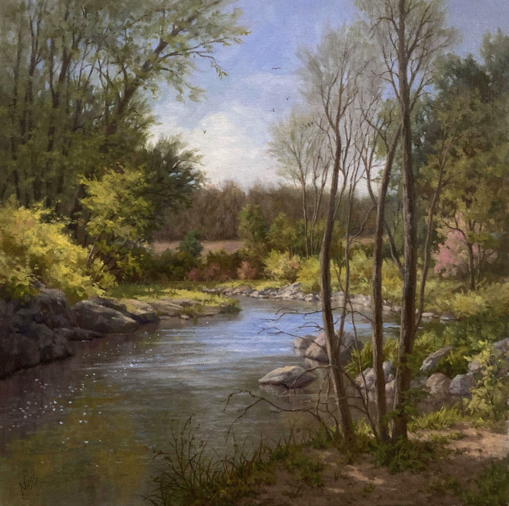
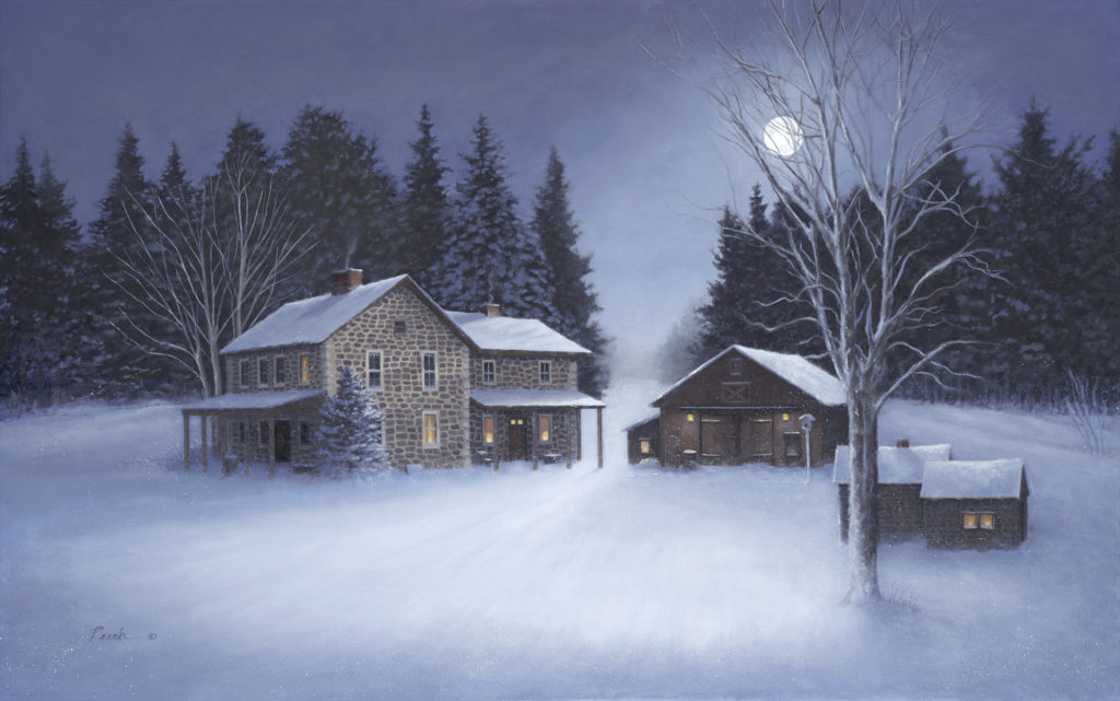
Berkley Gallery is set to present “Three-Part Harmony,” an exhibition of recent landscape paintings by Christine Graefe Drewyer, Barbara Nuss, and Nancy Peach. The artists share a deep love of nature’s beauty and power, as well as mastery of color, light, composition, and expressive brushwork.
Barbara Nuss, “Forever Spring,” oil on linen, 16 x 16 in.Nancy Peach, “Still of the Night,” 20 x 32 in.
All award-winning artists, masters of color, composition and brushwork, they take the viewer on a journey; whether it leads us to dazzling lily pads on a still pond, the brook at the edge of a field, or the haunting stillness of midnight snow under the moon. This is the power of art; to lift the spirit and remind us to look and appreciate the beauty and power of the natural world.
> Visit EricRhoads.com to learn about more opportunities for artists and art collectors, including retreats, international art trips, art conventions, and more.
> Sign up to receive Fine Art Today, our free weekly e-newsletter
On Painting Portraits > Tony Pro was born in Northridge, California, in 1973. He grew up in Southern California under the guidance of his father, Julio Pro (1929-2013), a successful Southwest wildlife painter. Tony received his Bachelor of Arts degree in Graphic Design while simultaneously studying drawing with the late illustrator Glen Orbik (1963-2015). It was at this time that he learned the value of academic figure drawing and the importance of applying these strict study principles to his craft.
What is it that portraiture and figurative work give you as an artist?
I’ve always loved painting people, as it’s a direct connection to others … especially portraiture; I love putting the spirit of a person on canvas. It still baffles me that moving paint around on canvas using sticks with hair can create a person’s image and likeness looking back at you.
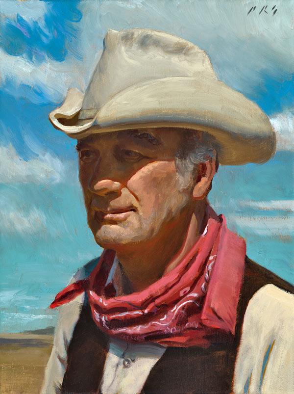
Tony Pro, “Cowpoke,” 14 x 11 in.
Could you walk us through your process for painting portraits? What are the steps you go through to create a painting?
A lot of my work starts with ideas in my head. I don’t always start with sketches; I usually compose things digitally since I am used to that, being a graphic designer for 25 years.
From there I can work out all the color and composition issues and I can move to the canvas and begin the work.
For finished paintings, I work in layers. I start with putting in my middle tone and moving to all the darks in a monochromatic fashion. Then from there, I start with all my midtones, and I key my lightest light and darkest dark so I know my value range early on. Sometimes I will glaze if need be to tone certain areas.
You work alla prima. To do that, what do you have to have figured out before you lay down that first stroke of paint?
I only work alla prima if I am painting from life, which is not that often these days. Any time I paint from life in a limited-time session, I have to work out the whole palette first by premixing everything before I lay down any strokes on the canvas.
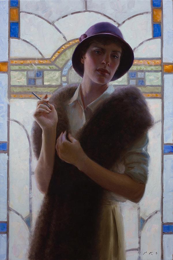
Tony Pro, “Her Day Out,” 36 x 24 in.
With your references, what do you take more or less directly and what do you translate? Why?
I was trained in school to idealize my figures and human heads — for men to be more heroic or characterized and the women to be more attractive than they are. I typically do that, unless it’s a commissioned portrait and likeness takes more importance than idealization. However, you always want to make the sitters look better than they are. Otherwise, you don’t get paid.
How do you approach color? Do you work exclusively with local color, or are there places you push the color? Why?
My color is pretty dependent on what’s there. I don’t usually push color saturation too much unless I am working on something more impressionistic. Really depends on my mood and what I am trying to achieve in a painting.
If likeness is important for an artist, where should they focus their skill development? Why?
Skill development always, always, always starts with solid head drawing. I spent five years learning to draw the head before I even touched a paintbrush. Understanding the design of the human head is paramount to getting a likeness. Drawing from life is paramount as well. Drawing from photos is great in-studio practice at home for most of the time, but drawing from a sitter at least once a week is necessary to be able to make decisions faster and to learn to convert the three-dimensional into a two-dimensional surface.
Tony Pro, “Winter’s Light”
What are the biggest mistakes you see your portrait students making, and what advice do you give them?
Not listening to my answer I gave to the previous question. Most students want fast tricks or gimmicks to make their work flashy, so they latch on to whatever artist they like that does it and try to mimic it by using whatever art supply that artist is touting as what will “take your piece to the next level.”
They don’t understand that to get to the point of taking shortcuts, you need to travel the long roads many times first. As the founder of our school, Fred Fixler, said, “You need to do at least 1,000 drawings to get one good one.”
As part of our effort to continue to help artists and art galleries thrive, we’re proud to bring you this week’s “Virtual Gallery Walk.” Browse the artwork below and click the image itself to learn more about it, including how to contact the gallery.
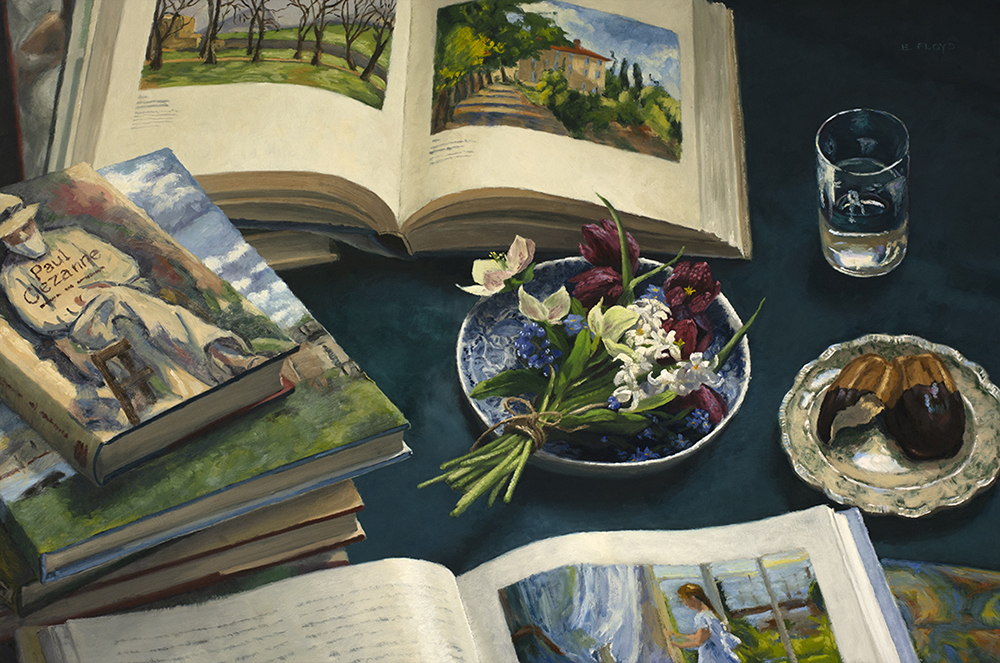
Cezanne & Spring Flowers by Elizabeth Floyd, Oil, 24 x 36 in.; Anderson Fine Art Gallery
Evening Colors by D.Eleinne Basa, Oil on canvas, 20 x 16 in., Signed; Rehs Contemporary
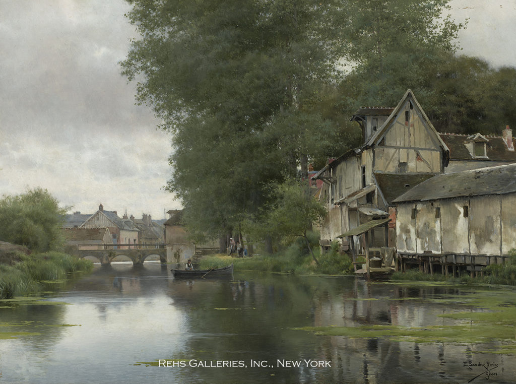
L’Epte à Gisors by Emilio Sánchez Perrier (1855 – 1907), Oil on panel, 13 x 18.125 in., Signed; Rehs Galleries, Inc.
Jewel by Daniel Gerhartz, Oil, 48 x 30 in.; ArtzLine.com
Want to see your gallery featured in an upcoming Virtual Gallery Walk? Contact us at [email protected] to advertise today. Don’t delay, as spaces are first come, first served, and availability is limited.
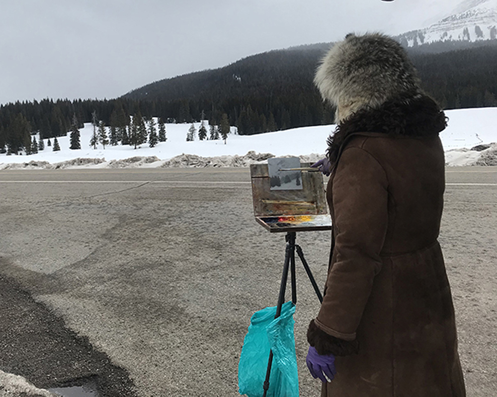
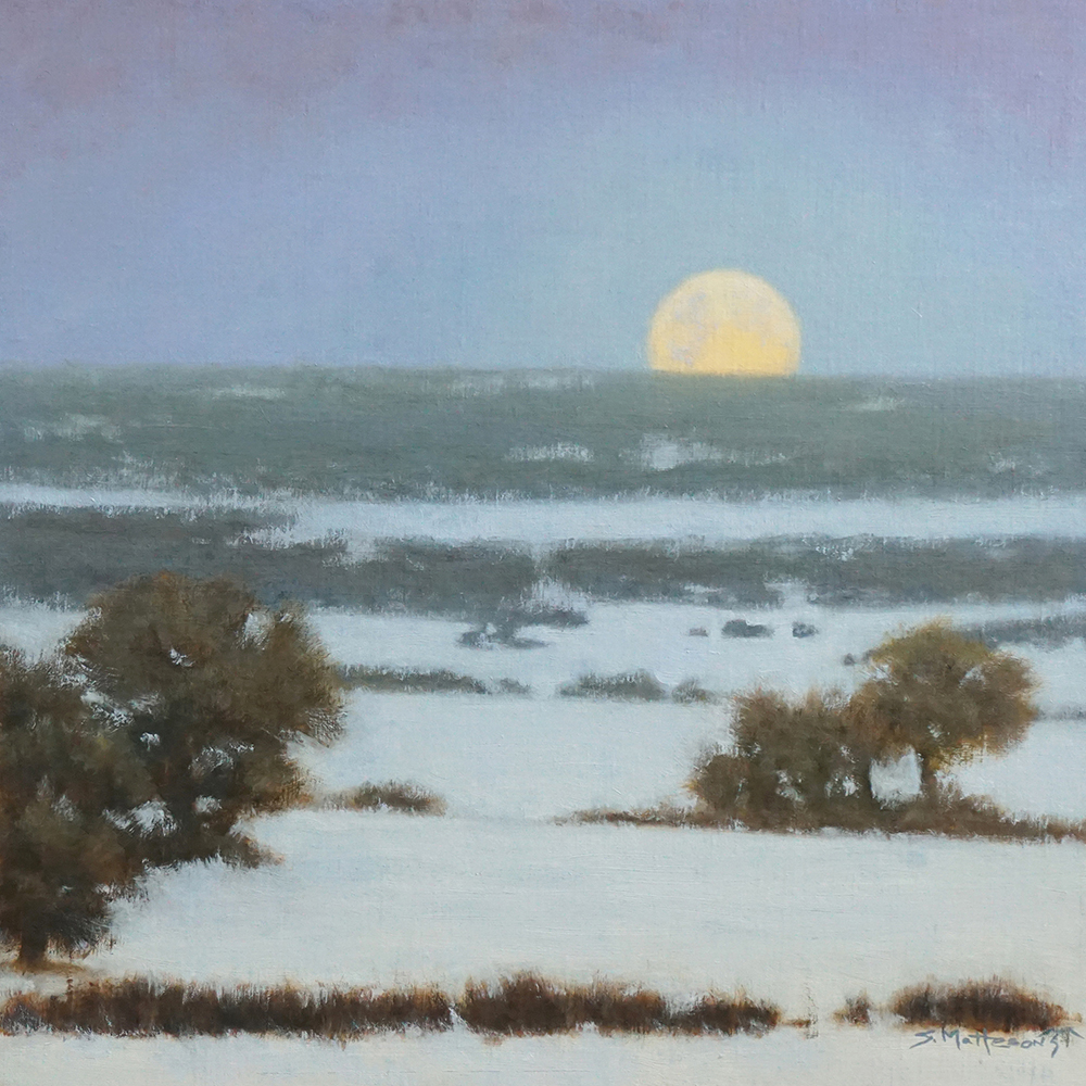
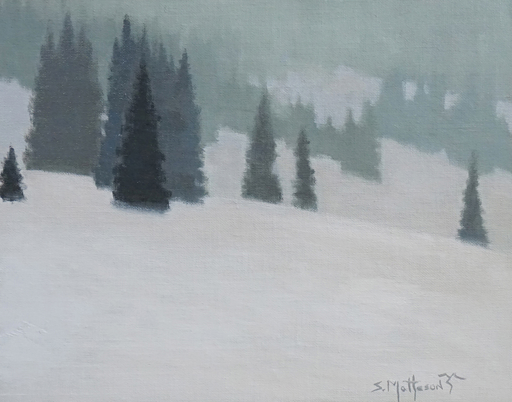
Susan Hediger Matteson, “Moonlit Pass,” 12 x 28 in., oil on linen, 2020
Susan Hediger Matteson in her winter painting gear — fur cap, not her hair!
How did you get started and then develop your career?
Susan Hediger Matteson: As I child I used to stay with a lady who loved to do watercolors and drawings, and I was fascinated, and it became a huge influence on me. I had some wonderful art teachers in middle and high school, and these teachers pushed us as students, to create in various mediums plus public works and murals. This approach promoted a wide range of disciplines, and I feel I was very lucky to have been a part of that. I find it sad now that most public schools don’t support the arts like they used to; it is truly a loss for everyone and a lost opportunity for some.
When I started attending Southern Illinois University, I declared my art major in the first semester. I earned my fine arts degree and continued on to earn a second degree in graphic design and Illustration to pay the bills garnering a strong sense of discipline along the way. I felt the rigors of graphics and illustration — meeting deadlines, having a good work ethic, were all something I thought were missing in the fine art section of my education. In my design career, I competed in various shows and earned awards in Print magazine and ADDYS.
After 20 years in the design field, I wanted to explore more of the fine art side of my training. I signed up for classes and studied with artists whose work I admired: David Leffel, Sherrie McGraw, Scott Christensen, Brian Blood, Kim English, Robert Liberace, Susan Lyons, Scott Burdick and Huihan Liu.
How do you find inspiration?
I love how light plays across a scene — whether a person or a place. Snow scenes are a constant favorite, especially when it is snowing.
What is the best thing about being an artist?
I can’t imagine doing anything else. I love going outside to paint en plein air but also like working in the studio. It is a lot like fishing — you are always going for the next big catch.
Who do you collect?
(Looking across my living room) – Anne Blair Brown, Jane Hunt, Hollis Williford, Veryl Goodnight, David Grossman, Scott Christensen, Brian Blood, Tiffany Stevenson, Kim English, Bill Gallen, Susan Lyons, John Poon, a couple of favorite local artists: Jerry Cohoe and Ed Singer.
Susan Hediger Matteson, “Moonset,” 16 x 16 in., oil on linen, 2021 (Landscape Award of Excellence – OPA Western)Susan Hediger Matteson, “Reverence,” 36 x 27 in., oil on linen, 2020Susan Hediger Matteson, “Ute Mountain Moonset,” 30 x 30 in., oil on linen, 2021Susan Hediger Matteson, “Winter’s Muse,” 11 x 14 in., oil on linen, 2020
Enchanted
By Elizabeth Butler
36 x 72 in.
Oil and silver leaf on panel
$9,600
As native of Arizona, Elizabeth Butler has always been inspired by the beauty of nature. In turn her floral and botanical works of art inspire others to appreciate the gifts of nature. Her current body of work makes an effort to accomplish that with flowers. She arranges and paints them in such a way to draw attention to that life-giving fullness they embody. She carefully selects and arranges the flowers and photographs them as reference, but also keeps the live bouquet as inspiration as she lets her imagination run free.
Discover more of her work at www.celebrateart.com. Butler’s work, along with 100 other artists, was shown at the Celebration of Fine Art in Scottsdale, Arizona, January 15 – March 27, 2022. Contact us at 480-443-7695 or [email protected]
Joshua Cunningham (b. 1974), "So Begins the Green," 2020, oil on linen, 14 x 18 in.
Joshua Cunningham: Further In
Groveland Gallery
Minneapolis, Minnesota grovelandgallery.com
Through January 15, 2022
In Minneapolis, Groveland Gallery is set to host its fourth solo show dedicated to Joshua Cunningham, who lives just across the Mississippi River in St. Paul. On view will be paintings spanning two decades, including ones he self-deprecatingly admits were “started long before I knew how to finish them,” others “created over half a dozen visits to the same place at the same hour,” and still more that “came off the brush fully formed.”
Cunningham notes that his increased teaching load during the pandemic only “deepened my gratitude for the sacrifices and energy that my mentors put into my training, their mentors into them, and so it goes back for generations.” He adds that the newer paintings in the Groveland exhibition are “born of moving further into a deepening gratitude for all those artists who’ve come before.”
Of his verdant landscape painting illustrated here, Cunningham recalls, “There was something about how the undulating rhythms all roll toward the well-worn middle ground that creates a connectedness between the right and left of the canvas. No matter how far our attention strays, there is always a way back to common ground.”
> Visit EricRhoads.com to learn about more opportunities for artists and art collectors, including retreats, international art trips, art conventions, and more.
> Sign up to receive Fine Art Today, our free weekly e-newsletter
David Poxon was born in the Industrial heartland of England, but now makes his home in the rural countryside of Shropshire, U.K. He is an elected member of the prestigious Royal Institute of Painters in Watercolours and is also a signature member of the National Watercolor Society of America.
David Poxon is on the faculty of the 2022 Watercolor Live virtual art conference, January 27-29, with a Beginner’s Day on January 26. Register early at WatercolorLive.com!
A recurring theme in David’s work is the reclamation by nature of that which man has created and abandoned, finding renewed life between object and environment.
His medium of preference is watercolour, and he says he is “a purist in the sense that mainly transparent pigment is used, and white paint avoided.”
Here’s more about his watercolour techniques and inspiration.
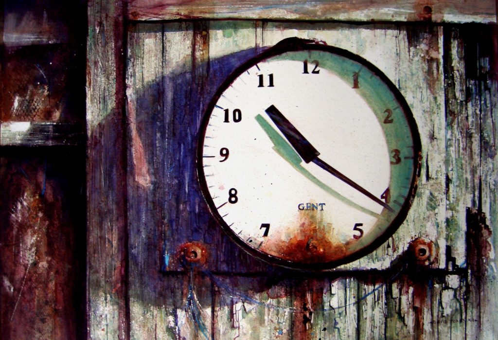
David Poxon, “Killing Time,” watercolour This painting won the Shanghai Biennial and got me my first big breaks in China. The clock was attached to an old Cricket Pavilion and had long stopped working. To be true to the subject I waited for the correct time before quickly drawing and photographing it in order that the cast shadows from the clock hands would be an accurate reflection of the minutes past the hour. So hence the title, “Killing Time,” waiting for inspiration.
Stimulating Watercolors
BY DAVID POXON
I aim to record what is seen and felt in a subject as accurately and realistically as possible, believing that any finished painting should attempt to transcend a mere visual experience and reach out to the viewer in a stimulating, emotional, and engaging way.
Totally fascinated with the technical challenges that pure watercolour painting presents, my working method requires patience and preparation. Thinking about the subject whilst exploring its ‘construction’ through drawing, and refining and rehearsing passages that stretch my abilities as a painter, provides my constant motivation. This reverential approach is very much born out of the respect I feel for the subjects that call me.
David Poxon, “Harvest Days,” watercolour, 27 x 19 I wanted to capture the atmosphere of the late summer Barley harvest. Where I live in rural Shropshire, England I am surrounded by beautiful countryside and the machines that maintain it. These tractors are modern day workhorses and each has its own characteristics. As a young boy my Father would take me to collect loads of potatoes in his old truck. The treat of the day was to have a ride on the farmer’s tractor. Tractors were the first things I learned to draw and paint.
The Subject Hunt
Subject hunting trips are usually frantic and fast-paced expeditions. I go armed with a small pad, drawing kit, camera, and tape measure to record size and scale. When the light is right – that which gives strong cast shadows and emphasises tonal definition – I am ready to go exploring at a moment’s notice. Being aware of potential subjects is very much a state of mind; inspiration can strike in the unlikeliest places and it’s important to have my “artist radar” on maximum alert.
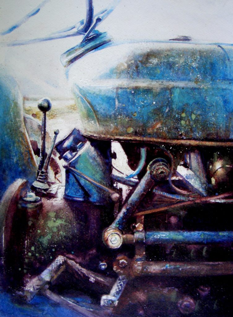
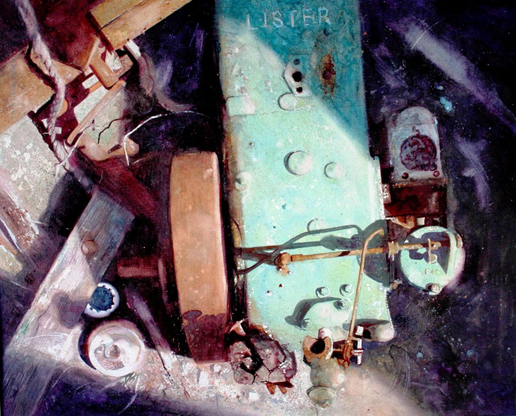
David Poxon, “In a Farmyard,” watercolour, 20 x 18 This is an old lister engine the farmer had used to power his milking parlour; it had a wonderful array of subtle blue to green and that glorious amber rust and soft shadow plays. I was so excited by this subject; it took me a month to paint!
Painterly Possibilities
I never rearrange a possible subject, as this can give an almost artificial atmosphere to the work. Rather, I change my position within the subject area until a sense of the painterly possibilities emerges. I move rapidly from one scenario to another, stopping to make quick drawing notes, taking photos for fine detail, and measuring where necessary.
Occasionally a more formal on-the-spot drawing is called for. Frottage is a useful technique to have in my armoury to instantly create an impression of texture, shape, and tonal extremes. An instant record of any object can be captured in a few moments with the aid of copy paper and a soft pencil.
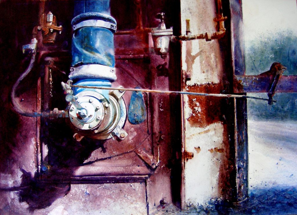
David Poxon, “Men Worked Here,” watercolour, 18 x 27 This subject and its format is typical of the compositional choices I make. A discarded factory and this painting is my take on a typical post-industrial scene. My early years were spent surrounded by Industry and factories which were my playground while growing up. Now long gone, this post-Industrial age gives us as painters some wondrous subjects.
It is only later when back in my studio that the day’s collection can be fully examined. As my painting method means that days or weeks are spent on a work it’s necessary to gauge whether my enthusiasm for what at first seemed like a good capture will sustain.
Some projects are far more complicated than others, and this is where accurate drawing and preparation are vital. There can be no obvious drawing errors when attempting to record the parts of engines or tractors, as it’s inevitable that an expert will be in the gallery and spot any embarrassing mistakes. Taking time to get the drawing right will avoid a world of pain later! These machines and scenarios have characters of their own, and I treat them as portraits in respect to their features.
The next step is to produce an accurate line drawing. I always work on stretched heavy watercolour paper held down onto marine plywood boards. Having a stock of these of various sizes always available means that my options are never restricted.
My final line drawing for transfer to the watercolour paper will be kept to an absolute minimum in terms of detail. The aim is to provide a simple skeleton shape. I regard this very much as scaffolding in the sense that when the painting is begun my process will rebuild the subject on the paper.
The next step is protecting areas to be kept white. I use anything that comes to hand to do this: scraps of paper, objects, masking fluid. It’s better to protect more whites than I may need, after all there are very few actual real whites in nature, and I can blend them away later in the painting if they are unnecessary. At this stage the ‘work’ does not look anything like it might end up; holding onto that final vision in the mind is vital!
The first washes tend to be splashy affairs with mixes about the consistency of milk. I try to get 7 or 8 layers of wash down, wet-on-dry, to get the paint body onto the paper. These are exploratory in the sense that a finished work may have more than 20 transparent wash layers.
The drawing may become lost amid the seeming chaos of these first applications; finding the scaffolding drawing sometimes requires the tenacity of an archaeologist. Knowing where I want the painting to go only comes through experience with this type of method.
My board is kept flat to maximise any granulation effects, but rocking it occasionally encourages runs and blending. Texture is important to me, so I will take any benefits the pigments throw my way. Balancing the medium’s natural tendencies while finding colour ways and exploiting light effects, counterchanged with complimentary darker passages, is an exciting juggling skill.
A Word of Advice
Watercolour has a reputation for being the most difficult medium to master, often seemingly to have a will of its own. With experience you can limit the chances of the paint running away from your subject and wield a certain amount of control by stepping down through the tonal register with multi layers of wash, working light to dark, and slowly steering the painting towards the vision that first inspired you.
This patient approach can be very rewarding, after all, life teaches us that you only get out of something what you put in.
David Poxon, “Another World,” watercolor, 12 x 17 I love to get close to my subjects and explore all the frail surfaces slowly transitioning. Watercolour is the perfect medium for capturing this natural process of reclamation. By overlaying multiple washes of transparent colour you can step down in value, but with very careful application maintain the glow from the paper that gives watercolour its unique characteristics.
For my upcoming Watercolor Live demo, I have chosen a seemingly simple subject that encompasses the elements which constantly appear in my work: texture and multi-layering for extreme value: an ancient building in Rome I came across on my travels.
We will ‘zoom’ in on the aspects that give me the greatest painting pleasure – all those textural details and rich colours!
My works can often take days or weeks to complete. Given the obvious and necessary time limit for my Watercolor Live demo, I have devised a way that can give a snapshot into my process for viewers in an easy to understand and follow system. I hope Watercolor Live fans will enjoy a small glimpse into my world and techniques. Enjoy.
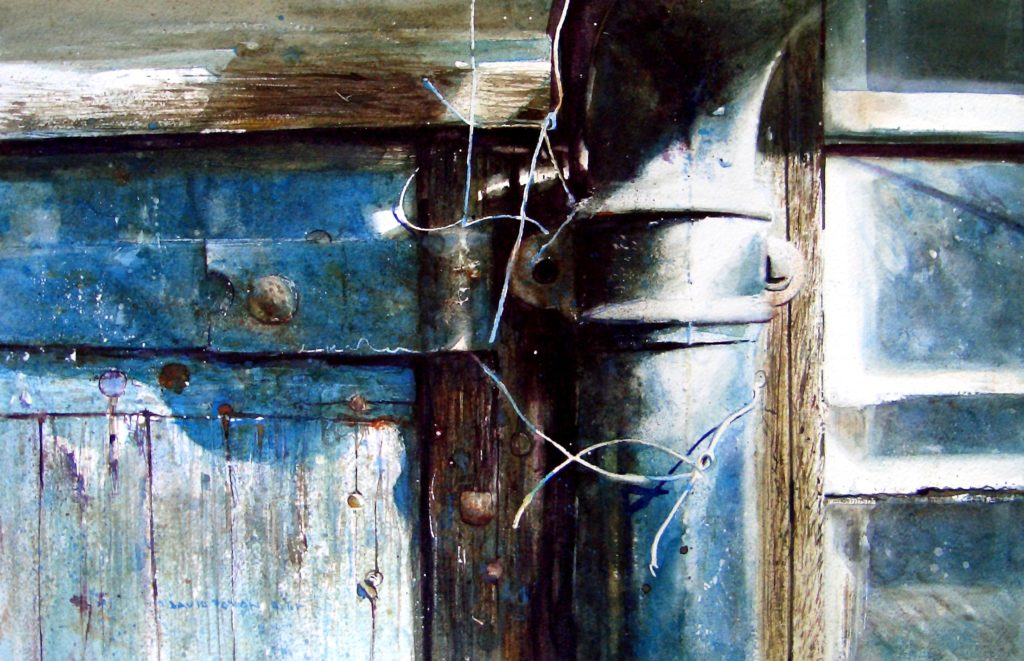
David Poxon, “Wired,” watercolour, 18 x 26 The solitude and silence in this abandoned workplace had an almost intangible presence. Its walls seemed to be imbued with the energy of the workforce long since gone. The crumbling textures, peeling paintwork, strong cast shadows, and delicate trail of old cables gave me all the painterly challenges I look for in a subject.
As part of our effort to continue to help artists and art galleries thrive, we’re proud to bring you this week’s “Virtual Gallery Walk.” Browse the artwork below and click the image itself to learn more about it, including how to contact the gallery.
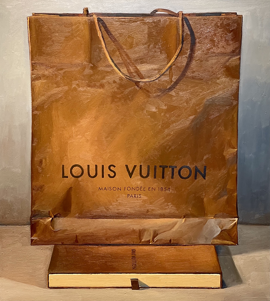
Blue & Brown (Louis Vuitton) by Ray Kleinlein, Oil, 38 x 34 in.; Anderson Fine Art Gallery
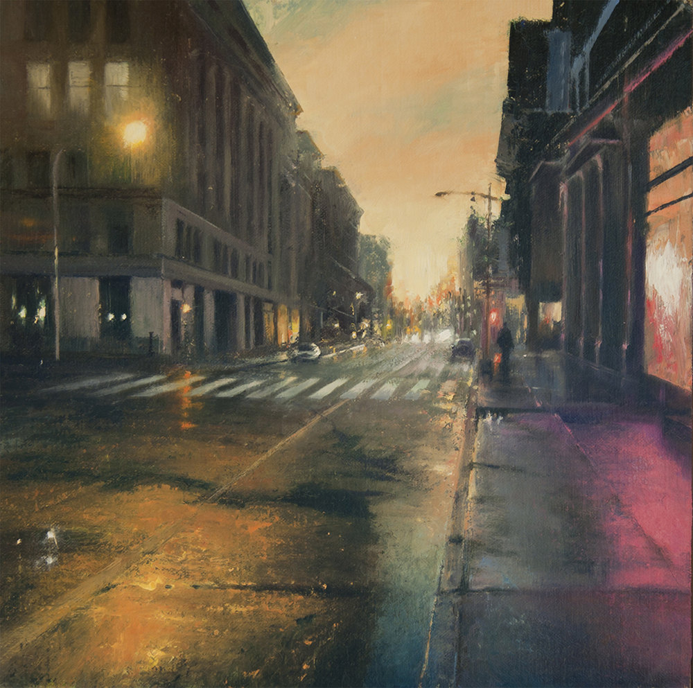
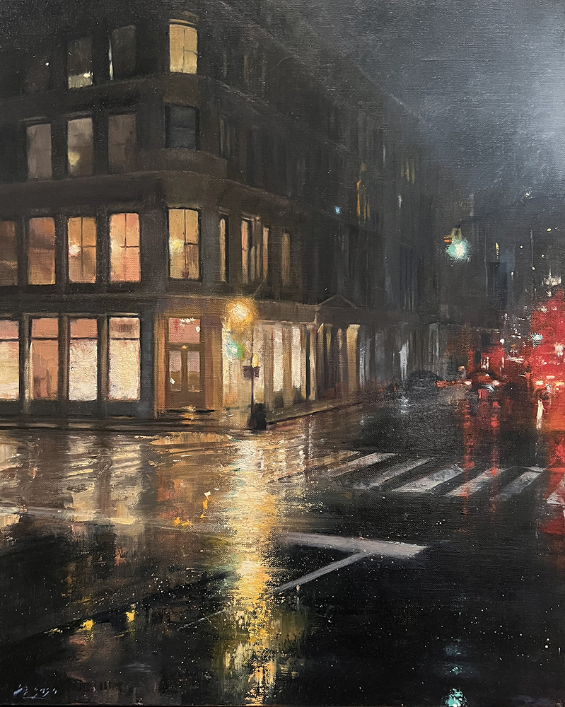
Soho Evening Rain by D.Eleinne Basa, Oil on canvas, 20 x 16 in., Signed; Rehs Contemporary
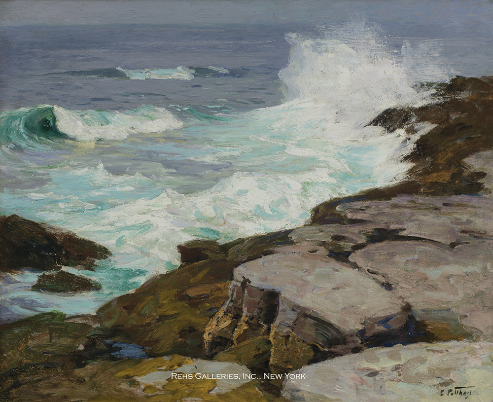
Surf at Low Tide by Edward Henry Potthast (1857 – 1927), Oil on canvas, 24 x 30 in., Signed; titled and addressed on a label on the reverse; Rehs Galleries, Inc.
Want to see your gallery featured in an upcoming Virtual Gallery Walk? Contact us at [email protected] to advertise today. Don’t delay, as spaces are first come, first served, and availability is limited.
Last Rays
18 x 24 in.
Pastel on prepared board
$1,750 (plus tax and shipping as applicable)
Available through Castle Gallery, 1202 West Wayne Street, Fort Wayne, Indiana
Jill Stefani Wagner PSA-MP IAPS/MC
“Last Rays was inspired by lovely late afternoon light peaking through snowy trees in February. As a Michigan artist, I have learned to appreciate the snowy months in the Midwest almost as much as I love the beautiful spring, summer and fall days. Each season has its own unique beauty. Sunny winter scenes really sparkle with warm light and cool blue shadows. In this piece I focused on that complimentary duality and accentuated the texture by using a thick pastel ground under painting.
“Whether painting landscapes, interiors or figures, my primary focus is always the light and how it affects the subject I’m trying to capture. Working in pastel and oil I approach my paintings as a sculptor would, carving out nuances of highlight and shadow.
“An avid plein air artist, I’m inspired by the American landscape and that of my beloved Italy. I find my greatest joy painting on location, taking in the atmosphere, temperature, sounds and smells, as well as the view. I participate in national plein air festivals, traveling throughout the country to capture the uniqueness of each venue. During the cold Michigan winters, I work in my studio creating larger pieces…but always, always chasing the light.”
Jill Stefani Wagner’s artwork has been exhibited in solo and group exhibitions throughout the country and is included in many corporate and private collections. Her paintings have been juried into prestigious national and international oil and pastel exhibits and have been honored with multiple awards.
One of Jill’s paintings graced the cover of PleinAir Magazine, and her work is often featured in their pages. Fine Art Connoisseur Magazine has frequently highlighted her paintings as has Pastel Journal and the French magazine, Practicum des Arts. Wagner has been invited Pastel Faculty at PleinAir Magazine’s Plein Air Convention for four years and enjoys teaching workshops and mentoring other artists.
Wagner is a designated Master Paste list in the Pastel Society of America and Master Circle in the International Association of Pastel Societies, and belongs to American Impressionist Society, Oil Painters of America, Great Lakes Pastel Society and Degas Pastel Society.
Jill Stefani Wagner graduated with a B.F.A. in painting from University of Michigan School of Art. She owned an award-winning advertising firm in Ann Arbor, Michigan, before “seeing the light” and becoming a full-time artist.
Fill your mind with useful art stories, the latest trends, upcoming art shows, top artists, and more. Subscribe to Fine Art Today, from the publishers of Fine Art Connoisseur magazine.

, Leftovers, 2021, oil on linen, 18 x 24 in.")
, Lilies and Lace, 2021, oil on linen, 30 x 40 in.")