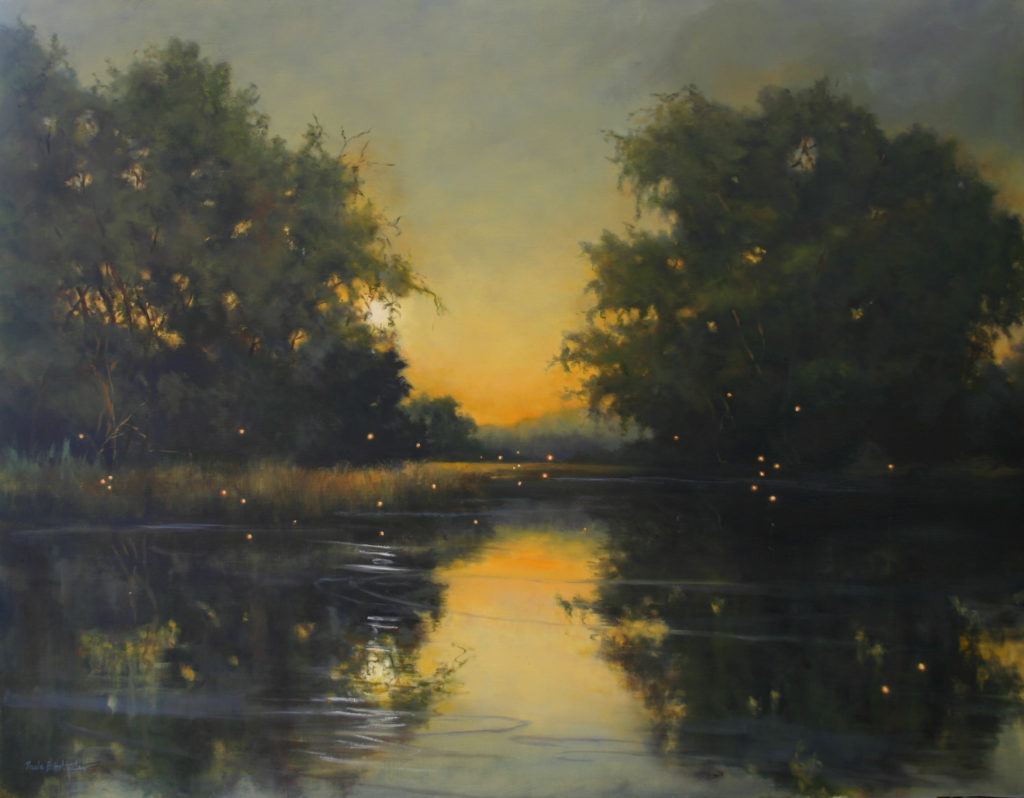
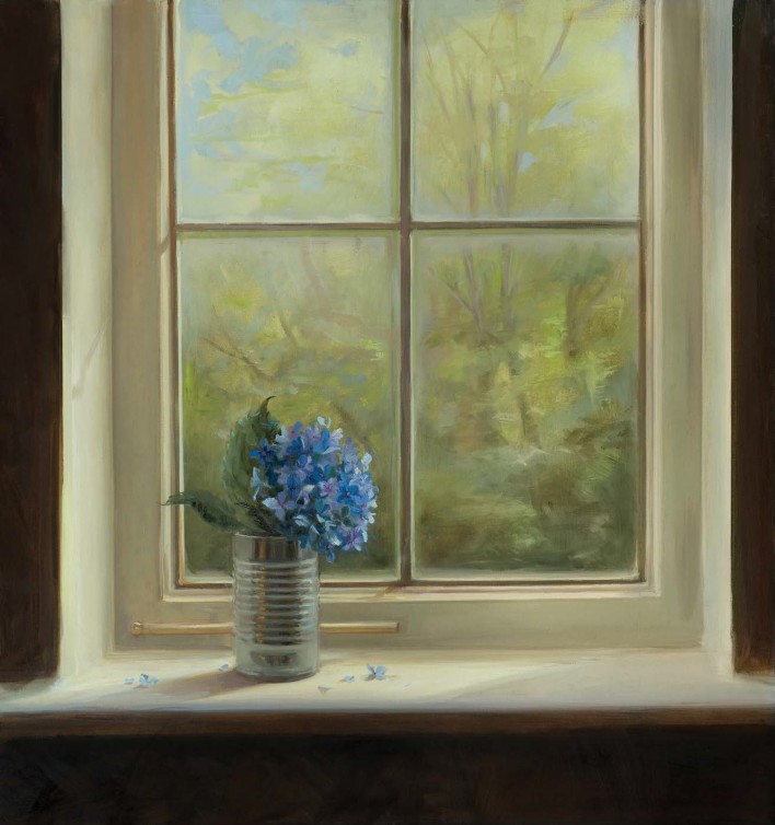
Dryocampo Rubicunda, for Remedios Varo, 2021
By Traci Wright Martin
24 × 18 in. (61 × 45.7 cm)
Charcoal and pastel on Stonehenge paper
Available through 33 Contemporary at Artsy
Traci Wright Martin is a contemporary portrait and figurative artist known for combining charcoal realism with mixed media. The use of colorful pastels, patterned papers, and paint techniques in the finished product creates a unique identity for her body of work. Design elements are carefully chosen to represent larger themes within each series. The overall narrative in Martin’s work weaves in and out of a conversation on identity and representation, explored through the visual symbolism of mixed media.
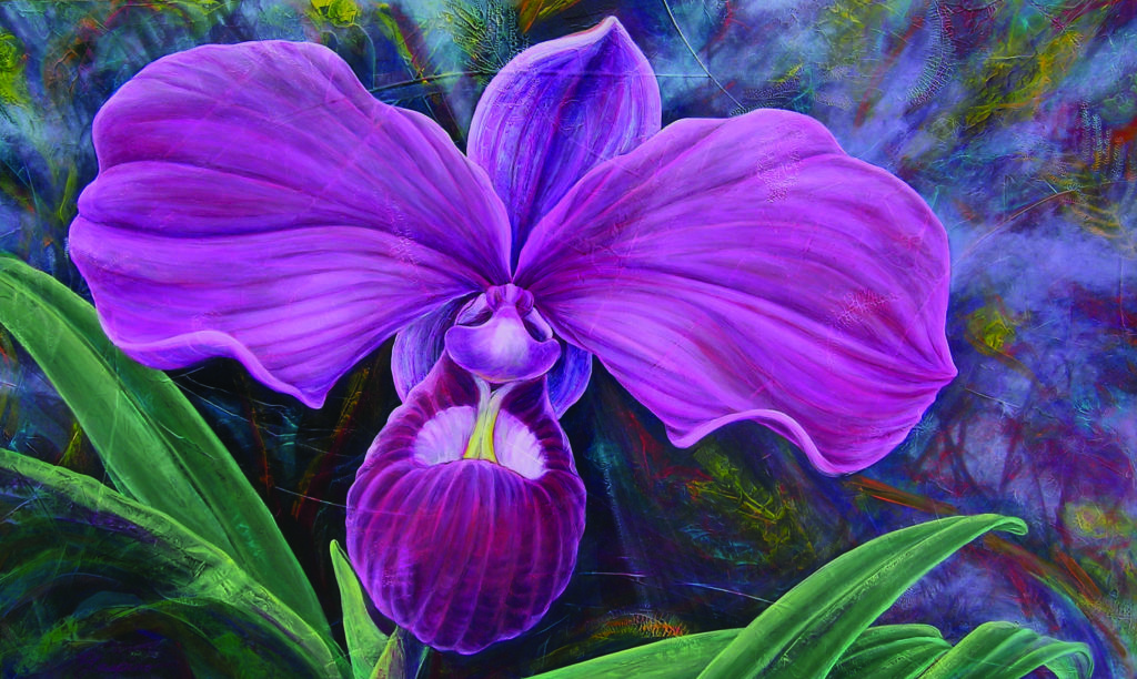
Patricia Laspino, “Marvelous S” 2019; Oil on Panel; 40 x 30 inches
By immortalizing nature’s own orchid masterpieces, Patricia Laspino’s work seeks to enhance the understanding of our past and present infatuations with orchid species, and illuminate future expectations for our interaction with these magnificent plants.
Stamford Museum & Nature Center has recently announced “Global Garden: Resonant Beauty,” an exhibition featuring the oil paintings, etchings, and drawings of Patricia Laspino. The exhibition will be on view in the Stamford Museum’s Bendel Galleries through March 21, 2021. Throughout February, the Global Garden exhibition will feature “Saturdays with the Artist,” with Laspino on-site at the Stamford Museum & Nature Center.
Patricia Laspino, “Obsession” 2016; Oil on Canvas; 36 x 60 inches
Over her 40 year career, Laspino has developed a signature style that entwines dozens of layers of transparent oil color glazes over a sculptural groundwork of botanical impressions. Her art is the cornerstone of the “Orchid Alliance Project—Bridging Art & Science,” an environmental effort she says has important national and international significance in the art and science communities. Her large-scale paintings use orchids symbolically to raise awareness for environmental stewardship and convey the interconnectedness of humanity and nature.
“The Orchid Alliance Project seeks to increase advocacy and appreciation for the natural world by interweaving the historical, biological and cultural significance of the orchid species through the vehicle of art,” said Laspino. “The abundant cultural presence of the orchid, as demonstrated by the cultivation of thousands of species and hybrids, is a testament to the collective passion this plant species has inspired worldwide for over 2,500 years.”
Laspino believes exploring ancient attitudes about orchids and their function, through the lens of art and culture, may shed some light on the present power orchids have on us – a power she believes can transform our future in terms of global stewardship.
“Patricia’s work marries together art and science, and makes it tangible in a way that people can receive and perceive,” said Jillian Casey, Curator of Collections & Exhibitions for the Stamford Museum & Nature Center. “Her orchid paintings explore and inform the viewer of the complex interdependencies and careful balances inherent in environments of orchids, which include every continent except for Antarctica.”
“We’re delighted host ‘Global Garden: Resonant Beauty’ as the first full exhibition of our 85th anniversary year,” said Melissa H. Mulrooney, Executive Director & CEO of the SM&NC. “Patricia Laspino’s floral portraits convey the interconnectedness of humanity and the natural world and are designed to be the storytellers of nature’s wonders.”
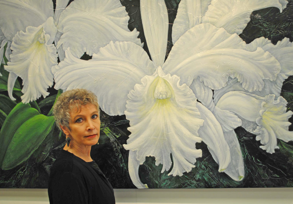
Artist, Patricia Laspino in front of her painting “Alice B” 2011
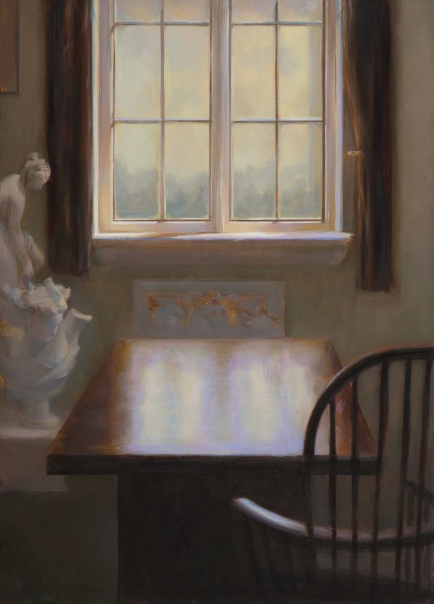
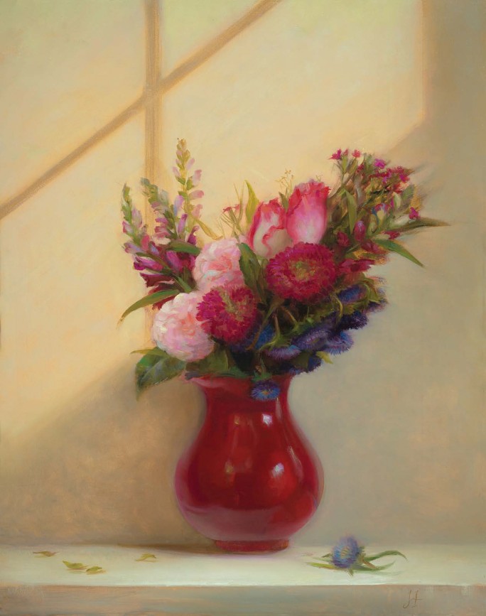
Juliette Aristides, "Interior," 28” x 22” oil on panel, 2020
Classical Art > “This collection of paintings, in their stillness and silence, are a record and a gift of this time,” says Aristides.
Master artist Juliette Aristides
The Customs House Museum and Cultural Center in Clarksville, Tennessee has announced its 2021 gallery calendar with an exhibition of paintings by award-winning realist Juliette Aristides. Featured in the Museum’s Orgain and Bruner galleries, the show includes still life and interior scenes, as well as a suite of figurative pieces.
The year 2020 and the changes to our “norms” brought a chance for reflection and observation. For Aristides, it allowed time to explore and document objects in the environment she lives in. In her new exhibition, “A Life’s Work,” the artist focuses on quiet moments, documenting light and shadow that fill her studio and home. The artist says of the work, “This year has been one of solitude and introspection set against a backdrop of intense disruption – a pendulum of extremes. My body of work is centered on a deep appreciation for the simple and unchanging parts of my everyday life.”
She goes on to say, “This collection of paintings, in their stillness and silence, are a record and a gift of this time. The aim of many art forms, from poetry to painting, is to return home and see it as if for the first time. As William Steig once said, ‘Art… has the power to make any spot on earth the living center of the universe.”
Paintings such as Aristides’ “The Atelier” bring out the artist’s understanding of sunlight and its dramatic effect on everyday surfaces. The reflective gleam highlights the polish of a thick wooden table and the soft curvy silhouette of the sculpture that quietly holds its place on the side.
Juliette Aristides, “The Atelier,” 24” x 17” oil on panel, 2020Juliette Aristides, “Hawthron,” 24” x 22” oil on panel, 2020Juliette Aristides, “The Space Between,” 28” x 22 9/16” oil on panel, 2020Juliette Aristides, “Summer,” 24” x 17” oil on panel, 2020Juliette Aristides, “Interior,” 28” x 22” oil on panel, 2020
Curator Terri Jordan states, “Juliette is one of the best contemporary painters of light. Her ability to portray that bit of afternoon sun coming into a windowsill and reflecting on a pewter pot is unmatched. You can feel the warmth in her paintings, and a sense of time standing still for one tranquil gaze by the viewer. They tend to draw you into your own memories.”
Aristides lives in Seattle, where she is the founder and instructor of the Classical Atelier at the Gage Academy of Fine Art. She teaches workshops both nationally and internationally and is cofounder of the Da Vinci Initiative, which provides artistic training to public school educators nationally. Well known for her figurative drawings, Juliette is the author of several instructional books including Classical Drawing Atelier: A Contemporary Guide to Traditional Studio Practice, Classical Painting Atelier: A Contemporary Guide to Traditional Studio Practice, Lessons in Classical Drawing and Lessons in Classical Painting, published by Watson-Guptill, NY.
The classical art of Juliette Aristides in “A Life’s Work” will be on view through March 31, 2021. For more information, please visit customshousemuseum.org.
Juliette Aristides is one of the world’s leading experts in the “lost art” of the classical technique — a technique that captures the purity and deep emotion within the human form like no other can.
Create beautiful and inspirational depictions of your subject…
Elicit a deep and powerful emotional connection with your viewers…
Find a sense of harmony and movement within your own creative vision…
As part of our effort to continue to help artists and art galleries thrive, we’re proud to bring you this week’s “Virtual Gallery Walk.” Browse the artwork below and click the image itself to learn more about it, including how to contact the gallery.
Tempest #3 by Michael Jinkins, Oil, 24 x 36 in.; Anderson Fine Art Gallery
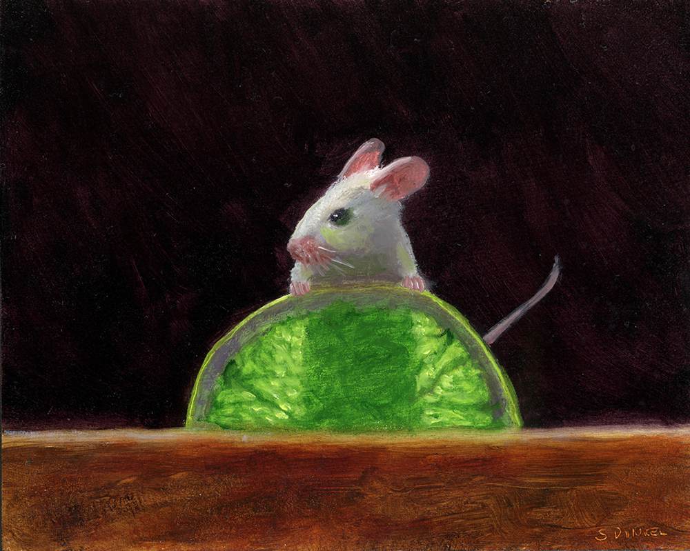
Electric Lime by Stuart Dunkel (Born 1952), Oil on panel, 4 x 5 in., Signed; Rehs Contemporary
An Italian Beauty by Antonio Zoppi (1860 – 1926), Oil on canvas, 26 x 20 3/4 in., Signed and inscribed Firenze; Rehs Galleries, Inc.
Pop Pop Pop! by Ilene Richard, Acrylic on canvas, 36 x 48 in.; Vermont Artisan Designs
Want to see your gallery featured in an upcoming Virtual Gallery Walk? Contact us at [email protected] to advertise today. Don’t delay, as spaces are first come, first served, and availability is limited.
The “Whodunnit? Anonymous Art Show & Sale” is a fundraiser for the Art Association of Jackson Hole, benefiting their art education and outreach programs.
“What is unique about this show is that all participating artists sign their work only on the back,” said artist and organizer Jennifer Hoffman. “Part of the fun is trying to guess who painted each piece. I can’t tell you which piece is mine, but I can reveal that I was invited to create an 18×18″ painting, and that my good friend Kathryn Turner also created a piece of this size. It is up to you to do the detective work!”
Visit whodunnit.afrogs.org to view the works; the sale includes set price “buy-it-now” items as well as the silent auction for 18 x 18-inch paintings. The silent auction/sale continues through March 4, 2021.
Fall in the Tetons
By Kirk Randle
48 x 60 in.
Oil on canvas
$24,000
A native of Utah, Kirk’s works depict a sense of place. He is known for painting sweeping landscapes and vivid skies, showcasing the intense beauty and reflective light of the West. His artistic career spans decades, including 31 years as a participant in the Celebration of Fine Art.
Come watch him and 100 other artists create at the Celebration of Fine Art, where art lovers and artists connect, in Scottsdale, Arizona; now through March 28, 2021. Contact us at 480.443.7695 or [email protected].
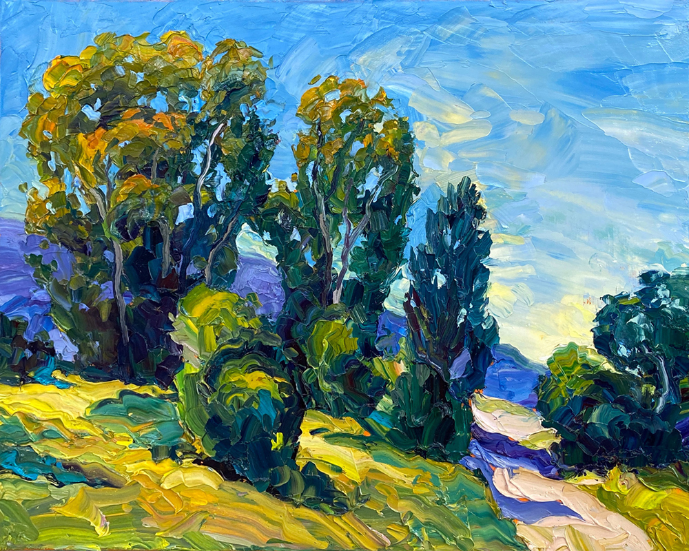
Brad Teare painting the mountains near his studio in Cache Valley, Utah.
Brad Teare’s studio with a canvas on the easel showing an acrylic marker underpainting — ready to apply textured oil paint.
How did you get started and then develop your career?
Brad Teare: I always wanted to be an artist — although there were times when I wasn’t sure where my career would lead. Above all, I wanted to be a landscape painter, but that didn’t seem financially feasible in my early years. So, I opted for illustration as a way to refine my skills while making a living. I was able to abandon my freelance career in 2001.
How do you describe success?
Success is bringing beauty into the world to help us transcend the struggles of life. I appreciate many artistic traditions, but I need to magnify the joy and energy I find in the natural world. I find using vibrant color of impressionism most suitable to my personality. I’m grateful to connect with enough collectors to make my artistic project possible.
Once, I was outside leaning my hand against a tree. As I looked at the bark, I saw a single leaf smaller than my fingernail protruding from a tiny stem. On close inspection, I could see the leaf shifted in color from red to yellow to green. A patina of rusts and mauves speckled the entire surface. I knew if I could impart just a portion of that leaf’s beauty into my paintings, I would be a success.
How do you find inspiration?
I love color and light playing across diverse environments — reflecting off streams and ponds — rocks and trees casting shadows. It’s a continuous display of rhythm and light. The sound of water inspires me, as do the chirps of insects and the whispering wind. Being immersed in nature can be overwhelming. I know some who feel a sense of diminishment by its grandeur. But it makes me feel as though I’m part of the majesty, that my life is as essential as any aspect of nature. I’m not alien to nature but an integral part. I try to impart that in my work.
What is the best thing about being an artist?
The artist’s life is an adventure. I’ve been able to travel freely, and I love the National Parks. To delve into creative states while painting has been life-sustaining for me. Meeting collectors has been amazing, and I’m always overwhelmed by their generosity. The artist’s life is often fraught with tremendous sacrifice, and that has been difficult. We often run incredible financial and personal risks, most of which we thankfully don’t realize until afterward. But it’s been worth it, and I can’t imagine living any other life.
Who do you collect?
I have a beautiful collection of paintings and fine art prints. On the wall at the foot of my bed, I have a woodcut by Royden Card. My late wife and I bought it the first year we were married. A few weeks ago, I realized it has given me joy every day for all those years. Each piece of my collection is like a battery that is constantly recharging me. That’s the criteria for my collection–that the pieces reflect beauty and vitality over the long term. I have paintings by David Meikle, James Gurney, and Dilleen Marsh. My fine art print collection includes work by Wolf Barsch, Wayne Kimball, and Carl Bloch.
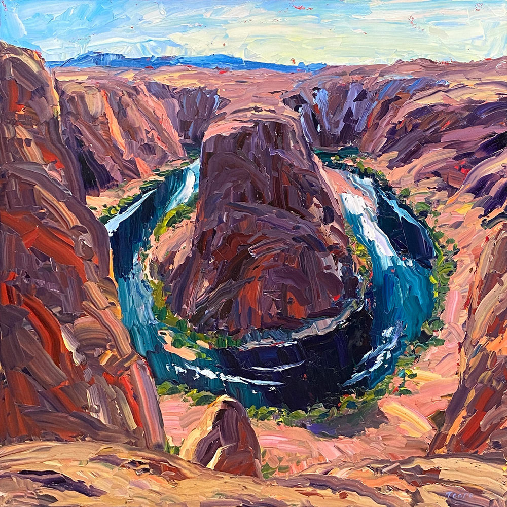
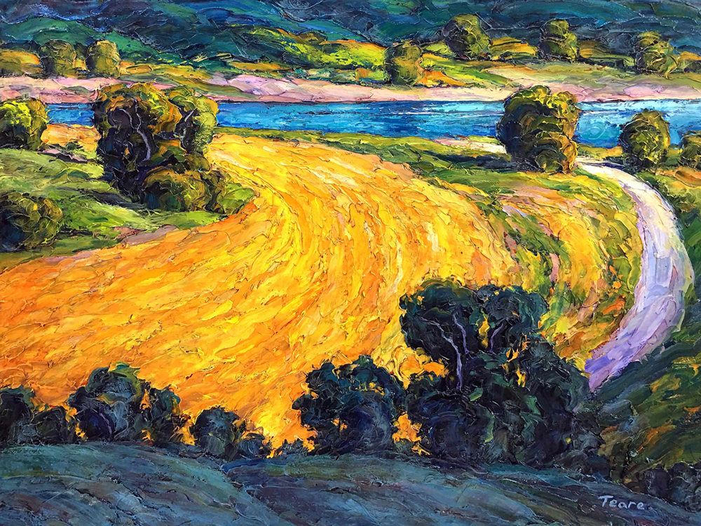
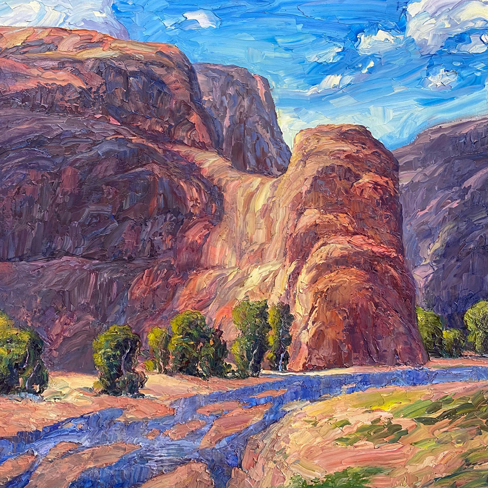
Brad Teare, “Spring Morning,” 16 x 20 in., oil on canvas, 2021Brad Teare, “Horseshoe Bend,” 36 x 36 in., oil on canvas, 2018Brad Teare, “Golden Fields,” 30 x 40 in., oil on canvas, 2019Brad Teare, “Red Rock Country,” 36 x 36 in., oil on canvas, 2020
Quang Ho (b. 1963), "Young Chef," 2007, oil on panel, 24 x 24 in.; Collection of Marion and George Howard, featured in the March/April 2021 issue of Fine Art Connoisseur
From the Fine Art Connoisseur March/April 2021 Editor’s Note:
Collecting for the Right Reasons
My favorite issue of the year is the one that highlights real-world collectors of contemporary realist art. This is that issue, and we hope you will enjoy “meeting” the individuals and couples who have so generously opened their doors. These folks now join 72 others we have profiled since 2015, and we are honored and grateful to welcome them to this community.
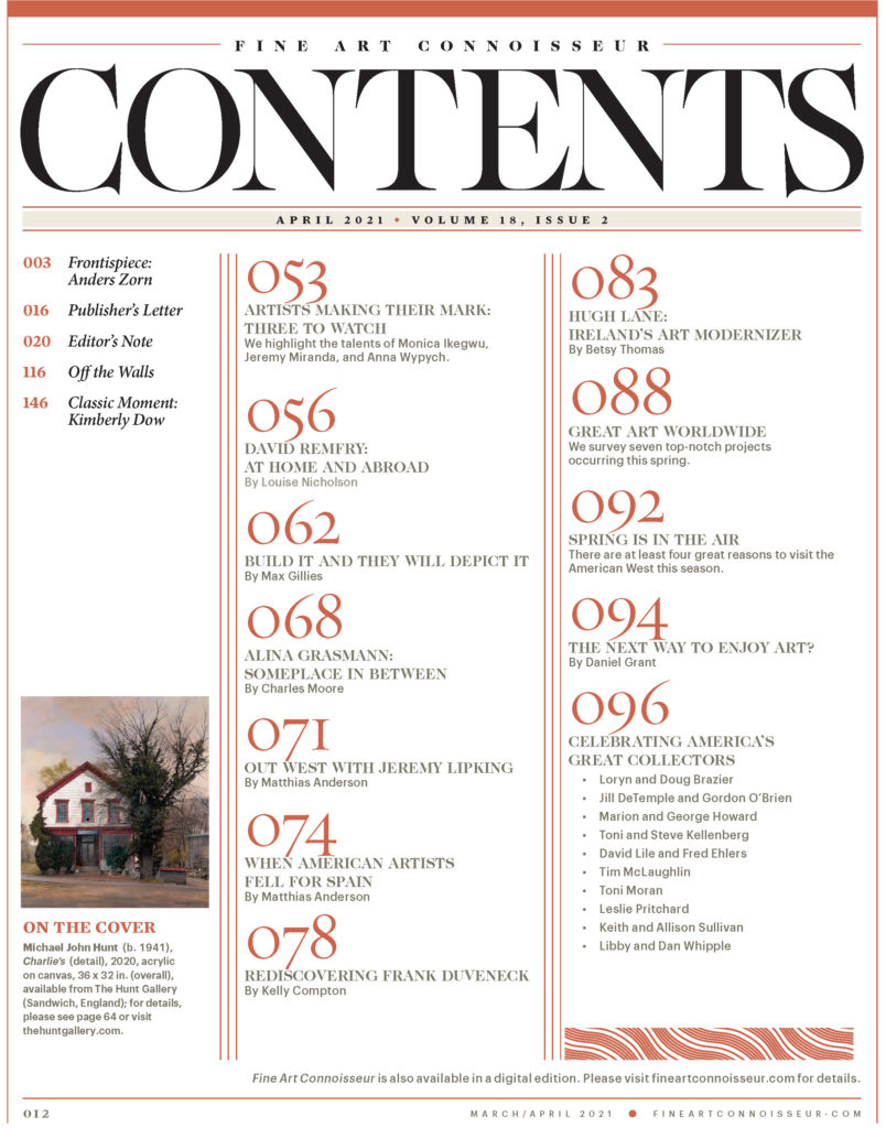
On the cover: Michael John Hunt (b. 1941), “Charlie’s” (detail), 2020, acrylic on canvas, 36 x 32 in. (overall), available from The Hunt Gallery (Sandwich, England). Get the March/April 2021 digital issue here.
Why do we do this? First, people need role models, in any walk of life. We play football better after watching Tom Brady, and we cook more effectively after Rachael Ray demonstrates the recipe. It’s harder with art collecting because there is no single way to do it, and unfortunately the best-known collectors are financiers and movie stars paying millions at auction for a Koons or a KAWS.
Good for them, but that’s collecting warehoused-investment assets with your ears, not art-to-live-with with your eyes. I’m far more intrigued by celebrities who collect items of comparatively low value: just for example, Tom Hanks buys antique typewriters, Angelina Jolie goes for medieval and Renaissance knives, and Claudia Schiffer seeks out mounted beetles, butterflies, and spiders.
Great, but this is a fine art magazine, and besides, buying anything when you’re a hundred-millionaire is not particularly difficult. The real trick is to buy wonderful “unbranded” art on a regular budget, away from the lime-light and the art advisers who think about this stuff all day. The folks highlighted in this issue buy art with their eyes and hearts, living with and enjoying it, sometimes enhancing their lives further by getting to know the artists who made it.
The hardest step in this issue’s preparation is asking the collectors to choose just two artworks to illustrate in their profiles. That’s like choosing among your kids, but the collectors do it bravely, and they understand why we ask them to. It’s simple: we can dedicate only two pages to each collector, and if we were to fill them with seven or eight “favorite” images, there wouldn’t be room for the words. Besides, each artwork would look more like a postage stamp than a painting. And so we go smaller (in number) and bigger (in photo size), reminding everyone that these two images don’t represent the whole collection, only evoke it.
Finally, two practical points. First, to the artists: never let your artwork leave the studio without photographing it to a high (publishable) standard. Artworks are your legacy, and if you don’t record them properly for future reference, you are trusting your legacy to a world that will never care like you do. While preparing our collector issues, I have been shocked by the difficulty of rounding up good photos of artworks. One cannot expect every collector to have great shots (though their insurers would appreciate that), but surprisingly few artists have them either.
Second, please note the lively profile of Toni Moran in this issue. She underscores how important it is for collectors to document the artworks they own, including photographing them. And once you’ve done that, I ask you to consider sharing the images with museum curators and living artists. This can now be done via at least two firms: Vastari and Artwork Archive.
Both offer safe, discreet ways to let “the right people” know what you have so they can research, publish, and perhaps borrow your art. It costs very little, and joining the network is an ideal way to connect with others who love art, too.
Thank you again to our wonderful collectors and artists for all they contribute to the vitality of our field.
Paula Holtzclaw, "Moonlit Marsh," 2018, oil on linen panel, 12 x 18 in., Cheryl Newby Gallery, Pawleys Island, SC
Contemporary Paintings > Artist Paula Holtzclaw has spent a lifetime learning to embrace the vibrancy of inspiration, which has itself shaped the course of her life. Here’s how.
Paula Holtzclaw, “Orchids with Pears,” 2014, oil on linen panel, 16 x 20 in., private collection
Following the Vibrancy: Contemporary Paintings by Paula Holtzclaw
BY CHARLES RASKOB ROBINSON
Right up front, the painter Paula Holtzclaw (b. 1954) confesses, “I usually dive into my canvas. I start out with my intent, and sometimes I carry it all the way through. But sometimes the painting begins to sail away from its charted course; I have to recognize the inspiration and go with it.” Occasionally this inspiration — what Holtzclaw calls “vibrancy” — is apparent, but at other times it takes a while to discern. Holtzclaw has spent a lifetime learning to embrace the vibrancy, which has itself shaped the course of her life.
Born in North Carolina, Holtzclaw was exposed to art as a youngster through her grandmothers, both of whom painted. She still recalls the smell of art materials as they introduced her to the basics of drawing and painting. Holtzclaw remained interested in art, but life took her in other directions before she returned to it.
In 1972 she enrolled at Western Carolina University, but she married two years later and began working for a contact lens company in its Charlotte laboratory. In 1978 Holtzclaw gave birth to twin boys. When they entered preschool, she joined a large ophthalmology group as a contact lens specialist engaging directly with patients — a welcome change from the solitary work she had pursued in the lab. This preference for being with others would resurface later in her artistic career.
Behind Holtzclaw’s soft-spoken Southern charm is a keen competitiveness. “I have always found myself striving for higher goals,” she explains. “I often ask myself, ‘Why can’t I just relax and enjoy where I am, instead of always reaching for more?’”
For instance, while in her thirties raising twin boys and holding down a professional job, Holtzclaw was introduced to the world of tennis. “I became totally consumed. Not content with just playing for fun, I begged games off the best players available. I played on every team and in every tournament I could. Ultimately I captained a United States Tennis Association team and we made it to the state finals for seven years in a row.”
Contemporary Oil Paintings > Paula Holtzclaw, “Luminescence,” 2018, oil on linen panel, 35 x 45 in.
RECONNECTING WITH ART
In the 1990s, recently divorced and still working in ophthalmology, Holtzclaw began to paint again. The vibrancy had reappeared. “I felt like I was coming full circle and had finally found my calling. I became totally obsessed with painting and gave up tennis. I would paint and study art books after work until midnight and as much on the weekends as I could.” In 1996 she landed her first representation, at Charlotte’s Providence Gallery, which still carries her work today. She also works with galleries in South Carolina, Georgia, Florida, and New Jersey.
In 2001, the artist met Chuck Holtzclaw, a certified master arborist who owns a tree-care business. “With much support from Chuck, I left ophthalmology in 2002 to pursue painting full-time. We married the next year and I have never looked back. It’s amazing how fulfilling my new career has been.”
The newlyweds moved to Waxhaw, a quiet town 30 miles south of bustling Charlotte. Holtzclaw had to cope not only with the change of pace, but also with the shift from her people-oriented corporate career to the solitary life of art-making. Sparked by her competitive drive, she decided to learn more about the people and institutions of her new profession.
Landscape Paintings > Paula Holtzclaw, “Banks Channel,” 2017, oil on linen panel, 24 x 24 in., Highlands Art Gallery, Lambertville, NJ
Not surprisingly, Holtzclaw was successful and soon surrounded herself with a new community of valued colleagues. Today she is an active member of many professional organizations, including the American Impressionist Society, American Society of Marine Artists, American Women Artists, California Art Club, Oil Painters of America, Plein Air Painters of the Southeast, Salmagundi Club of New York, and Women Artists of the West.
Landscape Paintings > Paula Holtzclaw, “Delta Twilight,” 2018, oil on linen panel, 30 x 40 in., collection of F&M Bank, Lodi, CA
Her artistic career has brought Holtzclaw numerous awards, but her real prize has been meeting other artists and engaging in the field’s organizations. She has been particularly active as a board member of American Women Artists (AWA), which, since its inaugural exhibition at the Tucson Museum of Art in 1990, has highlighted the fact that more than half of America’s working artists are female, yet less than 5 percent of our museums’ holdings were created by women. Less than 14 percent of working women artists are represented in top galleries, and not one of the 10 highest-selling artworks at auction was made by a woman.
In response to this situation, AWA has set a goal to hold 25 exhibitions at museums in the next 25 years. This initiative is already underway through shows that have occurred, or been scheduled, at the Tucson Desert Art Museum, Rockwell Museum (Corning, New York), Haggin Museum (Stockton, California), Steamboat Art Museum (Colorado), and Booth Western Art Museum (Cartersville, Georgia).
Nocturne Paintings > Paula Holtzclaw, “Lake Como Twilight,” 2018, oil on linen panel, 8 x 10 in., Highlands Art Gallery, Lambertville, NJ
IMMERSED IN NATURE
Given her involvement in so many organizations, it is fortunate that Holtzclaw loves to travel. “Always on the lookout, I notice painting compositions everywhere,” she says. “My favorite subjects — bodies of water, boats, and magnificent skies — rarely contain figures. I prefer painting coastal marine and landscape areas that are still untouched by man, knowing that this is becoming ever more impossible. For at least a while longer, it can be recorded on canvas. I enjoy plein air painting for the sheer enjoyment of being outside and seeing the subject as it truly is.” The painting Underway resulted from a Plein Air Painters of the Southeast event in Darien, Georgia, which Holtzclaw describes as “a wonderful little fishing town with old boats and rugged half-dilapidated piers — a painter’s paradise.”
The approach Holtzclaw has developed over the years reflects the influence of both the Hudson River School (particularly Albert Bierstadt) and the Tonalists, especially George Inness. Whether they depict the Hudson, Alps, Rockies, or Yosemite, Bierstadt’s paintings appeal to her through their luminous skies and distinctive light and also because he wanted to see such unspoiled regions preserved.
Inspired by how Bierstadt and his peers impacted the emergence of environmental protections, Holtzclaw feels that “as artists, we have at least some obligation to future generations to document natural areas that are disappearing so rapidly.”
For Holtzclaw, Inness offers another dimension with his emphasis on imagination and feeling, rather than just objective rendering of the subject. He himself was influenced by the theologian, scientist, philosopher, and mystic Emanuel Swedenborg (1688–1772), who taught that every object has a deeper significance. This approach helped Inness unite what he saw in the material world with his desire for spiritual expressiveness.
Holtzclaw views Inness as a transcriber of nature in its more tranquil aspects, and is inspired by his focusing less “on the specific location than on evoking a mood, emotion, or memory. His muted colors and soft contours foster a contemplative atmosphere that is restful to the eye and soul.” Holtzclaw achieved this effect herself with “Delta Twilight,” which hung in the AWA-sponsored exhibition at the Haggin Museum last autumn.
Nautical Paintings > Paula Holtzclaw, “Underway,” 2017, oil on linen panel, 18 x 18 in., Anderson Fine Art Gallery, St. Simons Island, GA
A NAUTICAL BENT
Holtzclaw’s father, Robert Manning Brand, was steeped in the sea. She notes, “Like all members of the ‘Greatest Generation,’ my Dad had a strong sense of patriotism and a love for all things military. I’m sure I inherited a love of water from him. He bought a small boat and took us out often to fish, water ski, or putt around. I lost count of how many times he brought us to Wilmington to see the USS North Carolina.”
Holtzclaw’s father served in the Pacific during World War II and was aboard the USS Damon M. Cummings 643 on Easter Sunday 1945, when the 82-day invasion of Okinawa began.
The maritime influence continued when the artist married Chuck Holtzclaw, who once worked aboard a Norwegian freighter, then became a quartermaster and member of the Mobile Inshore Undersea Warfare unit of the U.S. Navy. “Somehow it all ties in,” she muses. “I feel most peaceful and relaxed near the water, and just love being on or near it. Hopefully I transfer some of that to the canvas.”
Given this nautical bent, it is no wonder Holtzclaw joined the American Society of Marine Artists (ASMA), especially after learning that two artists she greatly admires, Don Demers and William Davis, are ASMA Fellows.
“Just maybe some of their magical ‘artistic dust’ will rub off on me,” she laughs. “ASMA has afforded me the opportunity to show my art in museums across the country and to meet other outstanding artists in the genre.”
Holtzclaw’s career advice for younger artists is based on her own experience. “If you truly love art, pursue it. Don’t let ‘no’ or setbacks discourage you. Choose a couple of the best artists you admire and study with them in any way you can. Paint or draw as often as possible. Practice, practice, practice! As simple as that advice is, it really does work!”
Holtzclaw might well have added that every artist must follow his or her own vibrancy, a strategy that has served her well.
CHARLES RASKOB ROBINSON is an author, contributing writer to Fine Art Connoisseur, and Fellow of the American Society of Marine Artists, the nation’s oldest and largest not-for-profit organization dedicated to marine art and history.
Claudio Bravo, "Camel and Lamb Skins," 2004, oil on canvas, 35 x 57 1/8 inches
Opening January 14, 2021, Forum Gallery is presenting its first exhibition of works by Claudio Bravo (1936 – 2011), whose estate the Gallery now represents. The exhibition of paintings, pastels, and drawings includes works exhibited publicly for the first time in the United States.
In his catalogue essay, Art in America contributing editor David Ebony writes, “Gifted with technical virtuosity, Bravo commands a seemingly effortless sleight-of-hand to enthrall viewers in unexpected ways. Like a modern-day alchemist, he manages to transform everyday objects and ordinary subjects into something inimitable, rarified, and extraordinary. Even his most austere and nearly abstract compositions can inspire awe in their transcendental allure.”
Claudio Bravo was a painter of color and light. It was the extraordinary light of Morocco that drew Bravo to the country where he lived from 1972 until his passing in 2011. He used this light to propel his art, rendering, in his still life paintings, objects from his own collections and his everyday life that he carefully arranged in the light to focus on their enigmatic meaning. His gift for economy and nuance served his interest in evoking an emotional response rather than creating a mere depiction. In the Forum Gallery exhibition, Moroccan Fans, 1994; Ritual Stones, 1997; Camel and Lamb Skins, 2004; and Yellow Marjana, 2008; are imbued with the harmonious color and spectacular light that set Claudio Bravo’s still lifes apart.
Claudio Bravo, “Camel and Lamb Skins,” 2004, oil on canvas, 35 x 57 1/8 inches
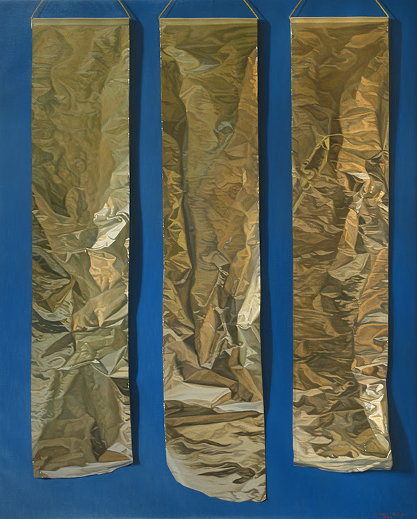
Inspired by the paintings of Mark Rothko and Antoni Tàpies, Claudio Bravo began painting the palpable textures and subtle colors of paper and fabric in the early 1960’s, and these subjects became the best-known of his works, remaining popular throughout the world during his lifetime and beyond. The exhibition includes Three Aluminum Papers, 2010, and Red Cloth, 2011, Claudio Bravo’s last completed painting, a majestic, luxurious work over six feet tall, to be exhibited for the first time.
Claudio Bravo, “Three Aluminum Papers,” 2010, oil on canvas, 63 3/4 x 51 1/8 inches
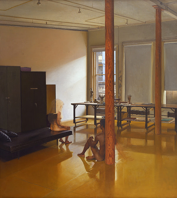
The earliest painting in the Forum Gallery exhibition is the haunting Nude Male Leaning on Column, 1979, recalling the artist’s stay in New York City from 1969 to 1972. An important example of Bravo’s figurative mastery, the silent, ethereal drama in this work is emblematic of Claudio Bravo, who said he owed much to Velázquez.
Claudio Bravo, “Nude Male Leaning on Column,” 1979, oil on canvas, 38 x 34 1/8 inches
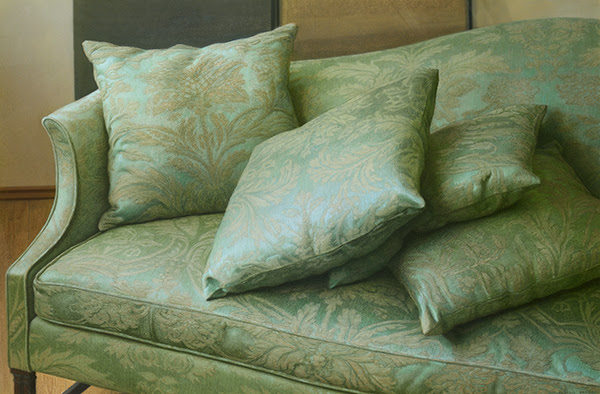
Often celebrated as a consummate draughtsman, Claudio Bravo worked on paper as well as canvas throughout his career, and his pastels and drawings are among his most sensitive works. The shimmering color of the pastels and the depth and beauty of the drawings in the exhibition are exemplified by the pastels Green Sofa, 1991, and Opening the Door, 1991, and the drawings Two Heads and Hands, 1983, and Said, 1995, as well as the rare still life drawing of Engines, 2008.
Claudio Bravo, “Green Sofa,” 1991, pastel on paper, 31 1/4 x 45 7/8 inches
Fill your mind with useful art stories, the latest trends, upcoming art shows, top artists, and more. Subscribe to Fine Art Today, from the publishers of Fine Art Connoisseur magazine.


 Visit
Visit 


 Download the March/April 2021 issue here