Marcia Burtt, "Ruffled Water, High Tide," acrylic, 30 x 36 in.
Starting college at the University of Chicago, Marcia Burtt graduated from UC Berkeley and earned an MA in art from the University of Montana. Fine Art Today had the opportunity to ask Burtt about her style of contemporary landscape paintings and her chosen medium.
Fine Art Today: What’s a common question you hear about your contemporary landscape paintings?
Marcia Burtt: I’m often asked how a painter can find her own style.
To me, style is simply what results as we painters try to show what we think is most interesting or beautiful about what we see. It’s also the handwriting that develops as we use the medium we find most comfortable for our purposes.
Style is just who we are when we’re working!
It’s not something self-consciously developed to make our work look interesting or to make our paintings different from anyone else’s.
The same is true of brushwork, which is nothing more than the evidence on canvas of what we’re trying to do.
Why do you paint in acrylic? Do you work outdoors or mainly in the studio?
Unless I’m creating a 12-foot painting for hospital installation, I paint almost entirely outdoors. Spending hours on location intently observing the natural world is a kind of meditation. It allows my eyes to unpeel like an onion, so that everything becomes beautiful.
Acrylic is seen by many as a medium that’s hard to manage on location. For me it’s the road to the meditative process I experience as I work outside.
I love the freedom of jumping right in without a plan, drawing, underpainting, or even a thumbnail. That way the entire painting process is a joy.
I absolutely need a medium that lets me revise when I change my mind!
Acrylic is not only opaque and quick-drying, but it cannot be lifted or dissolved by subsequent layers. If I don’t like the stroke I just put on, I can use a damp rag to remove it immediately.
In essence, it’s oil painting without the waiting. The colors are just as rich, and I can mix and apply them exactly the same way. Yet it’s easy to scumble one color over another to create a pointillist effect or to revise the edge of a grove of trees without getting the sky color dirty.
When the weather changes, I can too. As the sun and shadows move, I can follow them. When the tide and waves go in and out, I can paint over and over, searching for what works with the rest of the painting.
When my drawing isn’t accurate, I can paint the negative shapes to correct it, working back and forth from one shape to another in a lengthy painterly duet.
Please tell us about your paintings of water.
Whether calm and reflective, ruffled, or ocean rollers, I love painting water. Maybe because I enjoy waiting for just the right moment to put each brushstroke on the canvas, an acutely meditative practice.
“Colors of a Grey Day” was painted during an intense week when I worked all day every day along the coast of Laguna Beach. The overcast sky and tide that came gently in and gently out kept the scene from changing much. Soft blues, greens, and bronzes flowed off my brush onto the canvas. This was one of the easiest paintings I’ve ever done, and one I’m still satisfied with.
Marcia Burtt, “Colors of a Gray Day,” acrylic, 24 x 24 in.
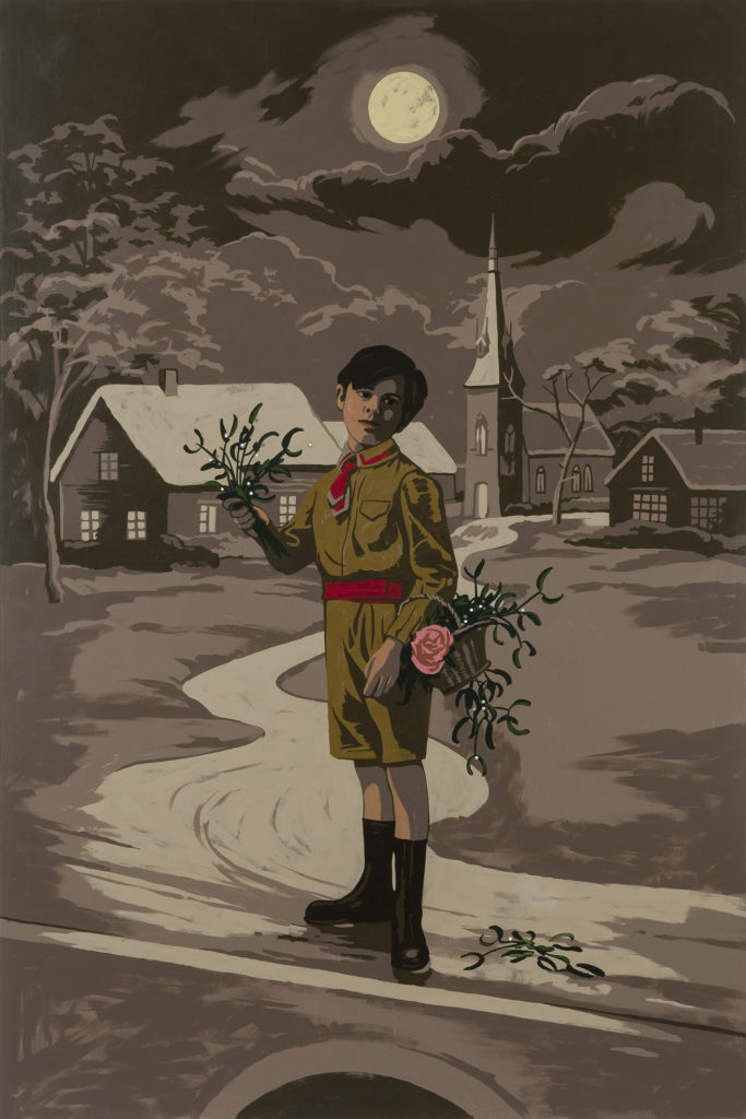
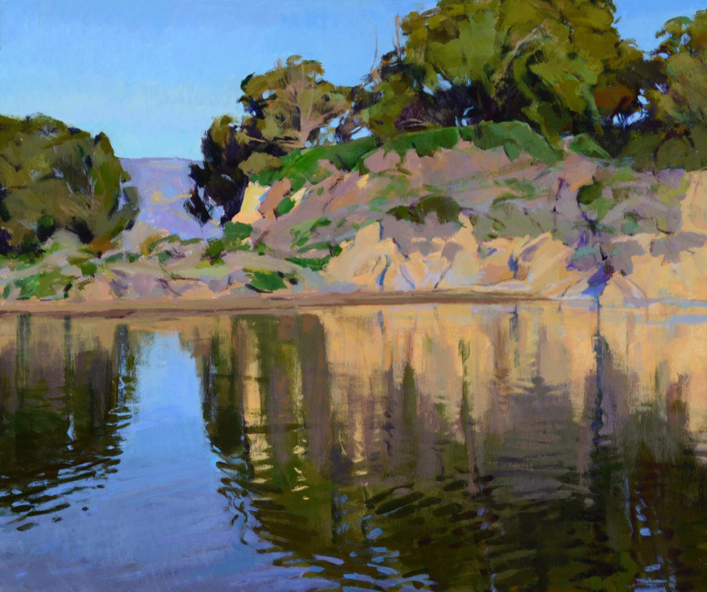
“Ruffled Water, High Tide” took many sessions at the same time of day over the course of more than a week. Sunny weather meant the shadows changed during the day. Light wind caused the water to ripple, and ripples don’t sit still!
But above all, because I didn’t draw beforehand, I spent an enormous amount of time revising so that features I became aware of as I worked would weave together to satisfy my compositional sense.
The arc of the clifftop with tree shadows on top of it is intersected on the right by a patch of sky as it works its way down through the trees, and that line is picked up by a shadow in the cliff, continuing to a vertical as it drops into the water.
That arc intersecting the winding slender vertical seemed absolutely necessary as it echoed the large vertical blue column of sky and water on the left.
Because it’s acrylic, no one but us knows there are dozens of versions under what we see.
Marcia Burtt, “Ruffled Water, High Tide,” acrylic, 30 x 36 in.
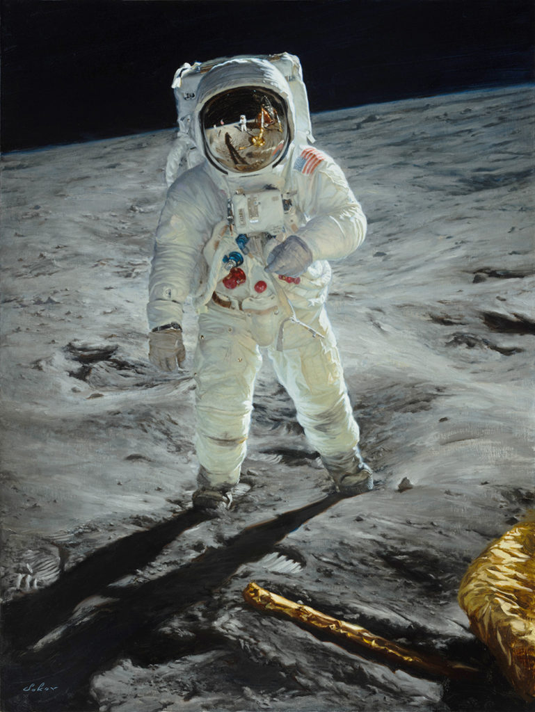
PAVEL SOKOV (b. 1990), "Jackie," 2018, oil on linen, 24 x 18 in., available from the artist
There is a lot of superb contemporary realism being made these days; this article by Allison Malafronte shines light on a gifted individual.
PAVEL SOKOV (b. 1990) — a young Russian painter currently based in Montreal — offers the art world an impressive array of talents and services, including commissioned portraits, figurative works of his own composition, and a weekly podcast titled The Creative Mastermind Show. This energetic artist also travels extensively, bringing an array of cultural influences back to his studio to inform these and other projects.
Sokov spends most of his time these days working on commissioned portraits, with such recent clients as the royal families of Saudi Arabia and Jordan, leaders of industry and government, and a well-known rapper. He is also involved as a portraitist in the 350 Visionary Project, which highlights 350 innovative women across multiple disciplines and vocations. Sokov is quite vested in this initiative and sees it as a way to visualize examples of aspiration for girls and younger women.
In his studio, where he tackles subjects of his own choosing, Sokov is eager to express through paint the stories of the distinctive characters he encounters during his travels abroad. One example is his painting “Jackie,” which shows a man with a legendary-musician-like look lighting a cigarette in a café.
Beyond the sitter’s intriguing appearance, we get the sense he has a story to tell. As Sokov explains, Jackie was a “bad boy” who fought for the Americans in the Vietnam War and today is a popular tour guide in Ho Chi Minh City. The artist met Jackie there this year as Jackie was explaining how merchants along the Mekong River Delta trade goods and services.
Having graduated from a business school in Montreal prior to his art training, Sokov is not afraid to marry painting and marketing. He chooses to remain without gallery representation, as he has managed to attract and retain his own clients and followers. Although he does exhibit in group shows and currently has an agent who has brokered two major assignments, Sokov plans to remain independent.
Considering he only started painting a few years ago and has already achieved several milestones — including a commission from Time to paint Vladimir Putin’s portrait for the cover of its 2014 Person of the Year issue — Sokov will surely do just fine marching to his own drum.
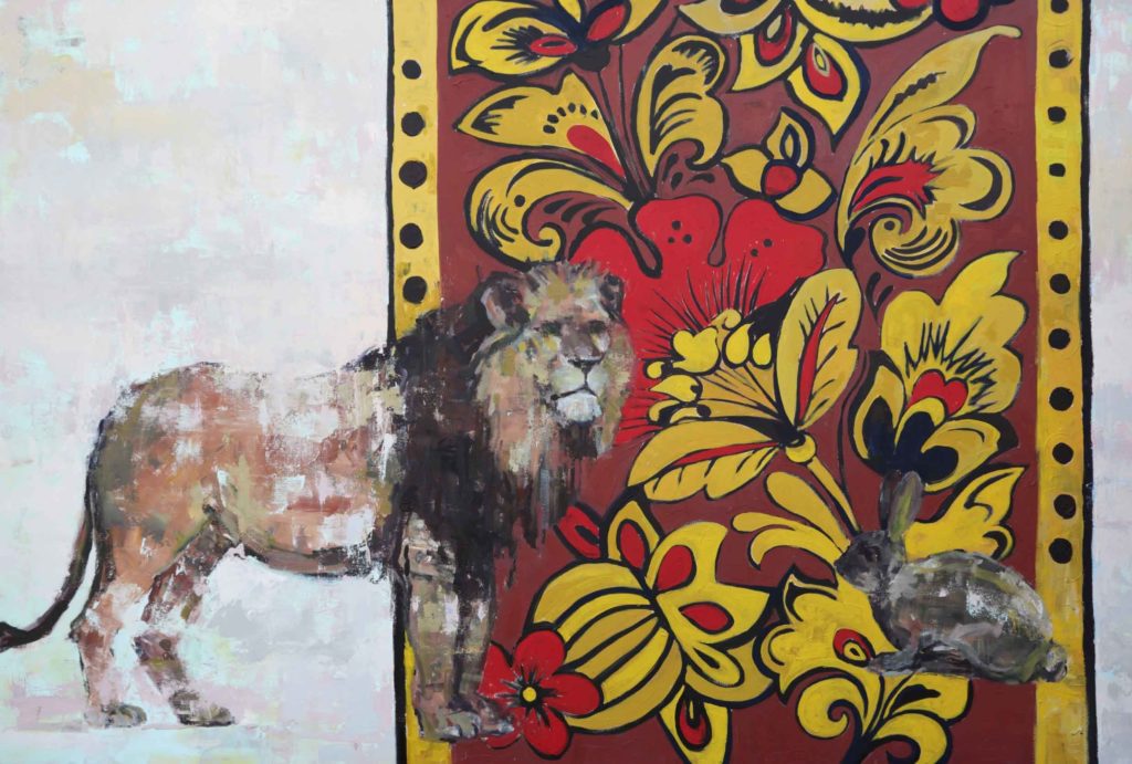
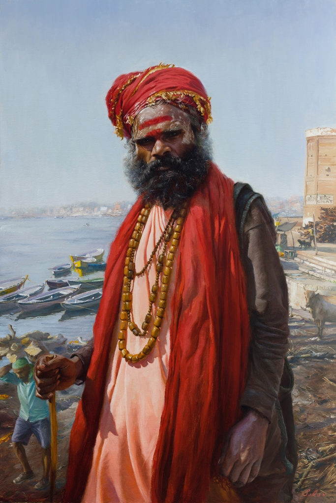
Tanya Atanasova,, "White Rabbit," oil on canvas, 110 x 100, 2021
One to Watch: Tanya Atanasova is a Bulgarian born figurative painter, currently based in Antwerp, Belgium. Atanasova shares how extremely emotional, intense moments, and strained relationships have informed her art.
“Back in the day, surviving was a real thing,” she says. “Having the skill for ‘guessing the person’ and knowing who to trust was often your only weapon in life. So, there is no wonder I primarily paint people and portraits.”
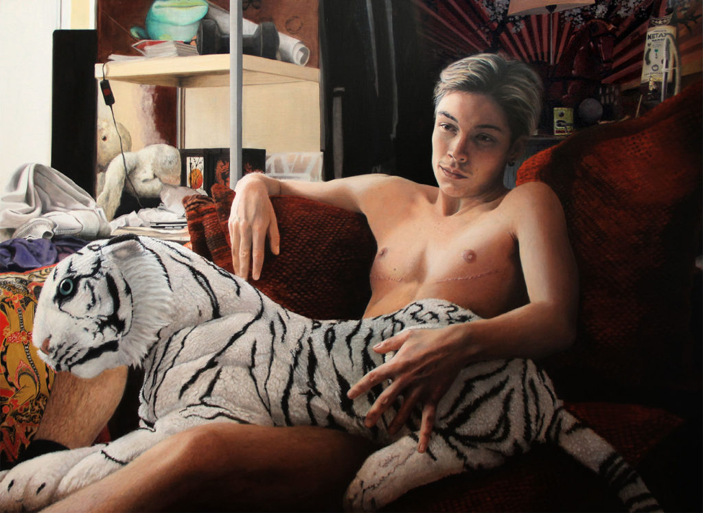
Tanya Atanasova, “Tiger,” oil on canvas, 140 x 100cm, 2018
On Becoming a Portrait Painter
BY TANYA ATANASOVA
I was born in 1978, in Koprivshtica – the very heart of The Balkans. At the time I was born, Bulgaria was still a communistic people’s Republic and I can still recall a lot of the regime-time-feel of the country and the mentality back then. On the surface our family was a standard, middle-class, working family, but digging deeper – it had a rich history of extremely emotional, intense moments, and strained relationships, which have played a significant role throughout my life.
I had two brothers, who were very much into painting, creating, crafting, and inventing things and we all use to attend painting lessons at a local artist’s atelier for years.
When I was nine, my brother Iliya (11) – an incredibly bright kid – died by an insane accident and that marked the beginning of a very different life then. My father could not bear his depression anymore and quickly found his way to abusive drinking and gambling. My mother left us, starting a new live and becoming super-religious. And in a sense, they both found their consolation in different niches / addictions and we were left behind, growing up with all the complexity of “neglected kids.”
Tanya Atanasova, “Lou,” 120 x 80 cm, 2018
As I grew up, the socio-political situation in the country had changed (it was around the time of the fall of The Berlin Wall). The small-town mentality together with the numerous family secrets started suffocating me and one night, when I was 13, I left the house of my father and took the train to no return.
I came to Sofia and I found my mother; I moved in and lived with her during the next few years.
Those were trying years of changes, chaos, comprehensive, pervasive crisis, hyperinflation, mafia wars and general misery and impoverishment. The ones who could, left the country; many people just didn’t make it.
Tanya Atanasova, “Still Water,” oil on Belgian linen, 70 x 46 cm, (27.6 x 18.11 inches), 2020
Back in those days, I met the Sredovski family, who almost adopted me and thanks to their moral support and the super hard work of my mom and my brother supporting me financially – I graduated successfully from the National Art Academy in Sofia. In the hungriest years of the modern history of Bulgaria, I studied art and everyone claimed I was crazy.
Many stories later, I became the very first Erasmus exchange-student in Sint-Lucas Academy in Ghent and a year later, I moved to Belgium to stay.
As a slightly traumatized kid, I easily made an “observing teenager.” (I only opened up verbally, when I met my second family – they are all very sociable and chatty). I’ve been trying to understand people and social phenomena nonverbally all my life. I used to be good at reading body language and facial expressions. Back in the day, surviving was a real thing and having the skill for “guessing the person” and knowing who to trust was often your only weapon in life. So, there is no wonder I primarily paint people and portraits.
Tanya Atanasova, “Philip,” oil on canvas, 50 x 70cm, 2019
Nowadays, when things start to move too fast, I tend to slow down and start on a painting, which will spend at least a few months in my studio with me. In the era of quick-replaceable social media profile pictures and selfies – my gaze goes into the story of every character I create. I am interested in the psychology and unique complexity of my model and I try to become an intermediary between subject and viewer – building a connection that goes beyond painted portrait. Looking at the paintings should be like glimpsing the character’s diary or reading a page from his / her biography.
Also, being born in a country where everything was about functioning in a group, the communal life and with unification going on on every level – I’m now, very much interested in the individual. For that and many other reasons I love painting portraits/individual moments and personal stories.
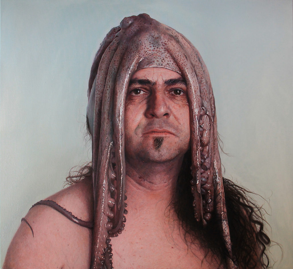
Tanya Atanasova, “Jens,” oil on canvas, 55 x 39 inches, 2018Tanya Atanasova, “Michel with Octopus,” oil on canvas, 120 x 110, 2016Tanya Atanasova, “Eva,” Oil on Belgian linen, 120 x 90cm, 2019
My solo show ECHTE MENSEN – Real People, is just one more declaration of love for personal stories. The exhibition is open for visitors at Cultuurhuis de Bijl, Zoersel (Belgium), and is on view through February 2021.
Matthew Benedict, "The Sea Cook (Cook and Crew of the U.S.S Monitor)," 2017, gouache on wood,
48 x 59 7/8 in/122 x 152 cm,
photo: Joerg Lohse,
image courtesy of Alexander and Bonin, New York
Painted in gouache on wood or paper, Matthew Benedict (b. 1968, Rockville, Connecticut) employs trompe l’oeil framing, illustration, and decorative arts conventions in his portraits, seascapes, and still lives. Benedict’s fascinations with systems of belief ranging from the biblical to the occult are embedded in the work as are literary references and contemporary allusions.
Matthew Benedict, “Ghost (Happy New Year. Normandy, 1914), 2011, gouache and varnish on wood, 72 x 48 in/183 x 122 cm, photo: Joerg Lohse, image courtesy of Alexander and Bonin, New York
More from the Alexander and Bonin gallery:
The artist’s paintings relay archetypal or mythological narratives, deliberately pulling parables from the ancient past into the present. Benedict grew up in New England, which is reflected in the maritime themes and legends that are prominent in his work, though the mythologies are often conflated with modern imagery and staged recreations that sometimes include evidence of their own artifice.
Matthew Benedict, “Bad Charles,” 2001, gouache and wax varnish on wood, 71½ x 48 in/182 x 122 cm, image courtesy of Alexander and Bonin, New York
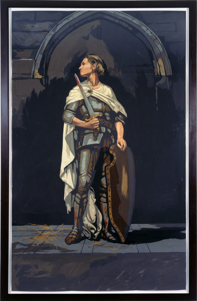
The earliest works in the exhibition are “San Lorenzo of Rome” and “Saint Joan of Arc,” the first of which was exhibited in the windows of the Grey Art Gallery in 1993. Depicted in near life-size scale on large sheets of paper, Benedict’s interpretations of Catholic saints are integrated into his work as modernized bearers of symbols of the transcendental.
Matthew Benedict, “Saint Joan of Arc,” 1997-98, gouache on paper, 96 x 60 in/244 x 152.5 cm, image courtesy of Alexander and Bonin, New York
Initially shown in a large survey exhibition of Benedict’s work at the Von der Heydt-Museum/Kunsthalle Barmen in 2008, “The Black Bursolino” displays a collection of objects, a wand, two coins, three swords, and a seven of hearts, all motifs which indicate the omnipresence of magic and transformation in Benedict’s work.
Matthew Benedict, “The Black Borsalino,” 2001, gouache and Damar on wood, 36 x 48 in/91.5 x 122 cm, photo: Joerg Lohse, image courtesy of Alexander and Bonin, New York
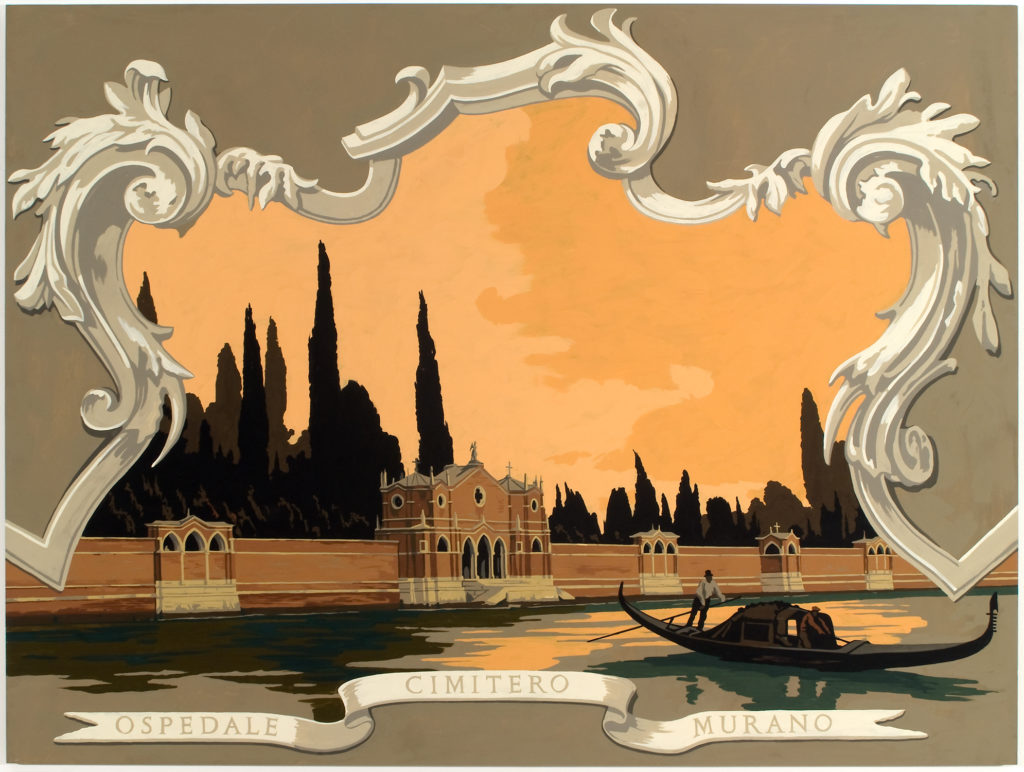
Also included are paintings from a 2008 cycle of works inspired by Arnold Böcklin’s paintings of the Isle of the Dead, which draw from Benedict’s experiences visiting two real-life “Isles of the Dead,” Isola San Michele, the walled, gothic, cemetery-island of Venice, and New York City’s little-known Hart Island, located just off of City Island in the Bronx.
Matthew Benedict, “Isle of the Dead, Venice (Isola di San Michele, Venice, 2008, gouache on wood, 36 x 48 in/ 91 x 122 cm, photo: Jason Mandella, image courtesy of Alexander and Bonin, New York
Benedict studied at the School of the Art Institute of Chicago and the New School for Social Research, New York. He has had several exhibitions of his paintings and sculptures at Alexander and Bonin, New York and Mai 36 Galerie, Zürich.
In 2008, a large survey exhibition of Benedict’s work was presented at the Von der Heydt-Museum/Kunsthalle Barmen, Wuppertal, accompanied by “The Mage’s Pantry,” a monograph published by Hatje Cantz.
He was in residence at the Versailles /Giverny Foundation in 2011 and had solo exhibitions at Galeria Álvaro Alcázar, Madrid (2008 and 2011) as well as Stene Projects, Stockholm (2013 and 2016).
Benedict’s works are included in the permanent collections of the FRAC de Picardie, Amiens; Dallas Museum of Art; the Hammer Museum, Los Angeles; the Museum of Modern Art, New York; the San Francisco Museum of Modern Art; and the NASA Art Program, Washington, DC.
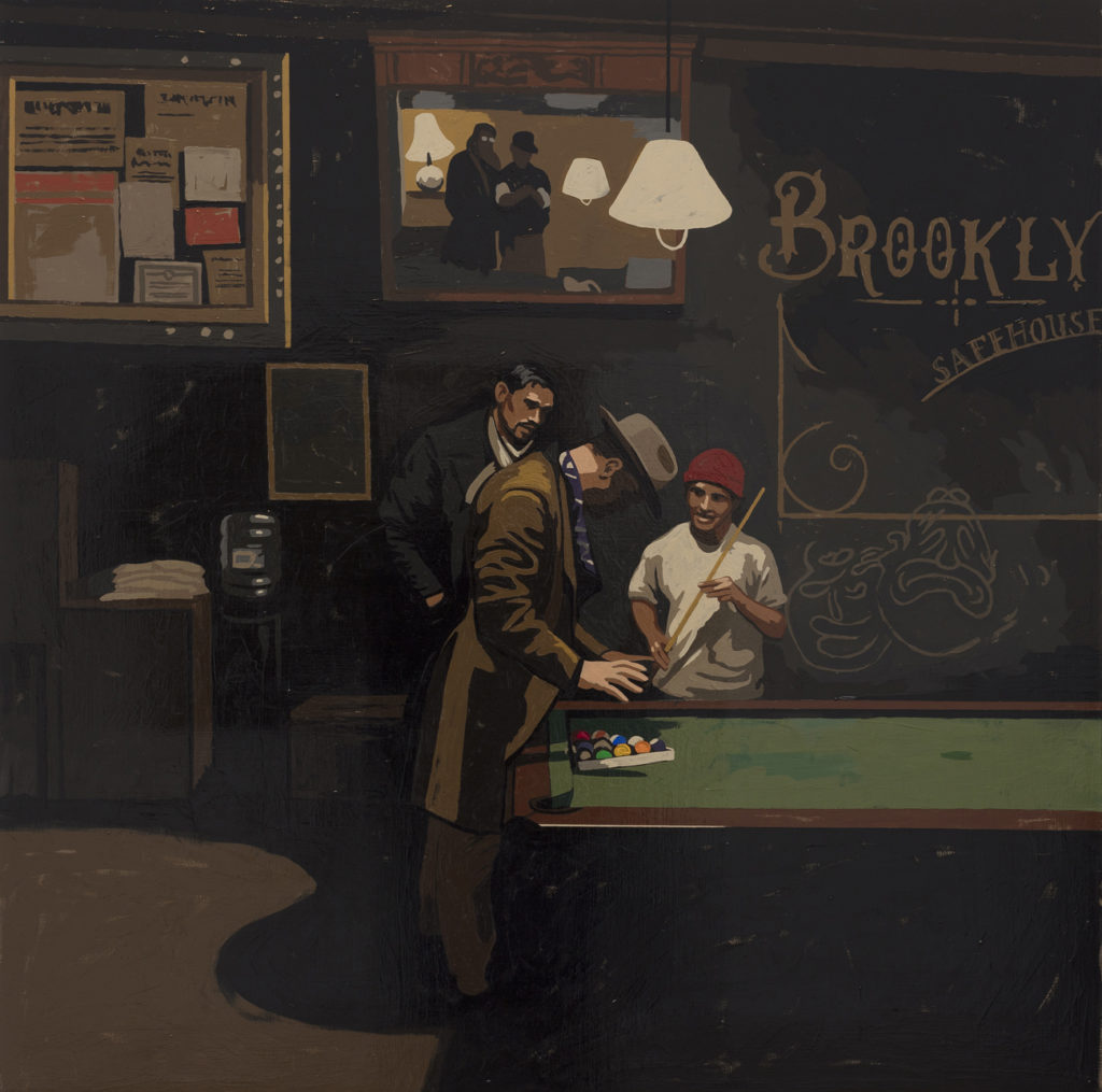
Matthew Benedict, “Pool Sharks at the Safehouse, 2019, gouache on wood, 36 x 36 in/91.4 x 91.4 cm, photo: Joerg Lohse, image courtesy of Alexander and Bonin, New York
Alexander and Bonin (New York, NY) recently announced an exhibition of paintings by Matthew Benedict, titled “Manifestations.” The exhibition includes works that Benedict has made throughout his 30-year career, providing an opportunity to see significant works seldom on view to the public. For information, please visit alexanderandbonin.com.
Brian Keith Stephens, “Promise You Never Make Me Eat Sardines,” 2020, oil and wax on cotton.
The Lyman Allyn Art Museum recently announced the opening of a new exhibition on highlighting the work of local Connecticut artist Brian Keith Stephens (b. 1973). “Almost True Tales” explores the artist’s fascination with animals as mythic symbols across time and culture. The exhibition will be on view through May 9, 2021.
Brian Keith Stephens, “Your Dress Is A Curtain,” 2020, oil and wax on Canadian birch.
More from the museum:
Spread throughout three galleries, “Almost True Tales” will feature 18 large works of art. In vibrant, figurative paintings, Stephens draws on legends, fables and folk tales from around the world to invest his animal subjects with meaning and emotion, revealing a common cultural language that resonates with children and adults alike.
Brian Keith Stephens, “Perfect Romance,” 2020, 57 x 38 inches, oil and wax on cotton
“Growing up in Connecticut, I have always found animals as a vessel for depicting human emotion; I believe in many ways animals are capable of expressing human emotions in a way that is both understandable, mysterious and alluring,” says Stephens. “At the center of my work and life are these fascinations with myth, the spectrum of human passion, our kinship to the spirit of the wild animal, and the challenges of balancing the real with the fanciful. My art has been and continues to be my outlet for exploring these themes and conjuring up new ones.”
Brian Keith Stephens, “Who’s That Lipstick On The Glass,” 2020, oil and wax on cotton.
At a time when the omnipresent flow of information makes it harder than ever to identify what is true, Stephens’ work encourages viewers to recall the simple virtues embodied by animals in countless tales. These enduring folk wisdoms are a source of solace and a reminder that decency can prevail and help the world to heal in even the most difficult times.
“It is a great pleasure to welcome Brian Keith Stephens, an increasingly well-known and beloved artist from our region, for a solo exhibition here in the Lyman Allyn,” says Sam Quigley, Director at the Lyman Allyn Art Museum. “No stranger to many aficionados beyond these climes, Stephens has shown his work frequently in New York, Palm Beach, Boston, Provincetown and other American cities, as well as in many important venues in Europe. Clearly, he is getting the widespread recognition he deserves, and we are very pleased to be able to share this cohesive body of work in our intimate galleries.”
Brian Keith Stephens, “Not All The Songs Are Worth Singing,” 2020, oil and wax on cotton.
Stephens graduated from the Lyme Academy College of Fine Arts in 1998. He then attended the Academie de la Grande Chaumier in Paris and, in 2004, received a Masters of Fine Art in Painting from the City College of New York. Since 2000, he has exhibited in solo shows and group exhibitions in the United States, Germany, France, Denmark, Italy, the Netherlands, Poland and Bulgaria. His work is represented in private collections around the world. He lives and works in Old Lyme and Brooklyn, NY.
Brian Keith Stephens, “My Lover Is Coming Home,” 2020, oil and wax on cotton.
For more details about “Almost True Tales,” please visit www.lymanallyn.org.
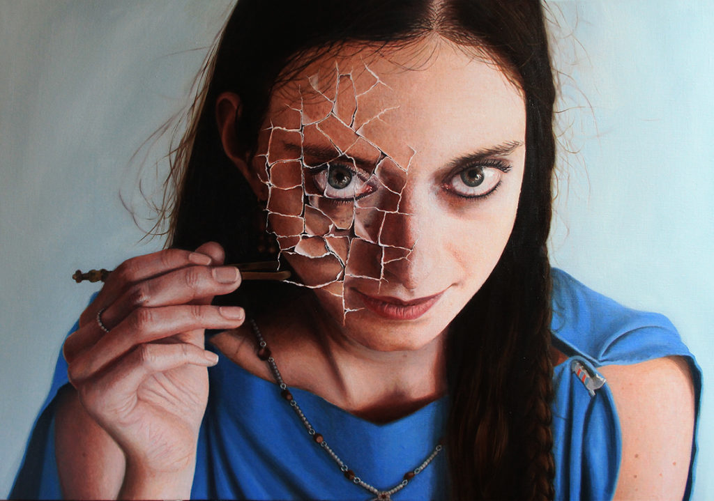
Alixandra
By Aiden Kringen
24 x 36 in.
Acrylic and ink on canvas
$5,750
Aiden Kringen’s work is a balance between traditional realism and geometric abstraction. His goal as an artist is to encapsulate idealized beauty through a cracked or broken lens. Kringen strives for beauty through controlling and organizing chaos. For him, the process of painting a portrait or figure involves balancing between reality and abstraction, down to each single feature of the face or hand. He dissects the figure using line work, dividing between tone and texture, and then reconnects the pieces along invisible planes throughout the painting. He has a respect for the pure and beautiful human essence while accepting that it is imperfect, and therefore depicts it through fractured linework. Kringen has always had an interest in traditional realism, but within his work, he’s strived to pare it down and reassemble it along a geometric framework that fits within a modern context. Aiden resides in Graton, CA.
You can visit him, along with 100 other artists, at the Celebration of Fine Art in Scottsdale, Arizona, through March 28, 2021. Contact us at 480-443-7695 or [email protected].
As part of our effort to continue to help artists and art galleries thrive, we’re proud to bring you this week’s “Virtual Gallery Walk.” Browse the artwork below and click the image itself to learn more about it, including how to contact the gallery.
The Red Flag by Rani Garner, Oil, 60 x 60 in.; Anderson Fine Art Gallery
Harmony in the Ebb and Flow by Vanessa Lemen, Oil on panel, 20 x 16 in., Signed; Rehs Contemporary
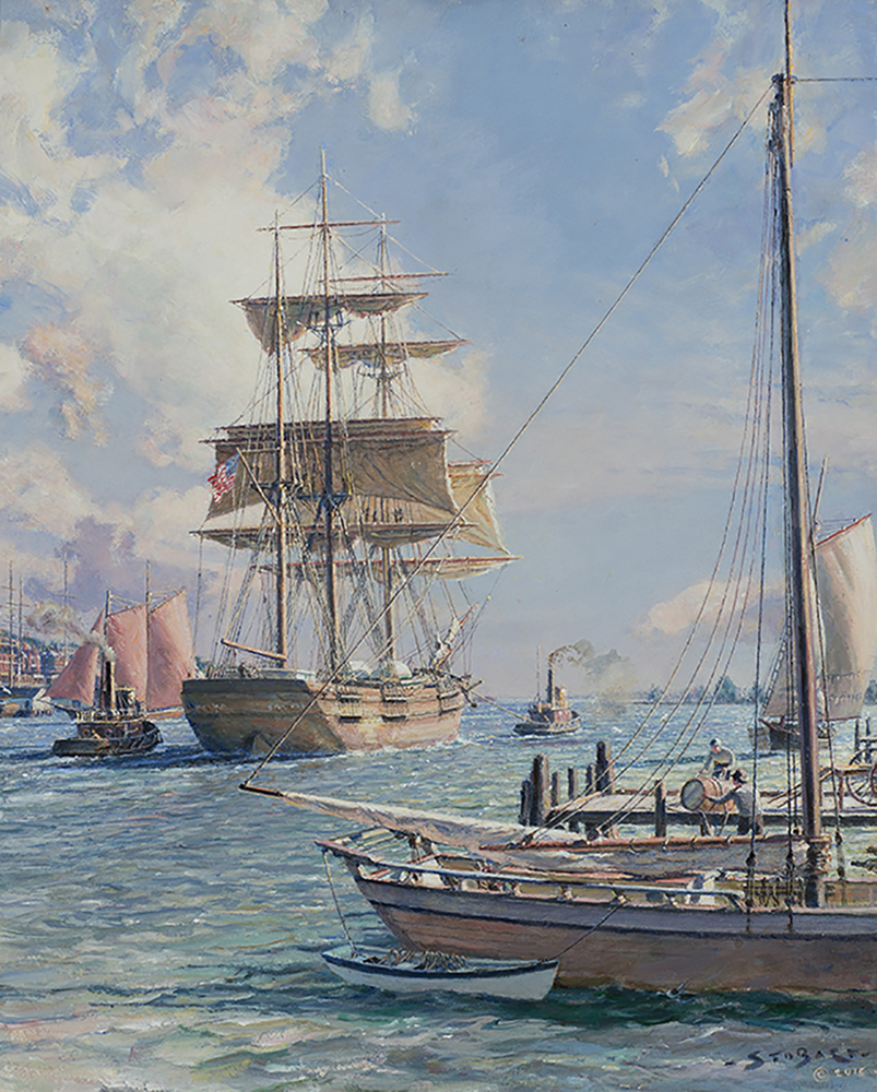
New York Shipping on the East River by John Stobart (Born 1929), Oil on canvas, 20 x 16 in., Signed and dated 2015; Rehs Contemporary
A River Runs Through It by Appel Bronstein, Oil on paper, 22 x 30 in., (30 x 38 in. framed); Vermont Artisan Designs
Rebecca by Susan Lyon, Oil on canvas, 14 x 11 in.; Liliedahl Enterprises, Inc.
Want to see your gallery featured in an upcoming Virtual Gallery Walk? Contact us at [email protected] to advertise today. Don’t delay, as spaces are first come, first served, and availability is limited.
Nick Patten, “Floating,” oil on canvas, 30x40 inches, $12,000
Contemporary Paintings > Fine Art Today had the luxury of sitting down with amazing painter Nick Patten, who offered some engaging thoughts about his process, inspiration, and more. So impactful were they that we’ve decided to quote him in full.
How Process Feeds Inspiration: Paintings by Nick Patten
Fine Art Today: Let us begin with your creative process. What inspires you, and once it hits, how do you approach a painting?
Nick Patten: I guess it would be fair to say that my process feeds my inspiration. By that I mean part of my process seems to be a natural (or a second nature by now) way of seeing things. I see subjects for paintings when I’m not looking for them all the time. It hits me in the gut, to use a loose reference. I see something and it gives me a feeling somewhere between pleasure and edgy. Sometimes it leans toward melancholy, in that there is a sense of isolation in many of my interiors.
Sometimes a scene gives me a sense of a moment — something just happened or is about to, and I’m privileged enough to witness the moment in between. In my statement that I wrote over 20 years ago, I say that I paint what I want to see. That is the essence of what I’m trying to do. I see a scene, and sometimes I know immediately that I must make it into a painting. I’m compelled to do it.
I always start a painting the same way, regardless of the subject matter. I start by laying down a gray ground in oil paint. I haven’t wavered from this too many times over the years, but when I have, it would have been to experiment with a yellow ground or a sepia ground. From there I draw in a grid in white colored pencil that matches the grid I have put over the source photo. I gravitated toward the grid because it facilitates my getting to the meat of the painting faster and more accurately.
I don’t love each step in a painting equally. I love the last 10 percent most, and want to get there as fast as I can. Once I realized that about myself, I knew I wanted a process that would insure I wouldn’t need to waste time on correcting simple issues like proportion or perspective. So, with the grid in place, I draw in the scene, again using a white colored pencil (as that will never bleed through the paint in time like graphite can). Once I have a linear drawing in place, I start my black and white underpainting. It is not as realistic as my final version, but it is far from a sketch because it’s at this point I can make real decisions about what I have. If it works in black and white, it will usually work in color.
Nick Patten, “Through,” oil on panel, 32×26 inches, $8300
For me, composition is as important as any other element of a piece, and I can assess it best without the distraction of color. Fortunately, it is also early in the process, so if there are mistakes or flaws or any changes I want to make, they are easier to make at this stage.
Next comes color, and I work in layers. The first layer of color is my least favorite part of the process because I’m basically destroying an otherwise competent black and white painting and I’m left with an awful-looking mess, as the first layer of color rarely looks good. But after the second layer of color, I start to hit my stride and I am beginning to see the promise the painting holds. It starts to look good, and I can get a better sense of what my choices will look like in the end.
Third layer of color confirms these choices, as I start to tweak my colors and values here. This could be a stronger blue, and that can be a softer ochre — those choices add to what I hope will be the overall impact of the final painting. From here, I have what many would consider finished. This is the beginning of the last 10 percent that is most of the reason I paint!
Here I assess each section of the painting, deciding in some cases the surface and the color is exactly where I want it to be. Other areas may need the same color again, but with a new layer it will solidify better, make a stronger impact. There is still room for changes of heart here as I might change a color or add a detail, but basically I’m reinforcing areas of the painting by laying down another layer or two. But like I say often, it is only certain areas that require it.
Nick Patten, “Toward the Blue,” oil on panel, 22×23 inches, $5100
In a recent piece, I had all the painting exactly where I wanted it in three layers of paint except for a couple of areas. One area was a sculpture pedestal that required two more layers of paint to get a very unusual yellow green that I wanted to portray. The other areas were parts of the painting that were pure white. Even though I use a paint called Radiant White by Gamblin, to get a real full-blown white, I usually paint it five or six times — one layer of pure white straight from the tube after another.
By the way, I always paint from photos, and I rarely use a paint medium to thin my paints. I never mix medium in with the paint; I will only dip the corner of my brush in medium from time to time, just to loosen it up. This gives me more control, and a solid confidence of the structure of the painting, as without mediums interacting differently with different colors, I know I’m always painting in an archival way and my surfaces dry in the order I lay them down, thus avoiding the risk of cracking in a year or two.
Nick Patten, “Surface,” oil on panel, 14×11 inches, $2200
There are a few different ways that I know when a painting is finished. Some are ideal, and some are real-world issues. Real-world issues tell me a painting is finished when I have bumped up against a real-world deadline. Maybe a show is opening, or a promise has been made, but the real world enters the studio more often than one might think. Most painters I know who do it for a living are always under some form of time constraint or another. I’m certainly not unique. In many cases, it serves to bring out the best in us because with less time come fewer excuses. And sometimes, that brings with it a laser-like focus that was needed all along.
But to be totally honest, I am not sure I ever know when a painting is finished. I do have a road map for each painting that I make. I know how to begin, and my beginning is a panel primed with a gray oil paint ground, then a grid, then the drawing on the grid, etc. I know how to make paintings — better put, I know how to make my paintings! I know where I am at all times during the process, and what still needs to be done. Simple!
It starts to get tricky and subjective when I am on my last layer of paint. It is here that, though I should be on my last layer, I don’t always know that for sure. This is really the most exciting stage of any painting, because here is where the art leaves the craft. Here is where I’m making decisions based on my instinct and aesthetic. The draftsmanship, the palette, the composition have all been decided and basically executed. That is the craft.
The art involves the subtle nuances that I start to see when the painting is in its final stages. A little darker here brings out a drama, but sacrifices a softness. I want this area to be cool colors to balance something else, but I find the cool color fights the balance, so I warm up the cool color. Sounds like I could be in a kitchen, with a pinch of this and a dash of that, and that might be a good analogy. This is the time in the painting that I can’t predict, I just don’t know, and the reason I don’t know if I need a day or a week or a month is that I must try things out to see what they will look like before making a final decision.
My eyes service my feelings. When I get a painting to a stage where it pleases my inner self, where it calms the intensity I felt when I started going after what I wanted to see, then the painting is complete. But is it really? No, not really, because I might see something else in a week, some other thought might pop into my head that will influence my decisions, and maybe influence what I now want to see. When this happens after the paintings have left my studio, I always make a mental note so that I remember to consider revisiting that image again.
Nick Patten, “Still Life and Stairs,” oil on panel, 28×22 inches, $6300
Fine Art Today: Briefly illustrate this process for us. Could you dive into the process of a specific work? Perhaps you can recall when, where, and how you were moved to create it.
Nick Patten: “Essence Redux.” This painting came about from work I did from a series of photos I took of a brownstone in downtown Troy, New York, which is my hometown. I saw online that there was to be an open house for this property, and I contacted the Realtor, explaining who I was and what I did, and asked for permission to come during the open house to take photos of the house to make paintings from. They contacted the owner, who agreed to let me attend. I knew from the address what the house would look like, and it exceeded my expectations. They had a beautiful area they used as a dining room and this is a scene from that area.
I had painted a few other views of this area, and still I had more to paint. The light in the room was all natural, and from the exquisite fern to the tasteful dining room set, I felt an elegance in this room. So my process was as I described above: applying a grid to the photo, and then resizing that grid and applying it to the panel where I had already laid down my gray ground. I followed my usual steps of drawing the image, and then the black and white underpainting, all through to the various layers of color. During the whole process I was undecided about how to treat the area of the wall the picture occupies in the final painting.
At the very end, I thought of what I wanted to add. What we see here is not a painted area representing a painting. What I did was to take a .jpeg of one of my own past paintings and print it out in the right size onto a small piece of rice paper. The rice paper receives ink well, and is so thin that the edges are not apparent once I mount it to the painting. Then I painted in a frame around the image. Next I “pushed the image back” with a thin layer of transparent white oil paint. Finally, I laid in a few glass effects to further recede the image, using the transparent white paint on top of it all. This is a technique I taught myself, and frankly I have not seen it used elsewhere, but it probably has been. I have employed it in several paintings when the effect was worth it to me. I quite enjoy doing it as it lends a whole other issue to contend with.
To me it makes the painting different. I wouldn’t even know what to call it — though some have referenced these as mixed media paintings, that might be too much for my definition. It does in this case wind up not being a painting within a painting, but more accurate would be a photo of a painting within a painting!
Nick Patten, “From 92nd Street,” oil on panel, 14×11 inches, $2200
Fine Art Today: What about narrative? Do you ever seek to create narratives in your works, revealed through, say, your use of light, surface, etc.?
Nick Patten: I have always maintained that I try not to have a narrative in my paintings. I know that is probably not achievable 100 percent of the time, but I can say I never start a painting with a narrative in mind. For me it is more about the scene and how it has impacted me. I know once one mentions emotions, then the idea of narrative comes into play, but I don’t anticipate what viewers’ emotions will be.
I had a commercial gallery open to the public for 12 years on Cape Cod. I painted in one room and showed my work in the other two. I experienced the range of reactions firsthand over many years. One person would view a painting of a single chair at the end of a hallway and see loneliness and melancholy, and someone would come in not a half hour later and remark that the painting was comforting and warm to them because the chair in the painting was just like a chair their grandmother owned. I can’t anticipate what experience in life one might have when they come to one of my paintings, and therefore I don’t try to.
Nick Patten, “Nightowl,” oil on panel, 24×20 inches, $5100
Fine Art Today: When it comes down to it, what are your primary goals in painting? What do you hope viewers take away?
Nick Patten: Through working from photographs with the aim of creating believable paintings, I strive to bring a quiet drama to everyday scenes. My paintings are never intended to be “photographic.” In part, my aim is to make paintings where the content of the image is most compelling, and how the painting was made is secondary. In a sense, attempting to make the work exceed the medium, my goal is to be able to paint what I want to see.
I hope that a viewer of my work takes away a memory of the work to such a degree that it remains in their consciousness. I’ve been told this happens by many people over the years, which is the only reason I feel entitled to even mention it as it may sound arrogant. Of course, in a practical sense, I hope the compulsion is so strong that they take away the painting itself, leaving behind money, which allows me to continue to support my life — which is spent painting.
Selling is important only to the point it provides one the ability to have a life as a painter. We all must eat, and clothe and shelter ourselves. We all have work that supports that. I don’t shy away from this concept in the least. What I don’t do is to make paintings in anticipation of a sale. If I knew what would sell, I might consider painting it. But since I don’t know, I rarely think about it. It really is that simple.
Nick Patten, “And Now Open,” oil on panel, 32×26 inches, $8300
Fine Art Today: Talk to us about the artists who’ve inspired you, whether historical or contemporary.
Nick Patten: A select list (there are many more) would include Balthus, Wyeth, Rothko, Morandi, Gerhard Richter, Edward Hopper — but not to the extent most people believe. Same with Vermeer, some, but not to the extent people might think, even though one critic referred to me as “an American Vermeer,” and that label kept getting repeated in subsequent articles and reviews. It is flattering and embarrassing in equal measure. The influence of Vermeer and Hammershoi on me are after the fact. I was already on my own path before I even discovered Hammershoi, and only recently have I related to Vermeer at all.
The most influential event in my life pertaining to my painting was seeing a Balthus retrospective at the Metropolitan Museum in 1984. I had never seen paintings with such an impact. Large scale, and the pieces he did in tempera over years had the look of stone. The surface of the paintings looked like fresco, and the images were as compelling as anything I had ever seen. It first gave me the idea of how much more a painting could be. The idea of a painting being an independent object almost with a life of its own came to me from seeing that show.
It was almost unbelievable to me when I discovered Morandi. I had been painting bottles on tables for several years from drawings I made from my imagination. Then to discover Morandi was both inspiring and devastating. Devastating because it appeared to me whatever I would do had been done to perfection, and it intimidated me. But I was much younger and had not found my own voice, so it was understandable from my vantage point today.
Another critical exhibition to me was the retrospective at MOMA of Gerhard Richter. I was in love with his realist paintings then as I am now, but also a fan of his squeegee paintings. Again, I got the sense of a painting as an object, like I did with Balthus. It seemed to me that Richter was surpassing the medium with his images — something I have strived for over the years.
Finally, there are too many contemporary artists to mention that have influenced me, and I would not want to list them for fear of leaving someone out. We are in a golden age of realism in my opinion, and there are so many brilliant painters around today it is both humbling and an inspiration to be occupying the same time frame.
Nick Patten, “Above,” oil on panel, 14×11 inches, $2200
Fine Art Today: What has your journey to becoming a successful artist been like? Were you always interested in art, even as a child?
Nick Patten: I have been interested in art for as long as I can remember. I drew as a kid, like so many kids do. I was encouraged and even rewarded at a very young age when I won a school-wide competition with a drawing I made from a book jacket. I think that was the assignment, to copy a book jacket. In any case, I have read that often people will lean toward anything that happens in childhood that they are rewarded for in some way. In my case from about age 10, I was rewarded with attention for my artwork, and I think that could have started a foundation that supported later interest and enthusiasm.
Nick Patten, “A Last Look,” oil on panel, 32×26 inches, $8300
Fine Art Today: Finally, where are you and your artwork in, say, five years’ time? How do you see your work evolving? Are there particular things you seek to achieve?
Nick Patten: I don’t think in five-year terms anymore — or one-year or 10-year. I started painting full-time as an occupation when I was 38 years old. By most careers that is older, but by an artist’s career it could be considered younger. By what I read of the number of painters who never can support themselves from their art through no fault of their ability, I hit the lottery. So, after 28-plus years working at it full-time, at the tender age of 67, my ambitions have changed.
Now I mostly care only about the quality of the work I produce. I have learned through experience that it matters very little to me what someone else says about my work. In other words, I have been fortunate enough to experience very high praise from notable individuals, and when the praise is lavished on a painting I don’t feel especially enamored with, the praise rings hollow to me.
I have won gold medals in shows, and many other prize levels. Only when I feel strongly about the painting that won the prize do I enjoy the prize. I have had an important room in a regional museum devoted to a show of my work, and I was quite pleased by that, but it pales by comparison to the excitement I feel when I finish a painting alone in my studio and I feel it is a good painting.
So I hope my work will continue to grow, and that I will continue to push myself to achieve that aim. As to my career, I don’t expect to be on the cover of Time magazine, and frankly at this point don’t really care about that sort of thing anymore, even if there was a time in my life that I did. Now what I want is to make good paintings, continue to show them in good galleries of note, and have a good working relationship with those gallerists who, after all, are my partners.
Nick Patten, “Calm,” oil on panel, 11×14 inches, $2200
To learn more about Nick Patten and his works you can visit his website here.
This article was originally written by Andrew Webster in 2017 and featured in Fine Art Today, a weekly e-newsletter from Fine Art Connoisseur magazine. To start receiving Fine Art Today for free, click here.
Cameron Knutson is an oil painter who, while learning how to draw photorealistically at a young age, was always more interested in painting a narrative than achieving an exact likeness. Working from his studio in Chicago, he paints figures which are confronted with loss and immerses them in colorful light. Cameron combines classical painting techniques with contemporary color theory to push the boundaries of color in realism painting.
Bronze sculpture of Diana by Augustus Saint-Gaudens (1848-1907)
Recently, an iconic bronze sculpture of Diana by Augustus Saint-Gaudens (1848-1907) soared past its estimate of $200-400,000, selling for $506,000 (including BP) at a Keno Auction during “Americana Week.”
More from Keno Auctions:
Purchased by a young New York couple, it is the fifth highest price at auction for any work by Saint-Gaudens. Recently discovered by Keno, the sculpture was on display at the Glascow Arms Restaurant in Delaware since its purchase by restaurant owner and collector, Constantine Sclavos in 1959.
Saint-Gaudens produced the original 18-foot tall “Diana of the Tower” as a weathervane for Madison Square Garden. The figure was so popular that the artist wisely secured a copyright of the design in 1895 and immediately began making smaller versions. Leigh Keno, President of Keno Auctions, noted: “I am thrilled but not surprised by the strong result. This discovery is only the seventh example of these larger versions of Diana known. Saint-Gaudens’ brilliant hand is revealed in its meticulously chiseled details.”
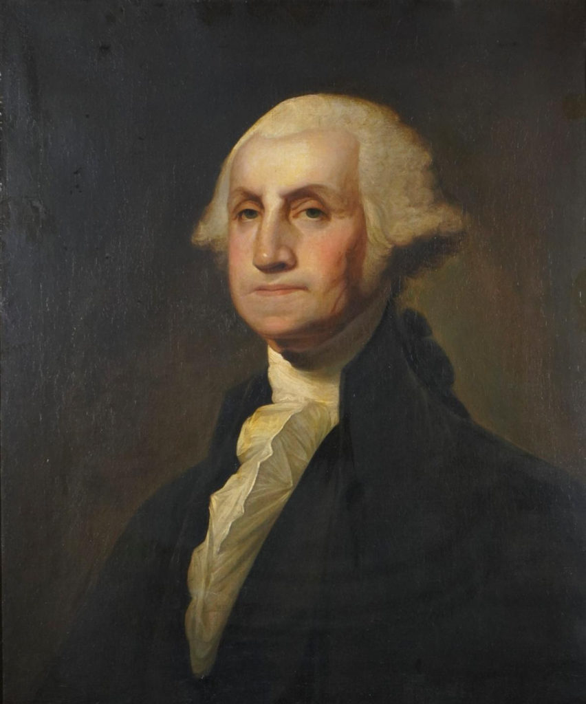
The auction was comprised of just five special lots, including the rare and important “Kinsman Portrait of George Washington” painted by Gilbert Stuart (1755-1829), which rose above its $150-300,000 estimate to sell for $356,000 (including BP) to a Southern private collector. The historic portrait had never before been offered at auction.
Painted between 1803 and 1805, when Stuart had moved his studio to Washington, D.C., it had been almost exclusively in private hands, including a century in the Kinsman family since its purchase in 1817 by Philadelphia merchant Israel Kinsman. It is in a remarkable state of preservation, retaining its original stretcher and frame.
Portrait of George Washington
Keno noted “Like the Diana Bronze, on a scale of one to ten, this masterwork by one of Federal America’s greatest artists rates a ten in terms of quality, rarity, condition and provenance. We are ecstatic but not surprised that it brought such a strong price.”
Fill your mind with useful art stories, the latest trends, upcoming art shows, top artists, and more. Subscribe to Fine Art Today, from the publishers of Fine Art Connoisseur magazine.


")