Brave Swimmer
Oil on canvas
16 x 20 in.
$1250
Available from the artist
Man versus nature. Brave Swimmer suggests a little boy to seemingly have no fear of the relentless, powerful waves. Each wave which might lift him and carry him back towards shore, would surely lead him to advance again and prepare himself for the next attack.
“Everywhere there is something special that needs to be discovered, captured and shared,” says artist Todd Baxter, who believes creating good art is all about learning to see, developing observation skills, simplifying, editing and directing the viewer’s focus within the canvas. “And yes, technical skills are also a big part of it.”
Todd’s keen sense of design and composition was honed over 40 years as a graphic designer, after graduating from the Art Institute of Pittsburgh. In June of 2010, with the responsibilities of raising a family in the rearview mirror, he decided to adjust course to focus on his passion for fine art. He continues his education by attending workshops, studying the works of other artists and painting—lots and lots of painting.
Todd has had numerous shows and won has awards in the Carolinas. He also teaches drawing and painting workshops, as well as weekly classes.
Gallery representation welcome. Requests may be sent to Todd online or through email.
View additional works by Todd on his website and sign up for his e-newsletter.
Diane Rappisi, a Studio Incamminati alumna who served as the school’s first executive director, has been appointed interim president.
Rappisi, a longtime professional artist and art educator working primarily in pastels, has taught classes and workshops nationwide and internationally. In addition to her artistic expertise, she brings a wealth of experience gained from running a teaching studio in Colorado.
She sits on the board of directors of the International Association of Pastel Artists, where she is a member of the association’s Masters Circle. She also is a Signature Member of the Pastel Society and a member of the prestigious Salmagundi Club in New York City and the Oil Painters of America.
Her work, which has been featured in Pastel Journal, is in numerous private and public collections nationwide and internationally, in Australia, New Zealand, and the Netherlands. Selected pieces have been published for the National Park Service in Glen Echo, MD.
She holds a host of honors, including “Best of Show” at the Pastel Society of Colorado’s Mile High Juried International Exhibition, as well as awards from the International Association of Pastel Societies and the Pastel Society of America.
Rappisi has exhibited widely, including exhibitions in Connecticut, Ohio, Texas, and New Jersey and the Butler Institute of Art. She also has participated in group shows at Arti et Amicitiae, Amsterdam; the National Arts Club, New York; S.R.Brennen Gallery, Santa Fe, NM; the Union League, Philadelphia, PA; Abend Gallery, Denver, CO; and the Old West Museum, Cheyenne, WY. Rappisi holds a B.S. in Management Studies from the University of Maryland University College and a certificate in Nonprofit Management from the University of Delaware.
Earlier this year, Studio Incamminati appointed Dan Thompson as the school’s dean. We reached out to this world-class artist so he could take you behind the scenes on his new role. [read more]
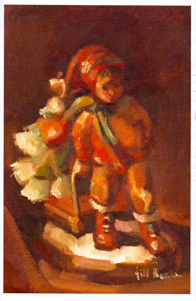
On cover: Jill Banks, “From the Hearth,” oil on linen-lined panel, 14 x 11 in., private collection
Since 1972, artist Jill Banks has been known as her parents’ “Christmas Card Creative Director.” View some of the nostalgic cards in this homage.
By Jill Banks
Once upon a time, Mom’s annual Christmas poem and notes for my parents’ card were unaccompanied by one of my drawings . . . or later, paintings. All that changed in 1972 (I’d like to say when I was 2…) and they’ve yet to ask me to retire, 46 years hence.
This collection of cards packs quite a history. Mom’s poems, my parents’ sentiments, reflect the concerns and joys that each year holds — in the nation, the world, and among family and friends. They noted milestones, moves, babies, weddings, deaths, anniversaries, wars, peace talks, Nixon’s resignation, inflation, elections, dreams, trials and tribulations. The stuff that life is made of.
The artwork has clearly changed over the years . . . as 2003 marked the beginning of my pursuit of fine art. My medium and tools shifted, too, from sparsely used markers or colored pencils to well-worn brushes and oil paints or graphite and charcoal. My once-a-year “job” as Christmas Card Creative Director no longer veers quite so far from my career as a prolific, award-winning oil painter. My signature has altered, too — not just style, but my name — from Jill Johnson (earliest years) to Jill Banks (married name, from then to now).
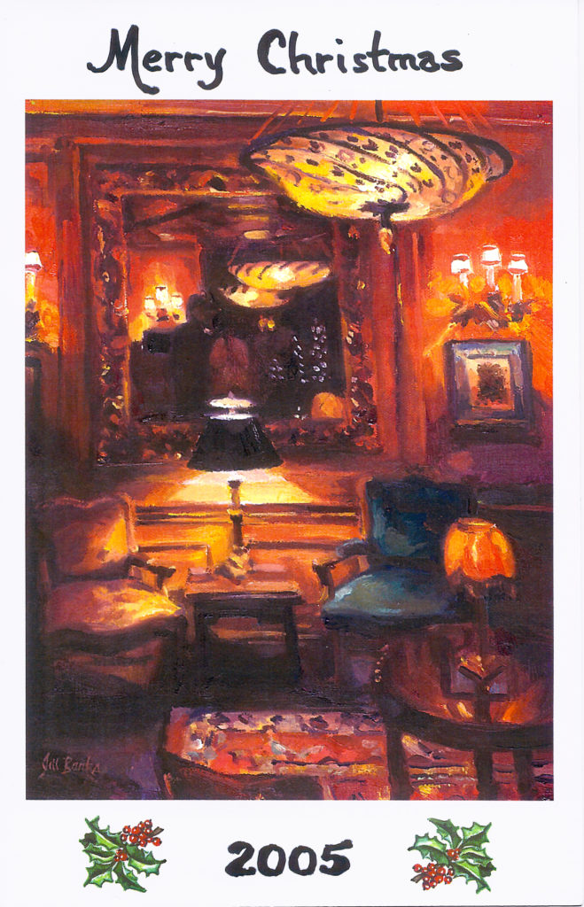
2005, on cover: “Pre-Dinner Drinks (Parlor of the Inn at Little Washington),” oil on linen-lined panel, 12 x 9 in., private collection
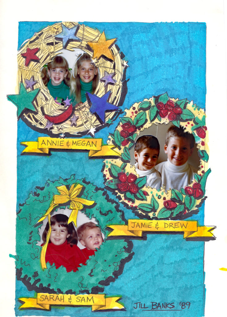
“Technology” has evolved — from one-color printing to that plus hand-coloring red bows, to two-color, to four. Print preparations starkly contrast. Not so long ago, my mom would shrink/enlarge real film photos of grandkids (lots of trips to the photo guys in town), then paste siblings together to peek out from holes cut into my physical artwork (take a close look at the card art from 1989). Now, page layout programs and photo editing software are employed to send press-ready files to the printer. A bit simpler. No scissors necessary.
The artwork for the 1989 card. I drew the cover art (markers). Mom collected photos of each of the then six grandkids and then resized and cut them out to fit in their wreath “frames.” Think about her cutting the holes inside the wreaths to show the photos behind. Then, the printer took it from here to pull it all together.
Some things have held steady over the years. Mom and Dad’s cards continue to weave the story of a beautiful, inspirational life journey — of love, friendship, parenthood, grandparenthood, sickness, loss of loved ones, and joyful celebrations.
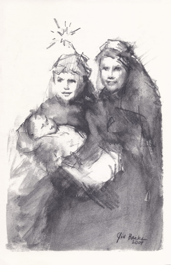
Looking back — to pull this Christmas Card “history” together I was so deeply touched by passages in my parents’ lives I’d missed. In picking out covers to include, choices were often tied to the messages inside. Like 2007, with a replay of her poem from 1957 (before my time) when my brothers recreated the Christmas story as Joseph and Mary. (That poem is included below.)
Additional Painted Christmas Cards
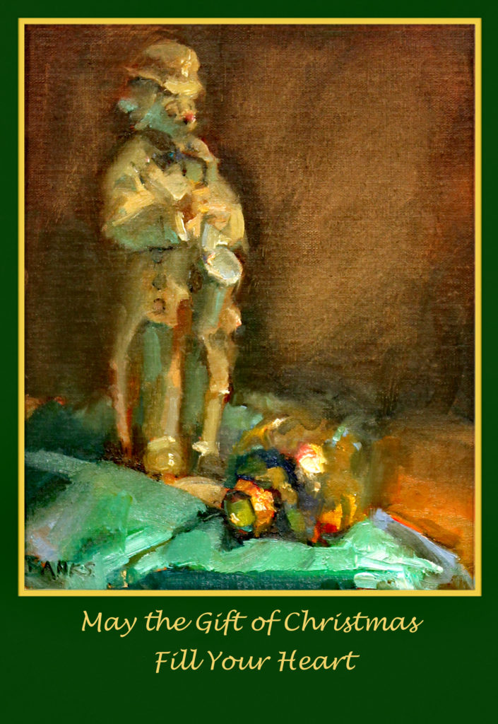
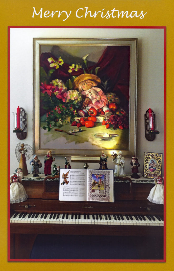
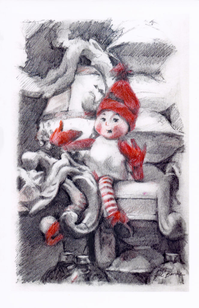
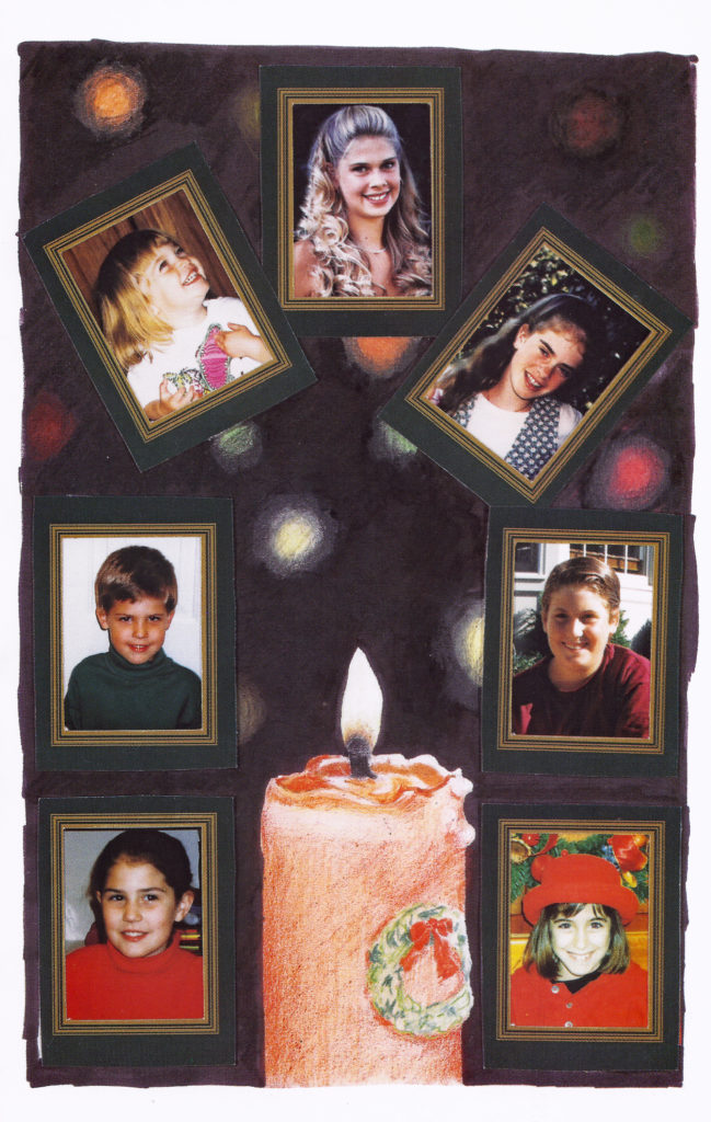
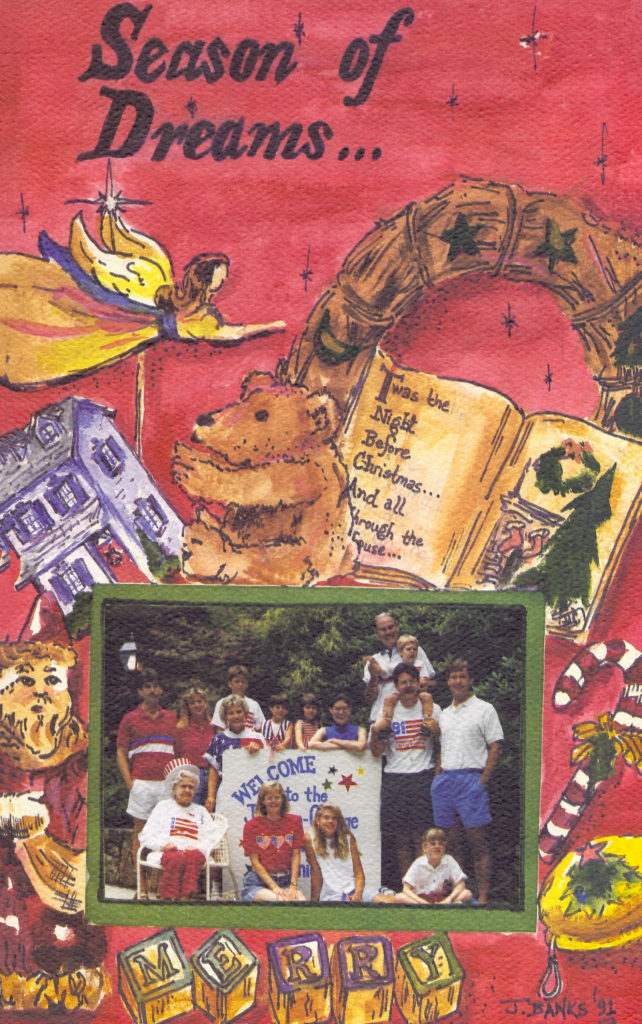
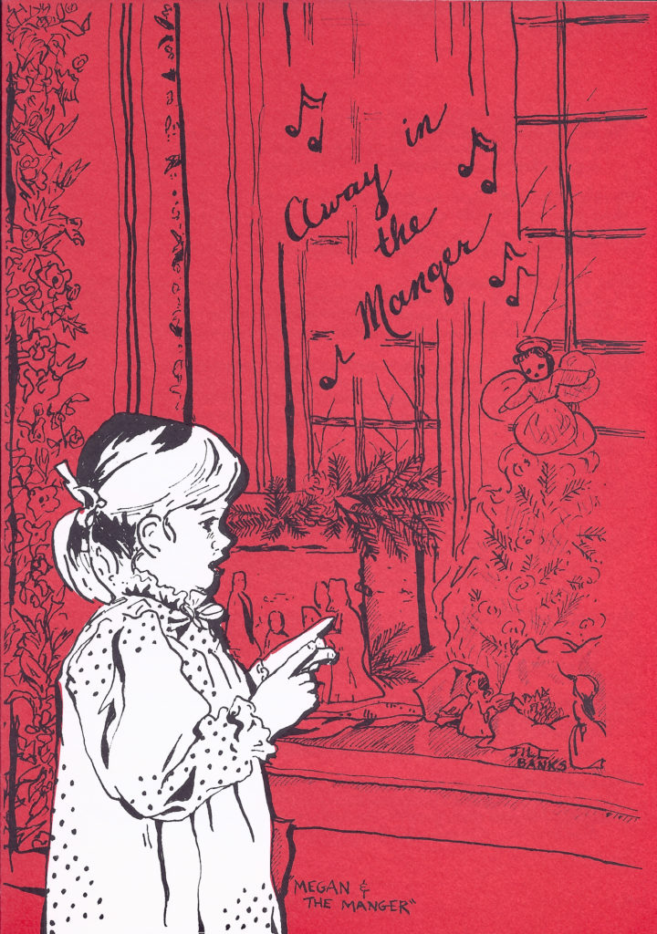
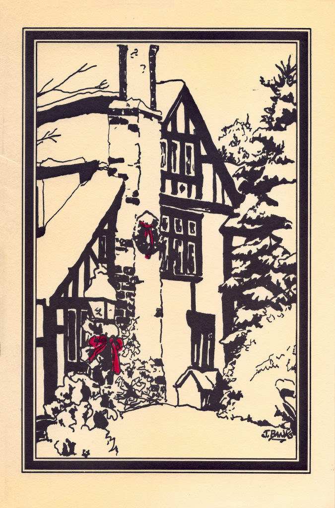
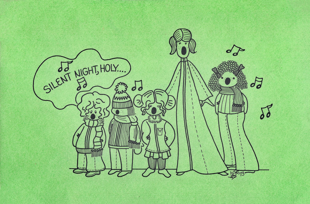
The original painting for the 2018 card is “Serenade,” oil on linen-lined panel, 10 x 8 in. by Jill Banks (available through the artist)My “part” in putting this card’s cover together is being the creator of the painting above the piano in my parents’ home. That’s “Garden Girl,” oil on linen, 50 x 42 in. — a still life painted of a setup brought to me, designed, by my dad. It includes one of Mom’s favorite dolls — on loan to my studio as needed. The painting, the cards are all a family affair. You’ll notice, too, that “Garden Girl” changed residence between 2014’s card cover (when she was above the mantel at my house) to 2017, when Mom and Dad decided they just had to have her.2012’s cover: “Bringing Home the Tree,” oil on linen-lined panel, 8 x 6 in., private collection. The figurine is one of my parents’ favorites. I have a feeling it reminds my dad of himself.2009, on cover: “Elf on the Chandelier,” graphite, red pastel, and charcoal pencil, 8.5 x 5.5 in., private collection. This guy was part of the normal Winter Wonderland decorations donned all about my parents’ condo. They’ve moved since then to another neat new home . . . and various elves continue to frolic about all the light fixtures.1994 Card: “Christmas Light” with my drawing of the Christmas candle and photos of Mom and Dad’s seven grandkids. This predates my embarking on a fine art journey . . . all covers created before 2003 are by me as a once-a-year Christmas card illustrator.1991 Card: “Seasons of Dreams”1983 Card: My drawing is of niece, Megan, my parents’ first grandchild.1981 Card: My drawing of the front of Mom and Dad’s home in Haverford, PA. The red bows were colored by hand on each card by Mom.My second year as Christmas Card Creative Director. (You don’t get to see year one unless you happened to be on my parents’ mailing list then.)For my parents’ 2007 card, they reprinted the poem she’d written about Christmas 1957. It told of my brothers reenacting the story of the manager as 5- and 3-year-olds. It might be my favorite poem and so neat to have this look back through my mom’s eyes.
So, because my expertise is in “pictures” and my mom’s is in “words,” here, with permission granted, are excerpts from her poems.
Scotty and Phil – Christmas 1957 (Reprinted Christmas 2007, above)
The New Year’s here, the tree’s all down, the presents are away
Still most of us remember this most recent Christmas Day
We all have ways of setting firm the mem’ries that we cherish
By photographs or other means in hope they’ll never perish
This year for us was special. We were in for a surprise
Our 5 year old, in twelve short months, had grown to be quite wise
We both were very proud last year when we would hear him say
That Christmas was a happy time, “’Twas Jesus’ Birthday”
He vaguely knew the manger scene, but carols, he knew none
For Christmas then meant Santa’s trip, the tree, the toys, the fun
But this year, I was clearing up some things I always leave
Undone until the day before the day of Christmas Eve.
When this same boy approached me with a somewhat strange request
He wanted several safety pins, for what, I’d ne’er have guessed
He took the pins and I heard him say, “I got them” to his brother
His words were reassuring, “I’ll be REALLY careful, Mother”
I could tell by little whispers and the gleam in Scotty’s eyes
That in just a few short minutes, I would see the big surprise
I pretended I’d forgotten so they’d take me off my guard
Though when two small boys are quiet, indifference is quite hard
It pleases me when patience shows on the part of our son, Scott
’Cause patience is a virtue Phil, age three, has just not got
But he worked with Phil and it wasn’t long ’til they came to let me see
What I’ll not forget, should I live to be one hundred thirty-three
’Round Philip’s head was a frilly blanket, pinned beneath his chin
His ears stuck out, but a word from Scott, and he quickly tucked them in
Now Scotty’s wool plaid blanket was securely pinned in place
To resemble ancient robes, and with a grin upon his face
He turned to show how he had tied his scarf behind his head
It was his favorite cowboy scarf, so wrinkled and so red
In Philip’s arms, a Teddy Bear was nearly out of sight
Because their Davy Crockett rug was wrapped around it tight
Though you’ve probably guessed the story by now, with facts I will not tarry
Our Scott was dressed as Joseph, and our Phil was dressed as Mary
Their costumes they had copied from the church play with great care
Since they had no doll for Jesus, they had used their Teddy Bear
So after getting words of praise on how nicely they were dressed
They scampered to the playroom to enact the scene so blessed
Our Scott would knock on closet doors, “May we stay here for the night?”
He’d accept their “no” then knock again, and again explain their plight
“We have traveled many miles today, so we hope our room is near
My wife and I are very tired, and our baby will soon be here”
Then finally they found a place, ’twas just a lonely stable
But the two of them were happy, and it would hold their baby’s cradle
They suddenly stopped short their play, and Scott ran out to me
He didn’t feel quite right about the Teddy Bear, you see
He felt it would be better if someone he KNEW could play
The little baby, Jesus, who was born amid the hay
“Would you call Mrs. McKenzie? See if Ger and Mike are home”
I listened to the plan he had, then called her on the phone
He’d chosen for the angel, Mike, who’s very sweet, but wild
And Geralyn, a little GIRL, was to be the small Christ Child
With the four of them so busy, I was listening, heart and soul
Ger wanted to be Mary, but our Phil clung to his role
Scott aligned them in our kitchen and directed them to sing
For the time had come for them to hail the Birthday of the King
But as they all began their march, Mike vanished out of sight
While “The Manger Song” was sung by Scott, and Ger sang “Silent Night”
Our Philip folded both his hands, and bowed his head to pray
His song was “Sandy Sleighfoot” and he sang it his own way
But no matter that the words or tunes were never in accord
The important thing was each small child was singing to the Lord!
-Ken and Shonnie
In 1977, when while I was away at college, my Mom was scarily sick . . . being revived one week before writing that poem of hope, faith, and love. Both covers match the messages inside although I wasn’t there for either “story” when it unfolded.
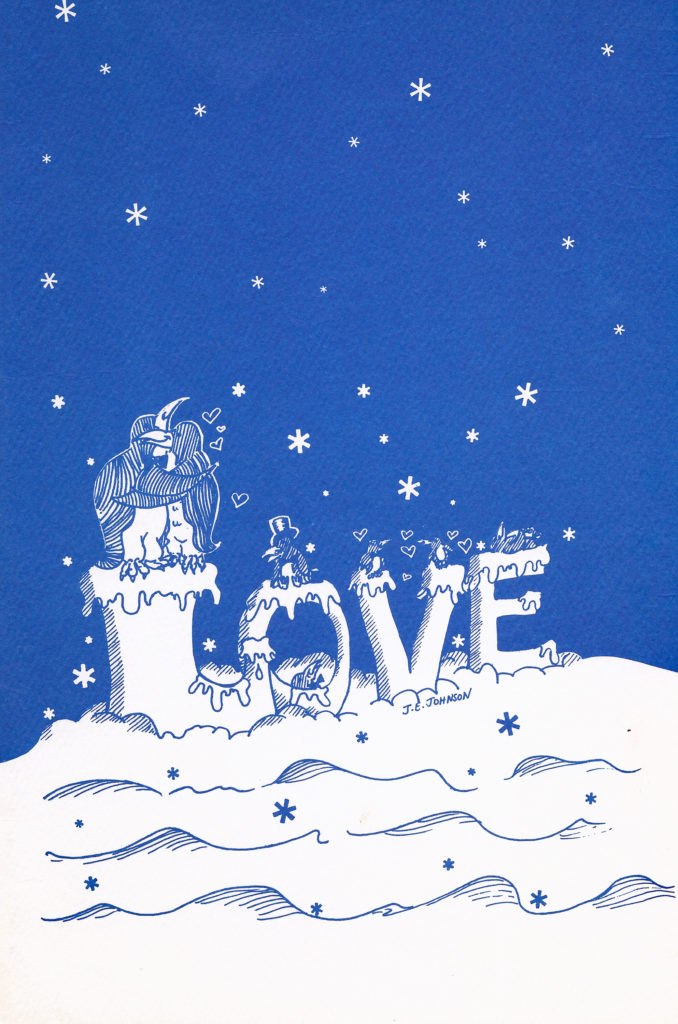
1977 Card: I don’t know what Mom’s instructions were to me for the design of that year’s cover. Her poem (below) tells just how difficult the year had been (I was away at college during the scariest times) and how love is what got them through. I guess that’s us on the cover — as a penguin family. Love conquers.
And this message of hope and love from 1977’s card from Mom and Dad:
Christmas 1977
As is always our custom at poem-writing time
We look back at the year which has passed
From a standpoint of sickness, concern, and adjustments
We’ve never felt more than the last
So many long weeks spent apart and in hospitals
Hours of worry and fears
My mom being sick for so long — and then me
It has really been one of those years
But doctors and medicine, time, and good care
Concern from so far and so near
The prayers and the thoughts and the love of so many
Helped make those dark days disappear
It’s hard to believe that just one week ago
I barely could pick up a pen
But again we’ve been shown what miraculous things
Can occur and astonish us when
One is well taken care of and showered with love
And we really think LOVE is the key
It has soothed disappointments and filled empty hours
We must add, and we’re sure you’ll agree,
That a hospital makes you aware of your blessings
Surrounded by sickness and pain
So we hope this same LOVE reaches out in abundance
To comfort, encourage, sustain
She continues with some family blessings and news of their upcoming move from Long Island to Philadelphia, with this the end of 1977’s poem:
It is true — there is SO much to be thankful for
There is not room to put it in writing
It is fitting that Christmas would come at the time
A season so bright and exciting
A season so filled with great faith and great hope
A season so teeming with joy
A season which puts us in touch with old friends
From the two coasts to Illinois
What a marvelous season, so brimming with LOVE
A season we always remember
We’ll spend it in Cold Spring this year, yet we know
That we’ll always be spending December
In a home which is filled, as it now is, with LOVE
For each other, our family, and friends
Location won’t change it. It goes where we go
It’s a feeling we hope never ends
So although we have wished it on previous cards
We’re repeating — that all else above
Since to us — it’s the greatest of all of God’s gifts
We most of all — wish you all LOVE!
– Ken and Shonnie Johnson
Warm wishes to YOU, too, from this beautiful couple’s “kid” and cover artist.
~Jill Banks
“Sunburst in the Riesengebirge,” a landscape painting by Caspar David Friedrich
The Saint Louis Art Museum recently announced the acquisition of “Sunburst in the Riesengebirge,” a landscape painting by the German Romantic painter Caspar David Friedrich. The museum purchased the painting December 12 at auction at Sotheby’s in London for a total price of $2.75 million, including buyer’s premium.
Paintings by Friedrich seldom come on the market. In the United States, the artist is represented in the collections of only a small number of museums, including the Metropolitan Museum of Art, the National Gallery of Art, the Kimbell Art Museum, and the J. Paul Getty Museum.
Acquiring a strong work by Friedrich has been a strategic priority for several decades, said Brent R. Benjamin, the Barbara B. Taylor Director of the Saint Louis Art Museum.
“As the leading German painter of the first half of the 19th century, Friedrich had an extraordinary influence on the generations of German artists who followed him,” Benjamin said. “‘Sunburst in the Riesengebirge” will have a transformative presence as a cornerstone of the Saint Louis Art Museum’s renowned collection of modern German art.”
German painting and sculpture at the museum includes masterworks of early 20th century Expressionism and the world’s largest collection of paintings by Max Beckmann, as well as seminal works by postwar artists like Joseph Beuys, Anselm Kiefer, Sigmar Polke, and Gerhard Richter.
“Sunburst in the Riesengebirge” is unassuming in scale yet rich in the allegorical imagery that characterizes much of Friedrich’s work.
The painting likely was inspired by Friedrich’s 1810 walking tour of the Riesengebirge, or Giant Mountains, a range located along today’s border between the Czech Republic and Poland. Scholars believe that the mountain hikes provided the basis for many of Friedrich’s later landscapes. However, as with much of Friedrich’s work, the painting does not depict an actual location.
Rather, “Sunburst in the Riesengebirge” exemplifies Friedrich’s symbolic approach to landscape painting, said Simon Kelly, curator of modern and contemporary art at the Saint Louis Art Museum.
“The painting is a beautiful representation of light, and sums up Friedrich’s approach to landscape as symbolic of the wider themes of life, death, and the promise of eternity,” Kelly said.
The painting will be on view in early 2019. For more information, visit slam.org.
If I were a branch on that tree, it would be my desire to create little blossoms of color that you can bring into your life and home, which daily enable you the opportunity to experience and be reminded to look for joy.
Joy is unique among the good things in living. It is one of the differentiating qualities in life if you allow yourself to recognize it. Different from a state of being such as happiness, which often requires real work or some prerequisite of your doing, joy is unpredictable and unburdened.
Gregory Packard, “The Embrace,” oil, 30 x 36 in.
Needing only your recognition, joy is a gift offered up in the smallest and largest moments of our daily lives.
Remarkably, joy can be experienced on our saddest, rainiest, darkest day if we are just willing to look for it. Like a sunburst, these moments are not meant to be permanent. As life itself, joy is fleeting. It is when a caterpillar first opens her wings, when the golden sun breaks through the stormy clouds, or when the sheer power of the storm excites you to the core.
It is when the leaves of autumn shimmer in the steep angle of afternoon light, when “nature’s first green is gold, her hardest hue to hold,” or, when you recognize something nature brings forth that reminds you of a recently passed loved one as if it was that loved one embracing you.
Gregory Packard, “Stellars Jay,” oil, 40 x 30 in.
These are moments that are entirely gifted to us — and if we give ourselves permission to experience them — these are moments of joy.
These are moments I attempt to cultivate in my paintings. I believe in the intrinsic value of this work. In large part I have dedicated my life to it, and it is my sincere hope that this work inspires you as nature herself does me.
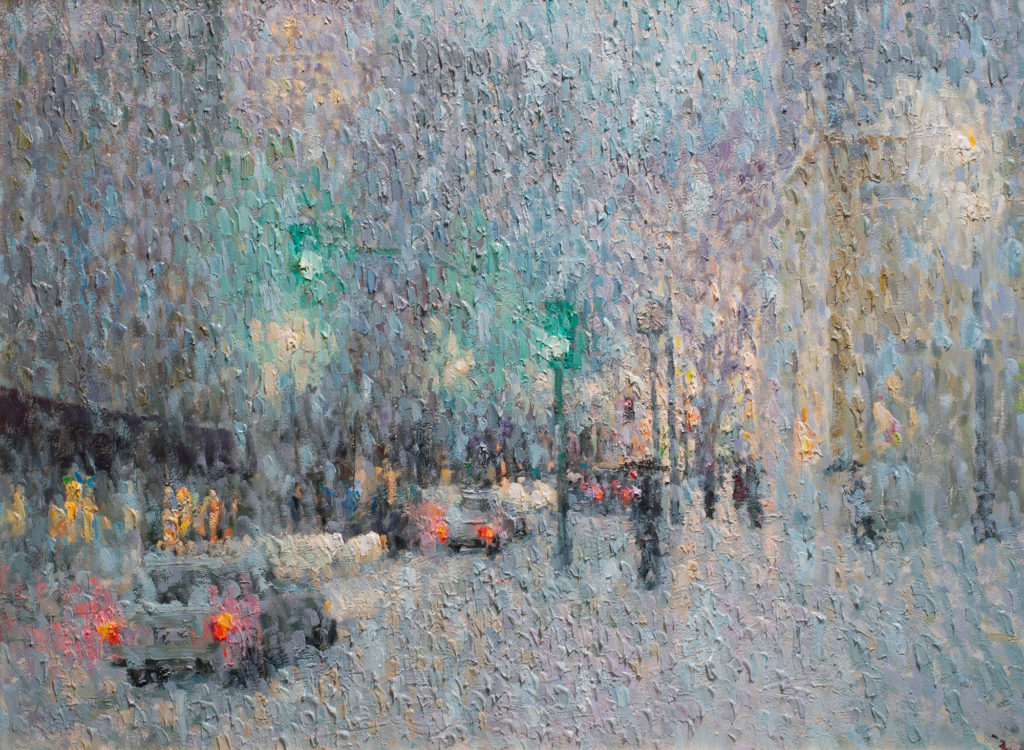
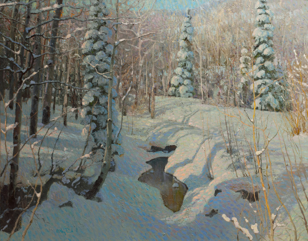
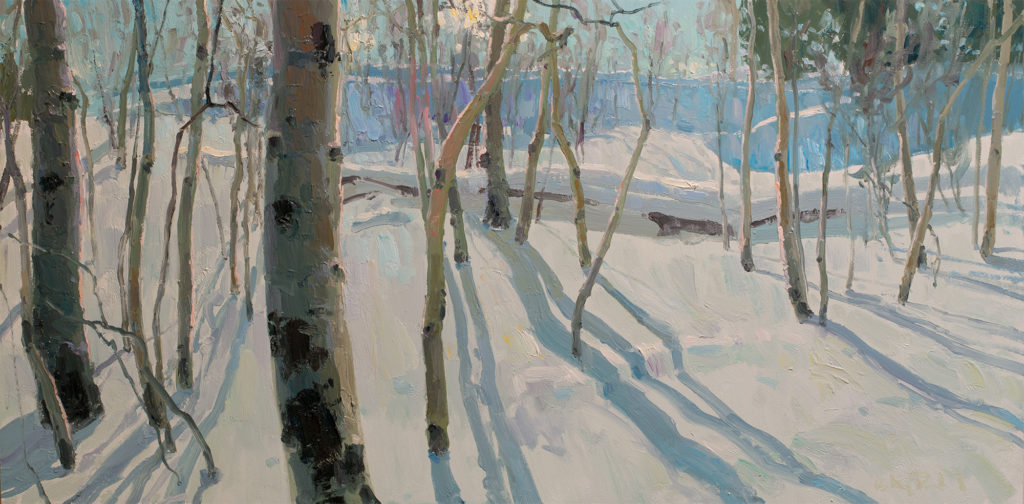
Gregory Packard, “Snow in the City,” oil, 30 x 40 in.Gregory Packard, “A Still Quiet Place,” oil, 48 x 60 in.Gregory Packard, “December Dance,” oil, 24 x 48 in.
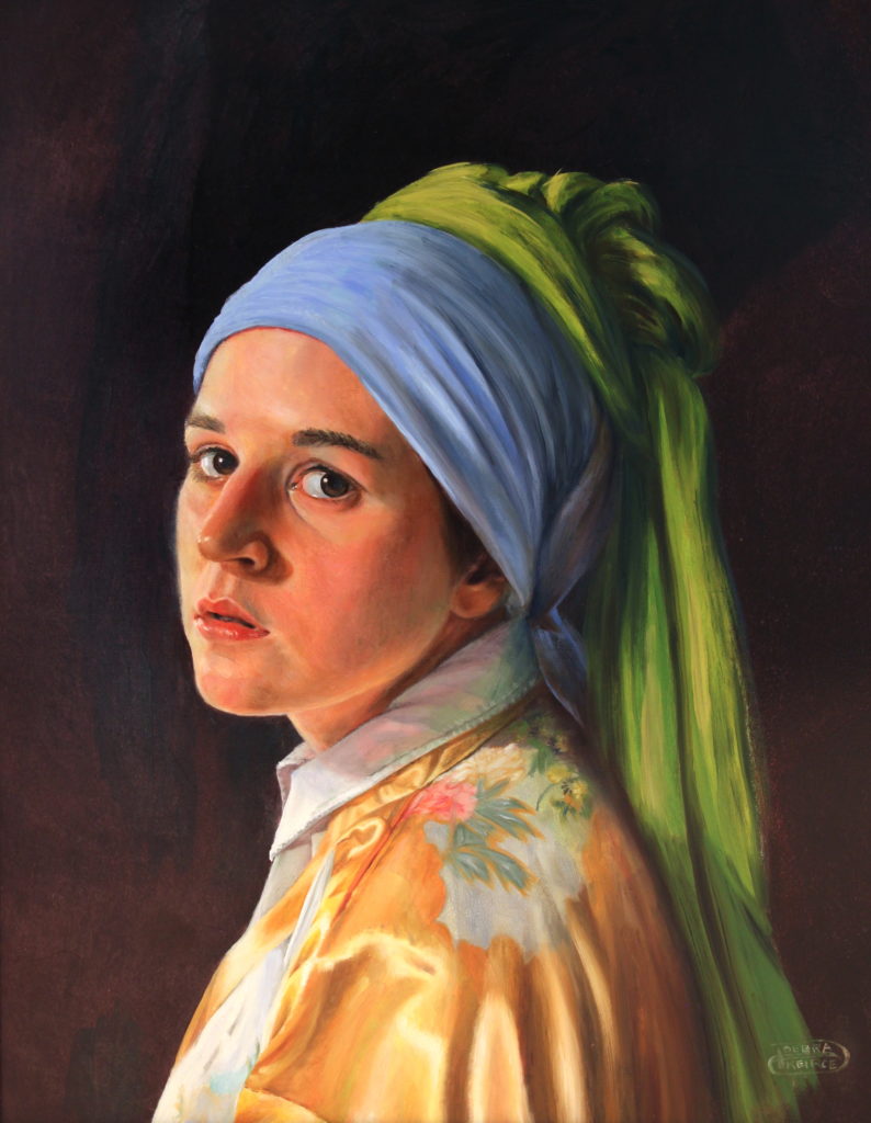
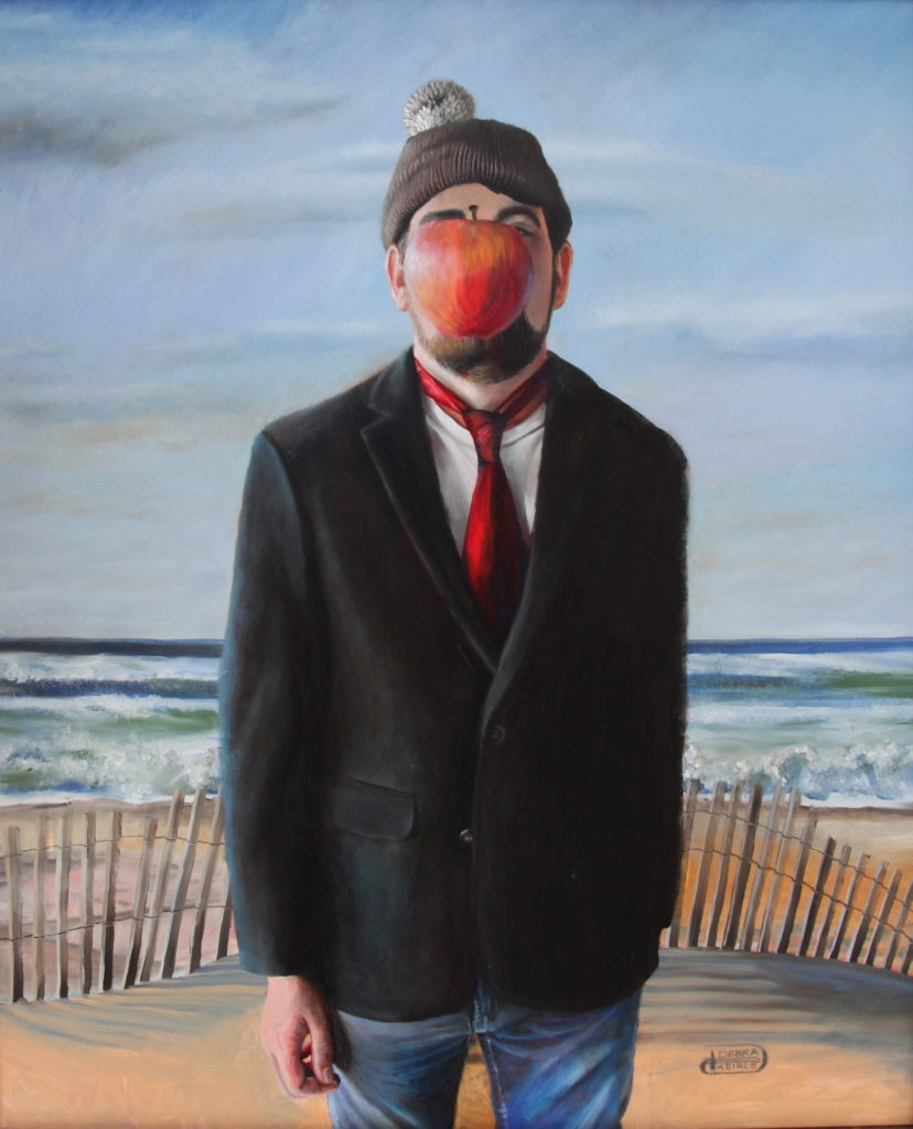
“The Scholar” by Debra Keirce, 12” x 14” Oil on Panel, Framed to 17 1/4" x 21 1/4", $1,585
INspired by “Astronomer by Candlelight” by Gerrit Dou, 1665, Oil on Panel, J. Paul Getty Museum, Los Angeles, CA
“INspired by the Masters” with Artist Debra Keirce
“My art journey has taken me to this place where I am finally understanding why I am drawn toward miniatures, and why I prefer classical realism to photorealism — in particular, why I love the Dutch masters and have since I was a kid. I love art that draws you IN,” says Debra Keirce.
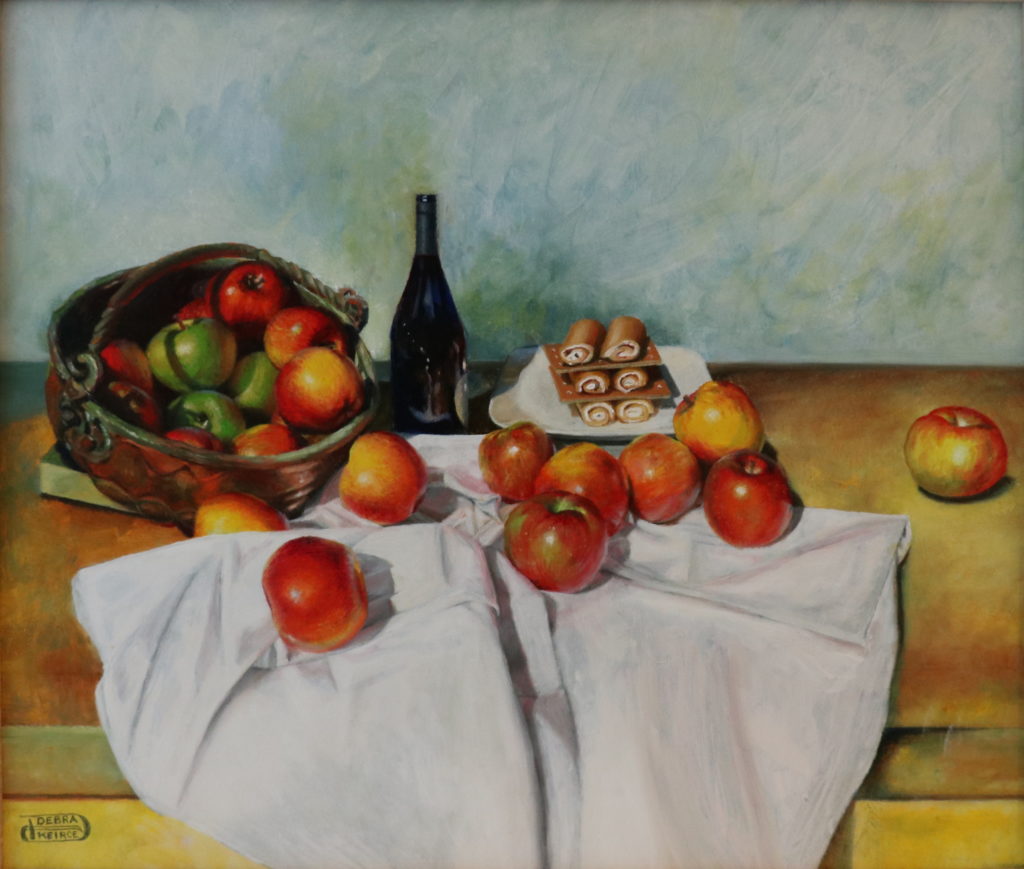
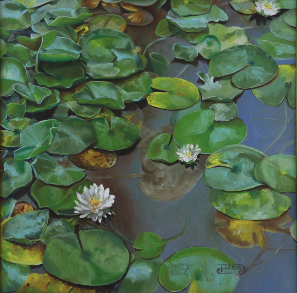
“An Apple a Day” by Debra Keirce, 12″x14″, Oil on Panel, Framed to 14 3/4″x16 3/4″, $1,395 INspired by “The Basket of Apples”, by Paul Cezanne, 1895, Oil on Canvas, Art Institute of Chicago“Girl Without a Pearl Earring” by Debra Keirce, 20″x16″, Oil on Panel, Framed to 22″x18″, $2,495 INspired by “Girl With a Pearl Earring” by Johannes Vermeer, 1665, Oil on Canvas, The Hague, Netherlands“Water Lilies” by Debra Keirce, 12″x12″, Oil on Panel, 17″x17″ Framed, $1,145 INspired by “Water Lilies” by Claude Monet, 1916, Oil on Canvas, National Museum of Western Art, Tokyo
“The Dutch masters painted in exquisite detail, similar to miniature art, and that alone invites you to lean in and look closer. Also, the 17th-century pieces are quite often composed in a way that invites you into the painting. My personal goal in my art is to give the viewer an experience. I try to stimulate all the senses. I want them to feel they are IN the painting, feeling the heat or the splash of the wave, smelling the flowers, hearing the birds chirping in the distance. I thought by capitalizing the IN in Inspired, it would convey some of that.”
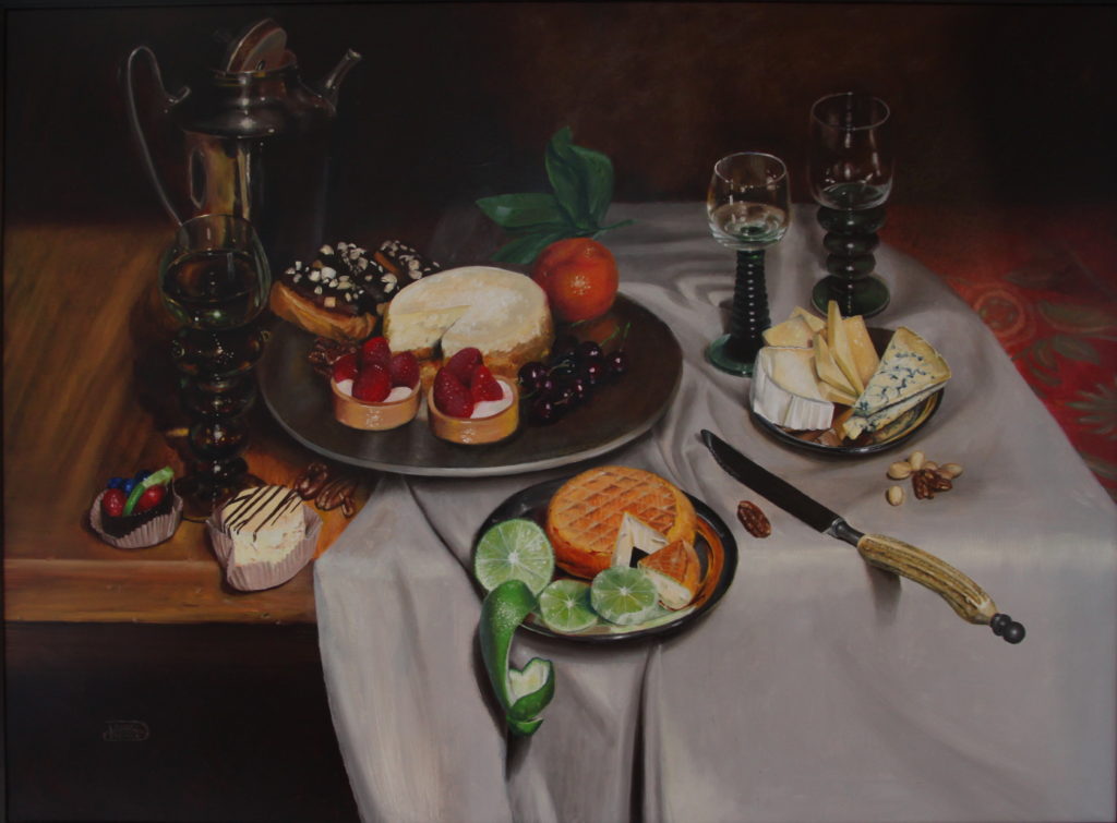
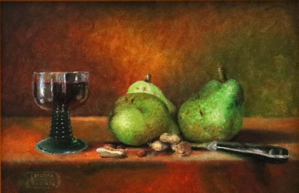
“Tarts” by Debra Keirce, 30″x40″, Oil on Brushed Aluminum Panel, Framed to 34″x44″, $5,975 INspired by “Banquet Piece With Mince Pie” by Willem Claesz Heda, 1635, Oil on Canvas, National Gallery of Art, Washington, DC“Pears, Peanuts and a Glass of Wine” by Debra Keirce, 4″x6″, Oil on panel, Framed to 7 1/2″ x 9 1/2″, $445 INspired by “Pears, Walnuts and Glass of Wine” by Jean-Baptiste-Simeon Chardin, 1768, Oil on Canvas, Louvre, Paris, France“Son of Woman” by Debra Keirce, 21 1/2″ x 17 1/4″ Oil on Panel, Framed to 23 1/2″ x 19 1/4″, $2,545 INspired by “Son of Man” by Rene’ Magritte, 1964, Oil on Canvas, Private Collection
“INspired By the Masters” is on view at Seaside Art Gallery (Nags Head, NC) through December 29, 2018. View the story behind the inspiration for each piece, along with the master paintings that inspired them, at https://seasideart.com/collections/inspired-by-the-masters.
Please help us congratulate the legendary artist Burton Silverman. He was recently award a Lifetime Achievement Award from Fine Art Connoisseur at the 2nd Annual Figurative Art Convention & Expo (FACE).
Burton Silverman has exhibited in galleries and museums since 1956. His paintings are represented in 32 public collections, including the Metropolitan Museum, NY, the Brooklyn Museum, the Philadelphia Museum of Art, the Denver Art Museum, the Smithsonian American Art Museum, and the National Portrait Gallery.
He has won nine major awards from the National Academy Museum, and gold medals from the Portrait Society of America and the American Watercolor Society. He was also a featured instructor at the 2nd Annual Figurative Art Convention & Expo in Miami, Florida.
Tracker
Oil on Linen
72 x 48 in.
$16,500 Available at Gallery Wild, Jackson, Wyoming
Patricia Griffin is a wildlife painter, photographer, researcher, naturalist, and conservationist. She uses her work as a billboard for awareness.
“I see my paintings as a vehicle for the awakening of the human soul to the necessity of protecting and preserving that which does not speak a human language,” explains Patricia.
Read more about Patricia in a recent Fine Art Today article A Relentless Pursuit.
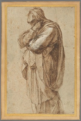
Parmigianino (Francesco Mazzola) (Italian, 1503–1540), “The Head of a Young Man,” about 1539–1540, pen and brown ink, 16 × 10.5 cm (6 5/16 × 4 1/8 in.). The J. Paul Getty Museum, Los Angeles
During the Italian Renaissance — the period from about 1475 to 1600 that is often seen as the foundation of later European art — drawing became increasingly vital to the artistic process, as it grew dramatically more sophisticated in technique and conception. Today, Italian Renaissance drawings are considered some of the most spectacular products of the Western tradition. Yet, they often remain shrouded in mystery, their purpose, subjects, and even their makers unknown.
Featuring drawings from the Getty Museum’s collection and rarely seen works from private collections, “Spectacular Mysteries: Renaissance Drawings Revealed” highlights the detective work involved in investigating the mysteries behind master drawings.
“The Getty’s collection of Italian drawings counts among the greatest in this country, and this exhibition will surprise many visitors with how much we still have to learn about these rare works of art,” explains the Getty Museum director, Timothy Potts. “This display, which includes some of our best Italian drawings, provides many insights into the methods curators use to investigate the purpose and meaning of these superlative works of art, and some of the revelations they have disclosed.”
The practice of drawing flourished in Italy during the Renaissance, due to a surge in patronage for paintings, sculpture, and architecture, which went hand in hand with the rise of artists’ studios and a rigorous production process for these works.
Many of the drawings produced at the time tell stories of their creation and the purposes they served, yet sometimes even the most seemingly simple question — who drew it? — is a mystery. Given the ease and informality with which a sketch can be made, its purpose and other information about it must be discovered from the only surviving evidence: the drawing itself.
Michelangelo Buonarroti (Italian, 1475–1564), “Study of a Mourning Woman,” about 1500–1505, pen and brown ink, heightened with white lead opaque watercolor, 26 × 16.5 cm (10 1/4 × 6 1/2 in.). The J. Paul Getty Museum, Los Angeles
Clues about the artist can be uncovered by comparing a drawing with the stylistic characteristics of other sheets. In 1995, for example, a Sotheby’s expert looked at “Study of a Mourning Woman” (about 1500–1505), and immediately recognized the distinctive penwork and handling of the drapery of Michelangelo. Subsequent study confirmed this attribution. The Getty acquired the drawing in 2017.
Inscriptions can sometimes also be a useful clue to the artist but should be treated with caution since they often reflect the over-optimistic attribution of a past owner. One work in the exhibition — “Exodus” (about 1540) — features many inscriptions. It took some time and much research to decipher which inscriptions belonged to past owners and which was that of the artist. Eventually, the drawing was attributed to Maturino da Firenze.
Mysteries about the sitter, subject, and purpose can sometimes be revealed by linking a drawing to a painting, sculpture, or print. The purpose of “Two Male Standing Figures” (about 1556) was unknown until 2001, when the work was auctioned and identified as the work of Girolamo Muziano. At that time, it was determined to be a study for figures in an altarpiece the artist painted for the cathedral in Orvieto.
“As I try to learn more and more about these captivating works, I sometimes feel like a detective,” says Julian Brooks, senior curator of drawings and curator of the exhibition. “In the end, this exhibition is the story of what we know, what we don’t know, what we might know, and what we can’t know about these extraordinary works of art and their world.”
“Spectacular Mysteries: Renaissance Drawings Revealed” is on view through April 28, 2019 at the J. Paul Getty Museum at the Getty Center (Los Angeles, CA). The exhibition is curated by Julian Brooks, senior curator in the Department of Drawings.
Jeremy Lipking, “Self-Portrait as a Zorn Painting,” 2012, oil on linen, 7 x 10 in., private collection
By Vanessa Françoise Rothe
Jeremy Lipking (b. 1975) is widely regarded as one of the top American painters working today, creating images of figures in landscapes that are simultaneously ethereal, sincere, and truly humanist. In view of his realist subjects and disarmingly “natural” style, it makes sense that he is often cited as a key inheritor of John Singer Sargent and Anders Zorn.
Arriving at this level of mastery has required countless hours of study, practice, and work — all the more remarkable considering that Lipking is only 41 and a devoted family man: he lives in Calabasas, California, with his wife and muse, Danielle, and their children Skylar, Jacob, Sierra, and twins Juniper and Zion, who arrived just this past September.
Jeremy Lipking, “Skylar,” 2015, oil on linen, 16 x 20 in., Collection Bryan and Jennifer Murphy
As the son of a well-known illustrator, Ronald Lipking, Jeremy grew up in Los Angeles’s lively artistic community and spent many hours watching his father work. Early on, however, the boy was singled out for his talent in guitar playing, not drawing or painting. To this day he can pick up virtually any stringed instrument and perform a song as if he had studied it recently. This “ear” and profound openness to all the senses have surely contributed to the complexity of Lipking’s visual art.
ROOTED IN NATURE
This heightened sensibility pervaded everything that Lipking saw and felt as a youngster. He recalls fondly the many summers his family spent in the Eastern Sierra, where he watched his father paint outdoors in the mountains. He, too, would spend all day outside, splashing in streams, climbing granite outcroppings, and fishing, always observing the way roots grow, the veins and shapes of leaves, the flow of rivers, and the colorful reflections on watery surfaces.
Lipking says he now realizes that “all of these experiences had a profound effect on my admiration of nature, and also gave me a perspective on life that I might not have had growing up only in an urban environment.” In adulthood, he has learned still more about the Sierras and the other unspoiled regions he paints: “When you realize you are standing in the glacier’s path, when you see landscape in geological terms, your understanding becomes so much deeper, transcending aesthetic beauty alone.”
Jeremy Lipking, “Last Light, Sierras,” 2016, oil on linen, 12 x 16 in.
Indeed, before he turned to figure painting, Lipking painted only landscapes, usually in watercolors, a medium easy to carry on hiking trips. During these adventures, he made many studies, living close enough to nature to capture it in a completely natural way, with a detail-oriented attentiveness that remains in his art today.
Though he did not complete a single art class in high school, Lipking was aware (through his father) that he might hope to earn a good living as a professional artist, so he enrolled in 1997 at the California Art Institute in Westlake Village. He notes, however, that what really honed his artistic skills and vision were the more intensive encounters he enjoyed with older practitioners — for example, the drawing classes he took with the illustrators Glen Orbik and Norm Nason, and the critiques offered by such masters as David A. Leffel and Max Turner.
Over and over, Lipking read the painter Richard Schmid’s revered book, Alla Prima, which taught him about values and edges. (The two men have since painted side by side several times.) Lipking was also powerfully inspired by his father’s collection of paintings by such Western masters as Frederic Remington and the Taos Society of Artists.
EARLY DAYS
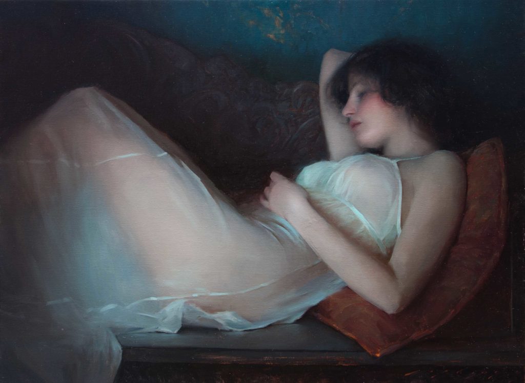
Around 2004, Lipking found himself working in a studio with slightly chipped walls painted bright blue: “There I painted a couple of nudes in sheer translucent fabrics, and I really liked the way they looked against this particular blue,” he recalls.
These were the first pictures to put Lipking on the art world map, further encouraging him to read books about, and visit museum collections of, such 19th-century French masters as William Bouguereau and Émile Friant in hopes of attaining their delicate balance of values, edges, and color. He was particularly inspired by Prof. Gabriel Weisberg’s book Beyond Impressionism: The Naturalist Impulse (1992), which introduced him to many naturalist painters, and by Dean A. Porter’s Taos Artists and Their Patrons, 1898–1950 (1999).
At age 25, just one year into his professional career, Lipking won the top prize at the California Art Club’s 2001 annual exhibition with his painting “Shady Grove,” stimulating even louder accolades nationwide. Soon afterward, New York City’s Arcadia Gallery began mounting a series of sold-out solo shows, rapidly building a truly national awareness of Lipking’s gifts. (Arcadia has since relocated to Southern California and continues to represent Lipking.)
So what was it that the judges and the gallery admired so much? Beyond the beauty of Lipking’s female figures and of their natural settings, surely it was their palpability — so detailed they could almost be photographic, yet captured far more ethereally than any camera could. Indeed, Lipking addresses various areas of his image in a looser, more suggestive way, with visible strokes and soft blended edges that impart a convincing naturalness.
It is this delicate balance that distinguishes his work from harder-edged contemporary realism, deftly mimicking how the human eye actually sees the world; the main subject is in focus and its surroundings slightly blurred — essentially a combination of realism and impressionism.
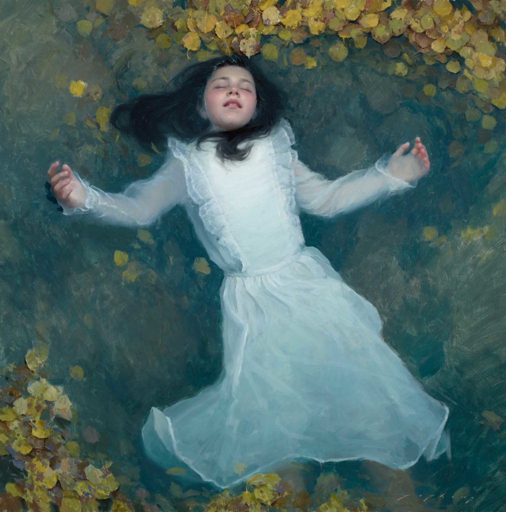
Jeremy Lipking, “Adrift,” 2013, oil on linen, 40 x 40 in., Collection Art Renewal Center
In the painting “Adrift,” Lipking tenderly depicts his daughter floating in a stream — a powerful and thought-provoking motif stretching back to John Everett Millais’s famous “Ophelia” (1851–52, Tate, London). Here he orchestrates a well-drawn figure, soft blended edges, and subtle changes in color, lights, and darks. Particularly masterful are the illusion of transparent water and the faint suggestion of submerged leaves.
ALWAYS LOOKING
Always seeking new inspirations, Lipking has in recent years traveled through America’s deserts and plains, to France and Switzerland, and also to Sweden, where he painted the same woodlands and lakes that Zorn revered. During these voyages, he particularly enjoys studying masterworks in local museums, and has paid special attention to Bouguereau, who inspires him to emulate that master’s astonishingly smooth skin and finely blended strokes.
Exciting new locales, with their differing light qualities, tree species, and textures, have also made their way into Lipking’s art. These settings range from Alpine peaks to weathered 18th-century workshops, from the blue lakes of Sweden to the brilliantly colored Mojave Desert: clearly, landscapes still play a major role in Lipking’s artistry.
Jeremy Lipking, “Reclining in White,” 2004, oil on linen, 30 x 40 in., private collection
Lipking confides that his work “is about the moment I experienced: the warm light that caught my eye at the end of the day fading from a mountaintop contrasting with cool shadows, the composition of the silhouette of a figure sailing on a lake with a reflection that mirrors the vessel’s dark shape, the dappled light pouring through trees onto green grass, or onto a woman’s skin.” He says, “The painting is complete when I feel I’ve captured that special aspect that I saw, or felt, in that instant.”
During regular visits to southern Utah over the past few years, Lipking has explored its warmer, brighter colors, which offer him a range of fresh subjects and combinations. He has also been exhibiting more scenes set in California landscapes, particularly in thriving Western venues such as Los Angeles’s Autry Museum of the American West and Oklahoma City’s National Cowboy & Western Heritage Museum. (He won top honors in the latter’s Prix de West competition in both 2014 and 2016.) Yet another pull in this direction is Lipking’s own ancestry: he is an enrolled member of the Keweenaw Bay Indian Community of the Lake Superior Band of Chippewa.
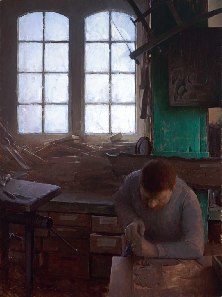
Jeremy Lipking, “Loire Valley Wood Carver,” 2003, oil on linen, 40 x 30 in., private collection
Although he is from California, Lipking makes art that cannot be categorized as Western, or even American, given the geographical breadth of his subject matter and the cosmopolitanism of his manner. Recently, a portrait commission from an important family brought him to France’s Loire Valley, where he was later inspired to create “Loire Valley Wood Carver.”
Only rarely does an artist come along who not only can see the sensitive nuances of beauty in the world around us but who also has the skill to translate that vision onto canvas.
To view more Jeremy Lipking paintings, visit lipking.com.
Fill your mind with useful art stories, the latest trends, upcoming art shows, top artists, and more. Subscribe to Fine Art Today, from the publishers of Fine Art Connoisseur magazine.