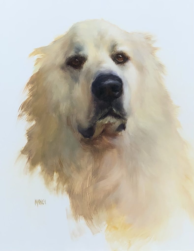
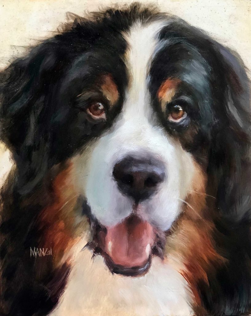
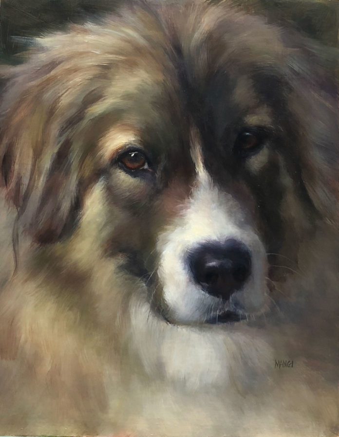
by Johanne Mangi
Put your brushes down. I’m about to make you uncomfortable.
If you really love something, you should have an open mind, don’t you think? I’m going to tell you something that is sooo incredibly simple that you might find it hard to do. I can instantly make you a better painter. I didn’t say great. I said better. But hey, it’s a start. More than that is up to you.
I know you are struggling with drawing, edges, color, design, etcetera, etcetera etcetera! We all do. Maybe not all of that all the time but some of it part of the time.
I can’t make you want to draw better, although I’m guessing the reason you don’t want to is because it’s uncomfortable! But that’s not what I’m here to talk about. We’ll save that for another time because, frankly, I love to draw. I didn’t say I was great, but I love it. It’s a start. Anyway, I digress.
I just went to the Salmagundi Club the other night to watch Sherrie McGraw do a mind-blowing demo. Now if you know anything about Sherrie, she’s not really us. She’s got it and tries to share it with the rest of us. You know the type. They make it look so easy. But then we try it and just make a mess. What I’ve come to learn is that we tend to complicate the simplest of concepts. It’s right in front of us. Really. And the true masters are showing us the way. We just choose to make it hard!
OK, here we go. I’m talking about value. Yes, I know you know. But do you really? Because basically all you have to do is look down at your palette and choose a value. Any old color will do if it’s the right value. And don’t worry if it’s the correct value. Get close. You can always fix it. You just have to take the first step and put it on the canvas!
 Is that spot lighter than the other? Darker? Of course it is or isn’t! And don’t try and make 20 values. A few will do. Lump a group together. Those transition areas that are hard to determine? Just make an executive decision. Make it either in the light or in the dark. See? Simple. Sort of.
I know you’re all worried about the right temperature and the right color. I’m telling you, forget all that. First and foremost, pick a value. Then another. You’ll think you’re a genius. There’s still time to make a mess of it when you start adding color, but in the meantime you will be brilliant because you just painted an amazing painting based on value. How do I know this? Because I frequently catch myself getting caught up in the wrong things. I’m so ahead of myself that I’m behind! Then out of frustration I’ll start to realize that I’m focusing on the wrong thing. It’s a process, and I just skipped three steps!
I learned something many years ago at the beginning of my former career as a marketing executive and consultant. KISS. You’ve heard it too: Keep it simple, stupid.
We think waaay too much for our own good.
 ***
***
If you’d like to learn more about how to apply these principles, be sure to check out Johanne’s best-selling DVD, “The Fine Art of Painting Dog Portraits,” available now through Streamline Publishing. And check out her website, www.johannemangi.com for current and upcoming news, events, and new works.
Sign up to receive Fine Art Today, the free weekly e-newsletter from
Fine Art Connoisseur magazine.


![17 Paintings of Parks to Be Proud Of Robert Peters (b. 1960), "Ancestral Cliffs," [Mesa Verde National Park, Colorado], 2009, oil on linen, 30 x 44 in., private collection](https://fineartconnoisseur.com/wp-content/uploads/2022/07/Peters-Ancestral-Cliffs-paintings-of-national-parks-218x150.jpg)


![17 Paintings of Parks to Be Proud Of Robert Peters (b. 1960), "Ancestral Cliffs," [Mesa Verde National Park, Colorado], 2009, oil on linen, 30 x 44 in., private collection](https://fineartconnoisseur.com/wp-content/uploads/2022/07/Peters-Ancestral-Cliffs-paintings-of-national-parks-100x70.jpg)

[…] Original article was written for Fine Art Connoisseur and can be found here. […]
Glad to see this. When in school an instructor we had (a former illustrator) had us work only in shades of gray for 3/4 of a year). All the students chaffed at the idea, they wanted to work in the complexities of color). This is such good advice. Change your colors around, probably no one will notice much unless you get really strange. Use incorrect values and contrasts and they, and you will notice.