Sharon Sprung, "Resting, but Complicated," oil on panel, 35 x 36 in.
Contemporary Realism Art >Sharon Sprung recently delivered a new oil painting titled “Resting, But Complicated” to Gallery Henoch. Here, she tells us her inspiration behind the title, the model, and even the textiles.
Contemporary Realism Art > On “Resting, But Complicated”
BY SHARON SPRUNG
Sharon Sprung is on the faculty of the 2nd Annual Realism Live virtual art conference. Register early at RealismLive.com to save!
“Resting, But Complicated” emerged from a spontaneous stream of consciousness, inspired by the need to drift away from the present for a while – a respite from temporary demands of the day to day. From this, there emerged an image of the model resting, not conscious of the world going on without her, having a moment, immersed in her ongoing inner fantasy world.
From that, I segued to thoughts of the Nutcracker Suite. In that ballet a young girl sleeps as the Nutcracker and the Mouse King battle. The Nutcracker is victorious and becomes a Prince who takes the girl on an adventure to different lands, and eventually to meet the Sugar Plum Fairy.
In this painting, the drapery and the multicolor fabrics embody the fantasy world of escape. I endeavored to bring the myriad configurations of patterns and colors to life – in contrast to my sleeping model. To me, textile design is the visual equivalent of the magic that ballet.
It was important for me to imbue the multiple shades and the drapery with a life of their own, multicolored stripes giving way to flowers and blossoms of many varieties and hues,
patterns that seem to be repetitive but can change form before us. With the use of paint texture and edges soft and hard, I enhance the movement and breath of the painting.
The image represents, to me, an escape into those objects that elaborate and enrich my life, layers of rich textiles and the movement of colors intersecting with others that create a world of richness and breadth.
> Visit EricRhoads.com to learn about more opportunities for artists and art collectors, including retreats, international art trips, art conventions, and more.
> Sign up to receive Fine Art Today, our free weekly e-newsletter
Frank Vincent DuMond, "Approaching Storm," ca. 1920, oil on canvas. Collection of Douglas and Marcia DuMond.
The Lyman Allyn Art Museum has announced the opening of a major new exhibition highlighting the art and teaching legacy of Frank Vincent DuMond (1865-1951). The first exhibition in twenty years to focus on DuMond, “The Prismatic Palette: Frank Vincent DuMond and His Students” explores the artist’s career in depth, with nearly 60 works of art drawn from private and public collections. The exhibition will be on view through October 3, 2021.
More from the museum:
A key figure in American art and art education, DuMond is known for his lush green landscapes and for the important role he played in the Lyme Art Colony in the early 20th century. He taught at the Art Students League of New York for 59 years, instructing multiple generations of artists, including such notable figures as John Marin, Georgia O’Keeffe, and Norman Rockwell. The exhibition, spread through three gallery rooms, will emphasize the work of some students as well as explore the enduring impact of Dumond’s “prismatic palette.”
Dumond was a skilled painter and draftsman with great technical facility and a keen eye for color. He began his study at the Art Students League in New York in 1884, and then studied in Paris at the Academie Julian from 1889 to 1891. While abroad, DuMond produced illustrations for Harpers Weekly, and his illustration work expanded after his return to the U.S. DuMond began teaching at the Art Students League of New York in 1892, and soon spent summers teaching and painting landscapes en plein air. DuMond and his wife Helen, also an artist, were early members of the Lyme Art Colony and purchased a home in Lyme, CT in 1906.
“The Prismatic Palette” highlights DuMond’s enduring contributions to art instruction and color theory. His impact as a teacher lies not just with the many artists he helped train, but also with his art pedagogy and painting techniques, which were passed on to subsequent generations by Frank Mason and other students and are still being taught today. DuMond’s “prismatic palette” offers an important and influential method of pre-mixing color strings that has been helpful for students, particularly for plein air painting.
The exhibition’s curator Dr. Tanya Pohrt notes, “We are thrilled to be exhibiting such exquisite works of art. The exhibition reveals DuMond’s diverse talents and explores his influential career as an art educator.”
To accompany the exhibition, Pohrt will be giving an in-person Curator Talk on September 22 from 5:30 – 7 PM where she will discuss in detail a selection of works on view in The Prismatic Palette. Admission to the lecture is $10 for members and $15 for non-members.
> Visit EricRhoads.com to learn about more opportunities for artists and art collectors, including retreats, international art trips, art conventions, and more.
> Sign up to receive Fine Art Today, our free weekly e-newsletter
Nikolo Balkanski OPAM, "Blue Skies of Taormina," 16 x 20 in., $3,500, Oil on Linen, 2021
Fine Art Oil Paintings for Collectors > The Oil Painters of America (OPA) will hold its Eastern Regional Juried Exhibition of Traditional Oils at ArtCenter Manatee in Bradenton, Florida from September 28 – October 22, 2021.
Artists, collectors, and art enthusiasts will find a collection of traditional oil paintings representative of the high quality of work being produced by the nationally and internationally acclaimed painters in this exhibition.
OPA’s membership is comprised of over 3,500 artists from across the United States, Canada, and Mexico. Over the years, OPA’s exhibitions have garnered a reputation for being one of the premier art shows in the country receiving over 1,200 submissions for consideration. Of those entries, approximately 110 artists have been selected to be part of this exhibition. Total awards will be approximately $11,500 in cash and merchandise. Well-known national artist Katie Dobson Cundiff, OPA, will serve as the Juror of Awards.
An opening reception and award ceremony will be held for artists, collectors, the public, and press on September 30 at the ArtCenter Manatee from 5:00 – 7:00 p.m. with the awards presentation beginning at 6:00 p.m. Admission is free, and all paintings will be for sale.
Additional Oil Paintings on View
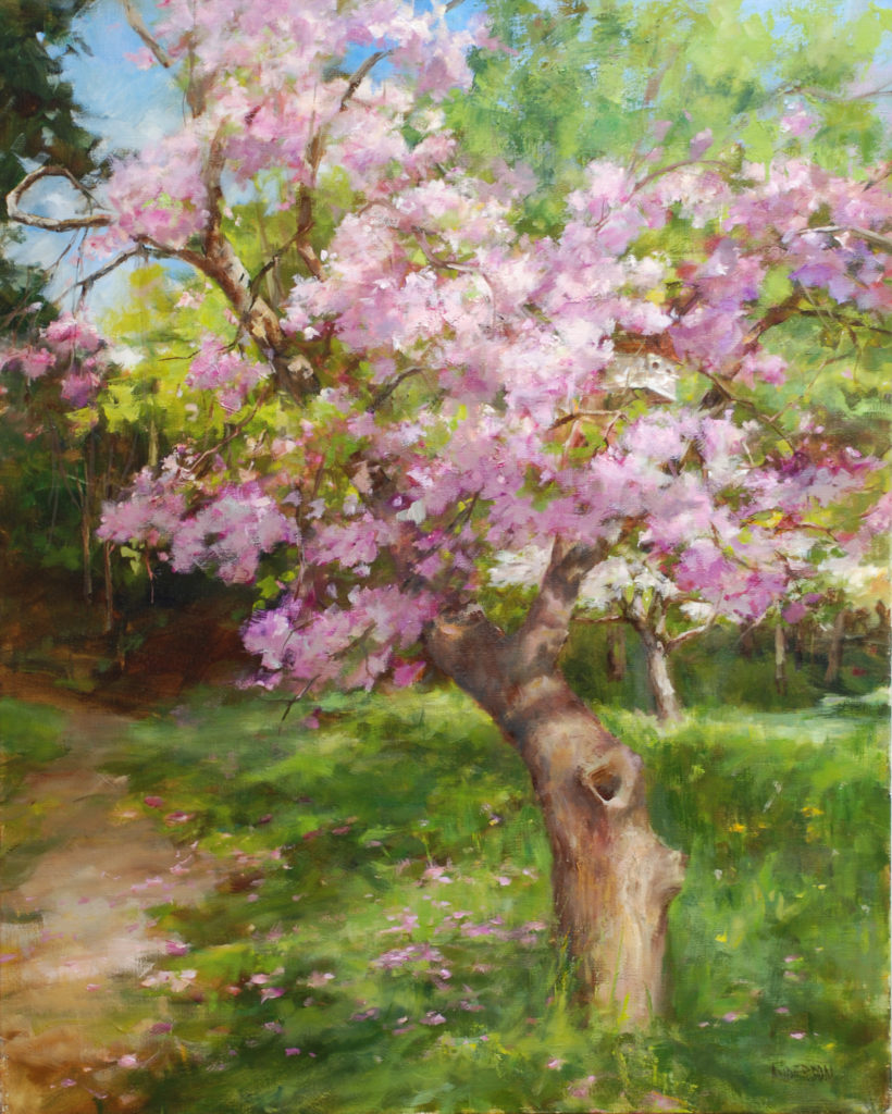
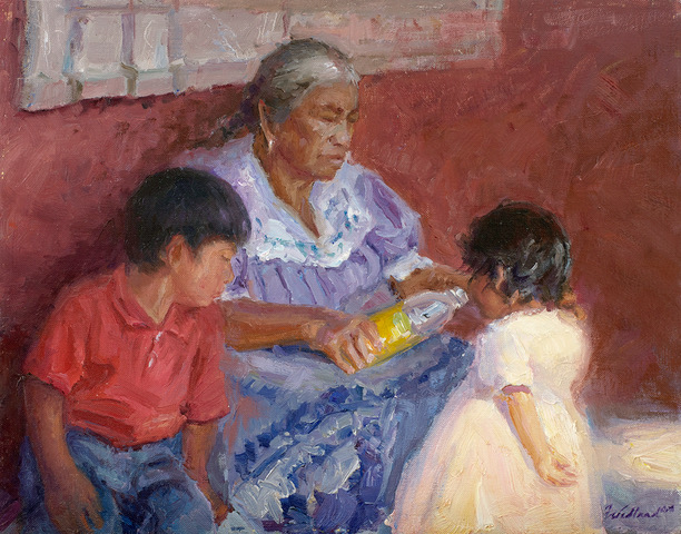
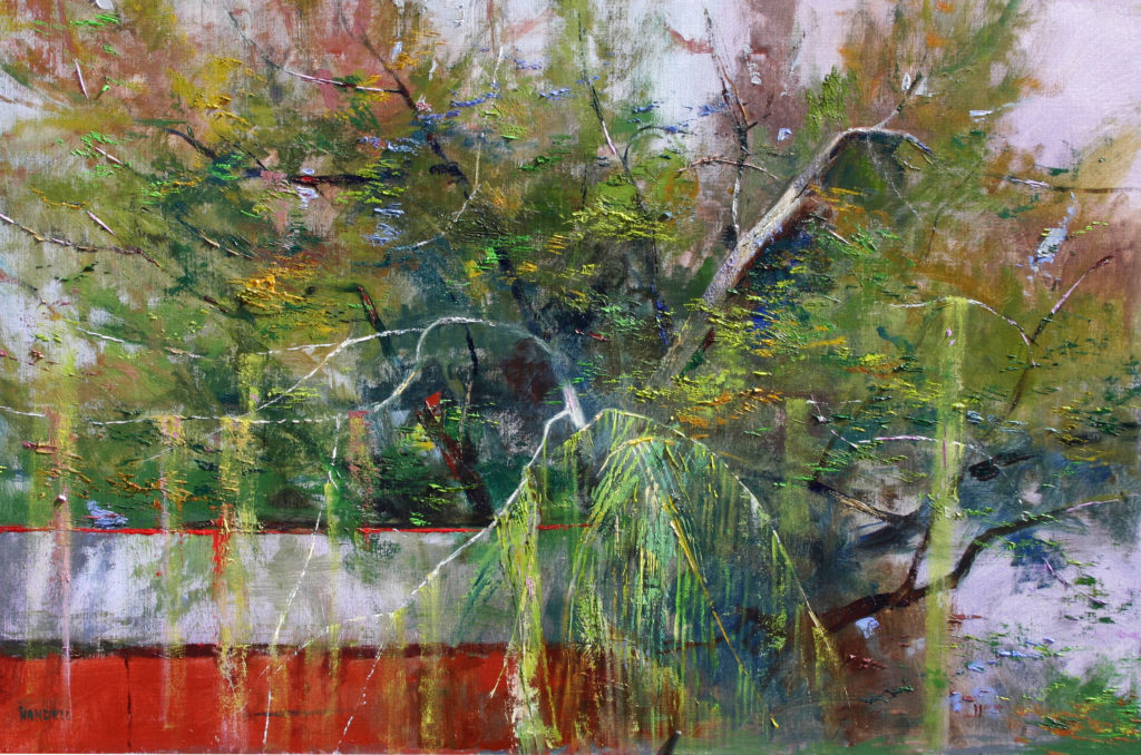
Kathy Anderson OPAM, “Bud’s Old Cherry Tree,” 30 x 24 in., $5,500, oil on canvas, 2020Howard Friedland OPAM, “La Abuela,” 11 x 14 in.,$2,500, oil on linen panel, 2020Albert Handell OPAM, “The Red Barn,” 24 X 36 in., $18,500, oil on linen, 2020
> Visit EricRhoads.com to learn about more opportunities for artists and art collectors, including retreats, international art trips, art conventions, and more.
> Sign up to receive Fine Art Today, our free weekly e-newsletter
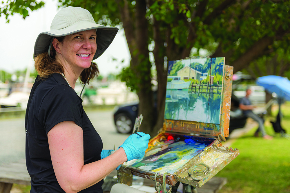
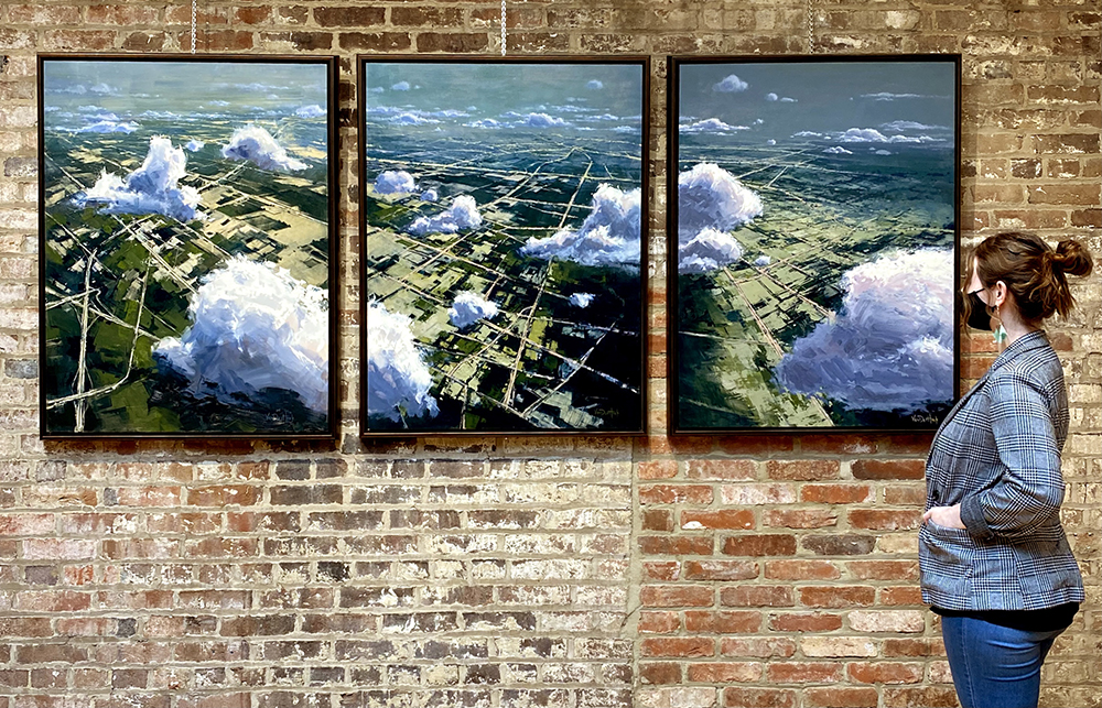
Kim VanDerHoek with her painting “Floating in the Blue.”
Kim VanDerHoek painting en plein air.
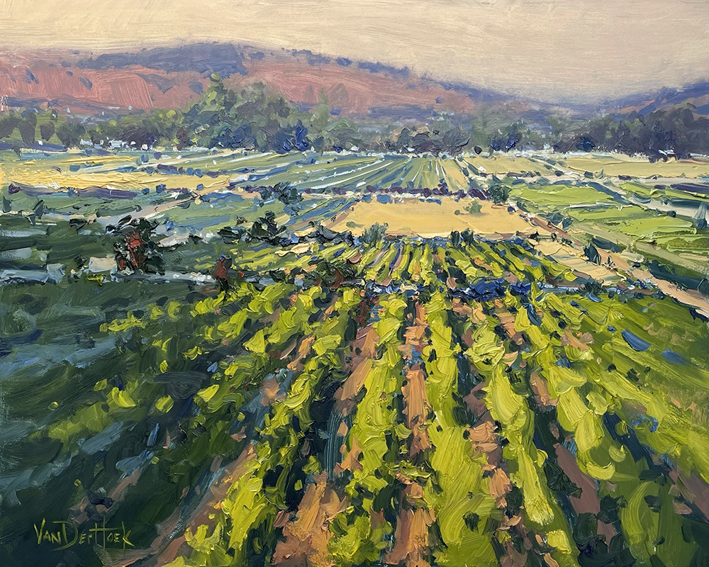
How did you get started and then develop your career?
Kim VanDerHoek: What’s the fastest way to learn how to draw or paint? The answer to that question is to work from life, which is why I began my painting journey by working in plein air. Prior to starting on that path, I finished my Bachelor of Arts degree in illustration then worked as a graphic designer. It wasn’t long after I began painting landscapes that I realized I wanted to make it a full-time job.
Since then, it’s been an ongoing learning process figuring out how to make a creative life profitable as well as developing my technical painting skills. Early in my career I was fortunate enough to meet the late artist Greg LaRock who became an unofficial mentor and good friend. His guidance was invaluable.
How do you describe success?
While I don’t want to discount the importance of finances, it’s not the only way to measure success. To me success is having a flexible schedule that enables me to be home to raise my kids, traveling to new locations to paint, having a career I’m passionate about, watching students advance their painting skills, and being creative every day.
How do you find inspiration?
Most often in museums and galleries. When I see other artist’s work in person, I’m always inspired to get back to my studio to try something new. Being open to receiving inspiration from unusual sources has enabled me to combine unlikely ideas into something creative, especially when it comes to marketing my work.
What is the best thing about being an artist?
Exploring an internal feeling and turning it into something visual. When I paint, I don’t have an end result in mind that’s set in stone. I like to have a general plan while allowing room for spontaneity to happen. That approach gives each painting a unique look. It can be a little problematic when I attempt to replicate a spontaneous moment, but I’ve learned and grown so much since cultivating this method that I haven’t looked back. It also keeps my work looking fresh while preventing me from becoming bored and too set in my ways.
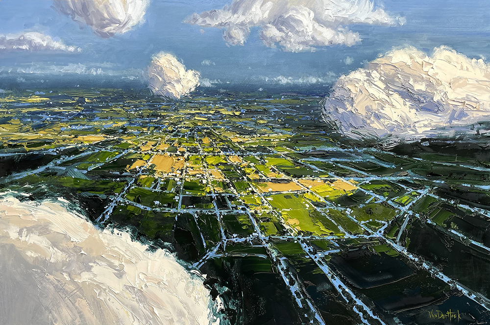
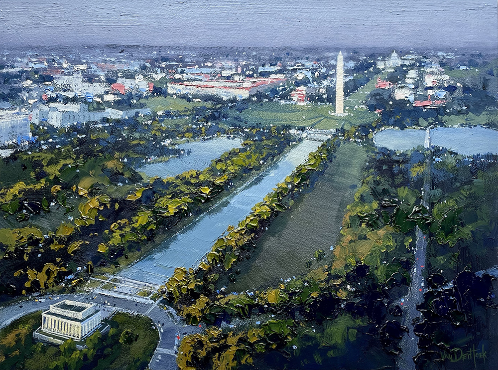
Kim VanDerHoek, “Cloud Triptych,” 40 x 90 in., oil, 2020Kim VanDerHoek, “Floating in the Blue,” 24 x 36 in., oil, 2021Kim VanDerHoek, “National Mall View,” 16 x 20 in., oil, 2021Kim VanDerHoek, “A New Season Begins,” 16 x 20 in., oil, 2021
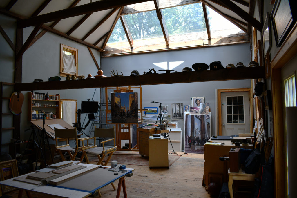
It's a safe bet that most inspiring art studios will have excellent north light, such as you see here in Garin's painting space.
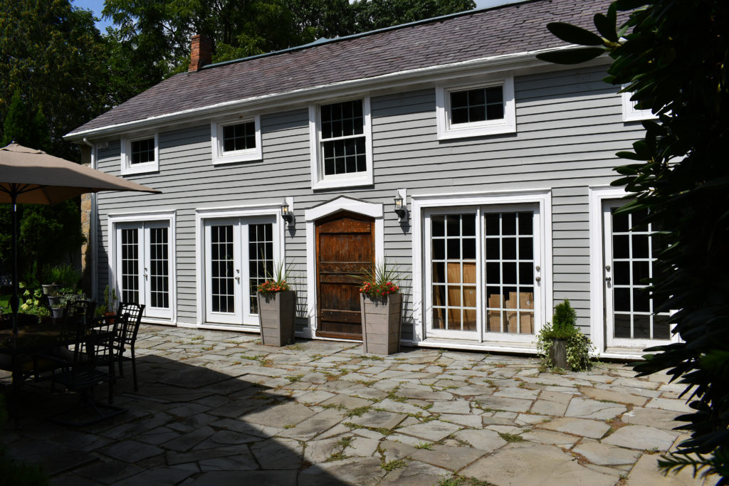
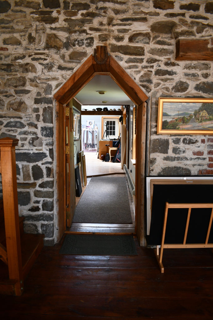
Inspiring art studios come in many shapes and sizes; Garin Baker’s space is unique in that he and his wife, Clara, have been restoring their 4500 square-foot property by converting the attached carriage house into the perfect artist haven.
“When we bought the place around 1991, it was pretty much ruined,” Garin said. “We went about the task of making the house livable over a couple of years for our young family, with the idea that eventually the carriage house would become my workspace.”
Until then, Garin’s art studio was in the dining room, which proved to be challenging. After about six years of renovating the main living areas of the house, Garin began renovating the carriage house, and over the years has converted it into one of the most inspiring art studios you’ll find.
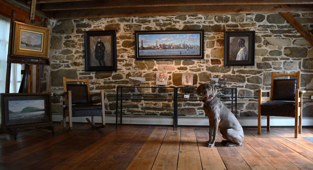
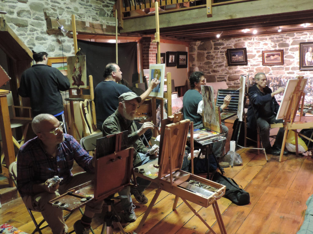
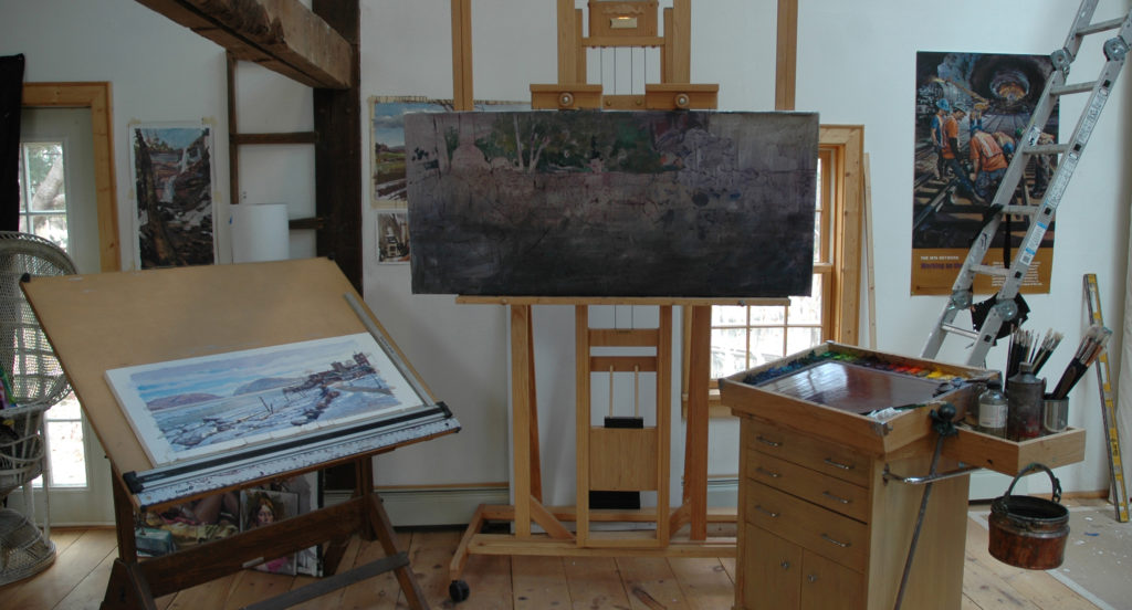
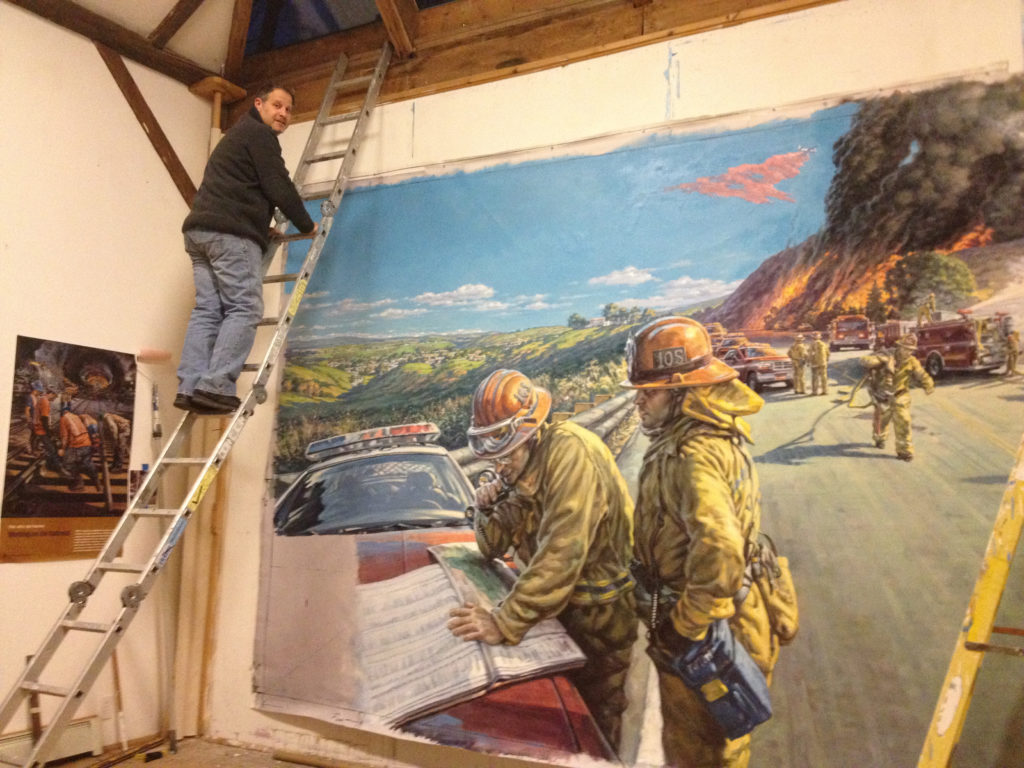
Here, Garin creates traditional paintings, works on large-scale murals, leads workshops, and does prep work for special projects, such as his recently released art video workshop, “Intuitive Figure Painting.”
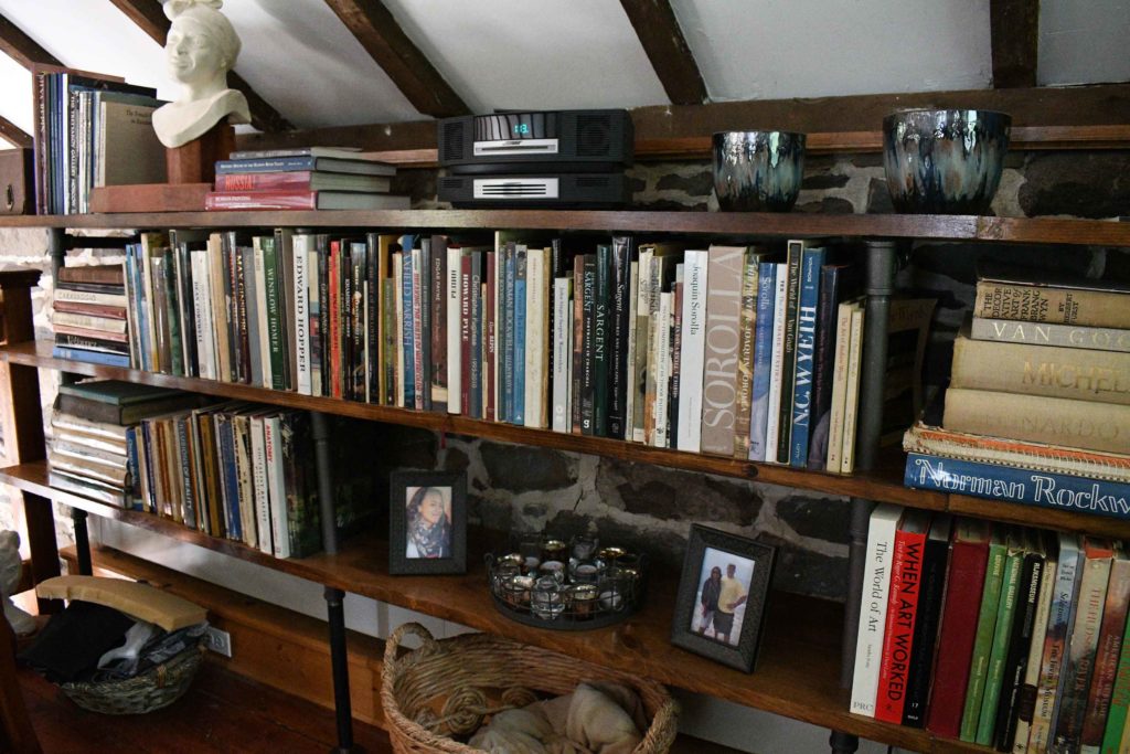
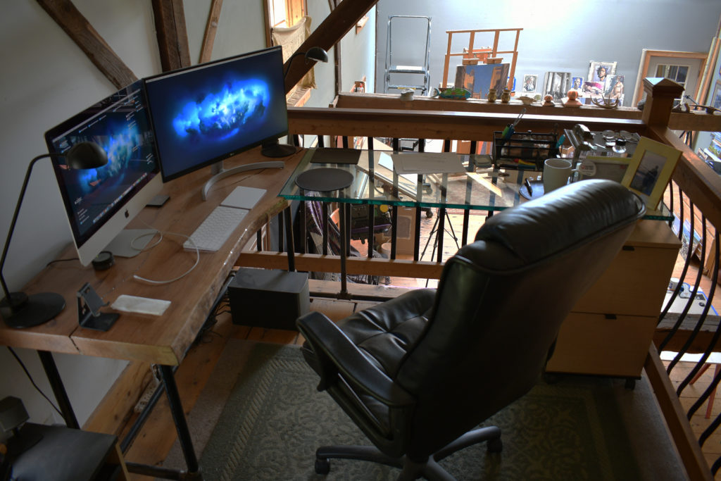
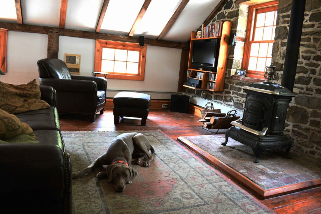
The front of the studioGarin’s four-legged studio buddy, HudsonArtist get-togethers in the studio / gallery spaceThe art book libraryThe office space Garin usesGarin’s easel and taboretIt was critical for Garin to have enough space in the studio to produce his large-scale murals.
So what’s the most important thing in an art studio? Some artists will say it’s their easel or taboret. For Garin, his taboret or office space might be a close second or third, but his top choice is an element that is less obvious to most.
“If I had to pick one thing, it would be the north light,” he said, admitting that he’s partial to this because of the amazing skylights he paints and teaches under at the Art Students League of New York. “The configuration of the north light in my art studio is really what enables me on a daily basis to really enjoy the space and use it to its fullest.”
He added that in addition to the perfect light, he greatly appreciates the wood stove for cozy warmth, the leather couch for naps as needed, and the art library for his continued studies of art. That said, “if I could give you a list, I would say in the hierarchy of it, in terms of actually working on a daily basis here, the north skylight is really the key.”
It’s a safe bet that most inspiring art studios will have excellent north light, such as you see here in Garin’s painting space.
Garin has been teaching art in New York City for more than 30 years. Looking back, he said there are things he wished he knew earlier, but not just as an artist. “Sometimes I feel like maybe we just calm down a bit,” he said. “We’re sometimes in fear of what would happen if we didn’t do something, like something terrible is going to happen. I guess, as you get older – I would hope – you get a little wiser.”
He added that it’s important, especially for young people and young artists, to “just chill,” and to contemplate what kind of work they want to be doing, but he’s included in that group. “I think, ‘what kind of things do I want to create with my time here?’ rather than constantly thinking ‘oh my gosh, I’ve got to do that, have that, and chase that.’”
Garin encourages internal investigation for artists to find the kind of work “that’s most nurturing to your soul rather than just trying to become the next sensation. What kind of stories might you want to tell through your work?”
It’s no surprise then, that one of the most beloved spaces in Garin’s studio is the loft, also known as the “chill space.”
Garin’s loft “chill space”
Lucky for us, Garin is teaching a new generation of artists to slow down, and enjoy the full experience of both life and art.
As part of our effort to continue to help artists and art galleries thrive, we’re proud to bring you this week’s “Virtual Gallery Walk.” Browse the artwork below and click the image itself to learn more about it, including how to contact the gallery.
Weathered the Storm by Sherry Egger, Mixed medium on aquaboard, 36 x 24 in.; Anderson Fine Art Gallery
Untitled, undated by Abie Harris (American, 1934), Acrylic on canvas, Emergent Landscapes: Mountains, Music, & Improvisation in the Paintings of Abie Harris, August 24, 2021 – January 15, 2022; Blowing Rock Art & History Museum
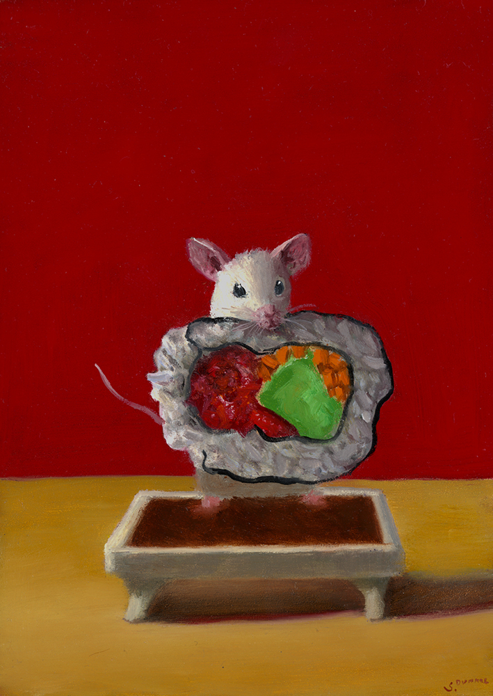
Soy Bath by Stuart Dunkel, Oil on panel, 7 x 5 in., Signed; Rehs Contemporary
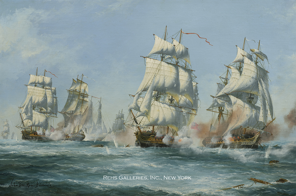
Action off Belfast by John Bentham-Dinsdale, Oil on canvas, 20 x 30 in., Signed; also signed and titled on the reverse; Rehs Galleries, Inc.
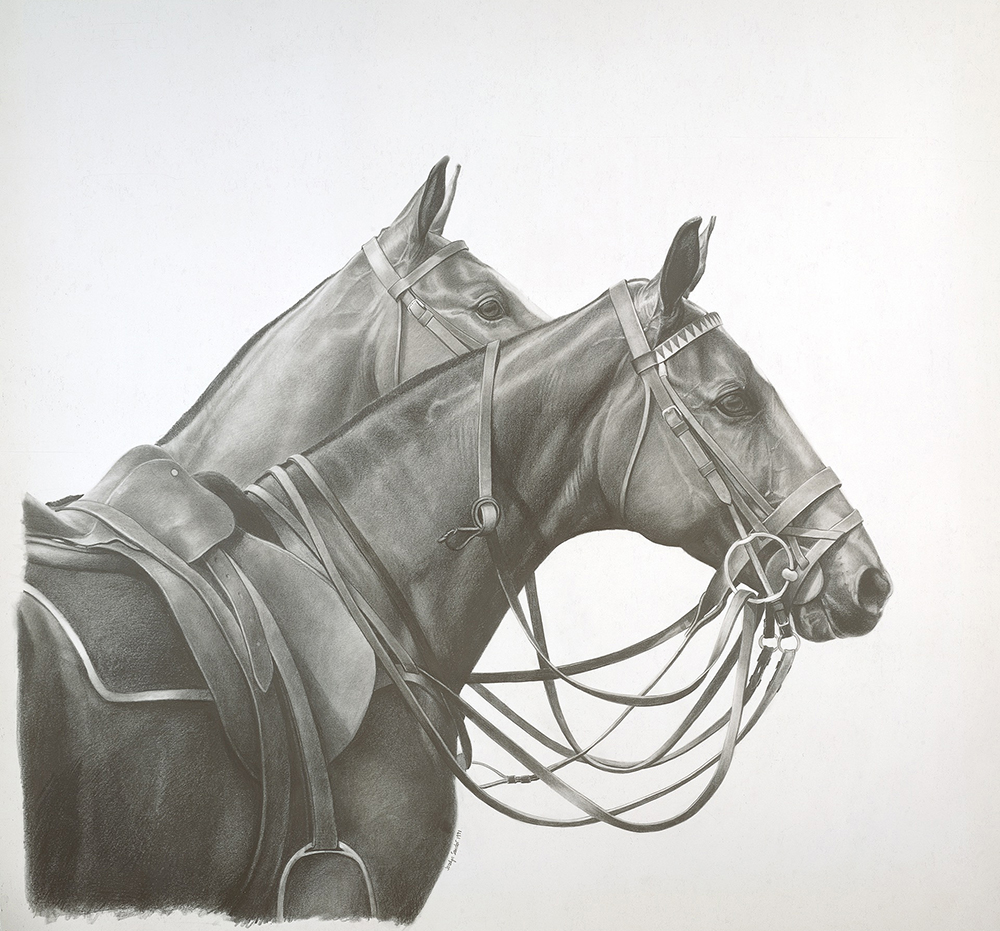
Two Ponies by Jocelyn Sandor Urban, Pencil, 34 x 34 in. (46 x 46 in. framed); Vermont Artisan Designs
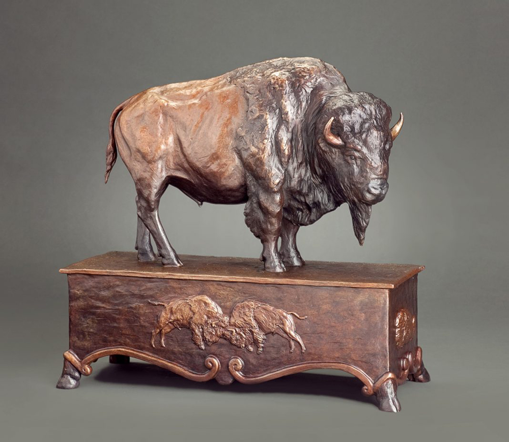
Patriarch Of The Plains by Mary Ross Buchholz, Bronze ed. of 20, 15 1/2 in. high; ArtzLine.com
Want to see your gallery featured in an upcoming Virtual Gallery Walk? Contact us at [email protected] to advertise today. Don’t delay, as spaces are first come, first served, and availability is limited.
Hugo Simberg (1873–1917), "Spring Evening, Ice Break," 1897, oil on canvas, 10 2/3 x 14 1/2 in., Finnish National Gallery / Ateneum Art Museum, Helsinki, photo: Hannu Aaltonen
On View:
Among Forests and Lakes
National Nordic Museum
Seattle, Washington nordicmuseum.org
through October 17, 2021
The National Nordic Museum (NNM) is the only North American venue for “Among Forests and Lakes: Landscape Masterpieces from the Finnish National Gallery,” an exhibition co-organized by NNM and Helsinki’s Ateneum Art Museum.
It offers a rare opportunity to see paintings, prints, and even video art created by Finland’s finest artists, few of whom are much known in the U.S. They include Fanny Churberg, Albert Edelfelt, Akseli Gallen-Kallela, Marja Helander, Eero Järnefelt, and Hugo Simberg. Together more than 50 scenes dating from the mid-19th century through today reveal how Finnish landscapists have helped form their young country’s sense of itself. The terrain represented spans 800 miles, from the Baltic coast heading north to the Arctic Ocean, even encompassing works related to the nomadic Sámi people.
This project has been co-curated by NNM deputy director Leslie Anderson with Hanne Selkokari and Anu Utriainen of the Ateneum.
> Visit EricRhoads.com to learn about more opportunities for artists and art collectors, including retreats, international art trips, art conventions, and more.
> Sign up to receive Fine Art Today, our free weekly e-newsletter
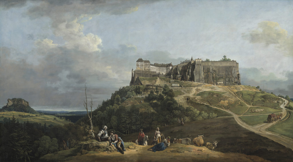
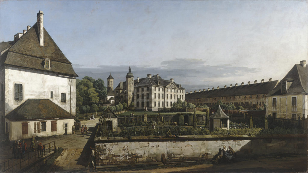
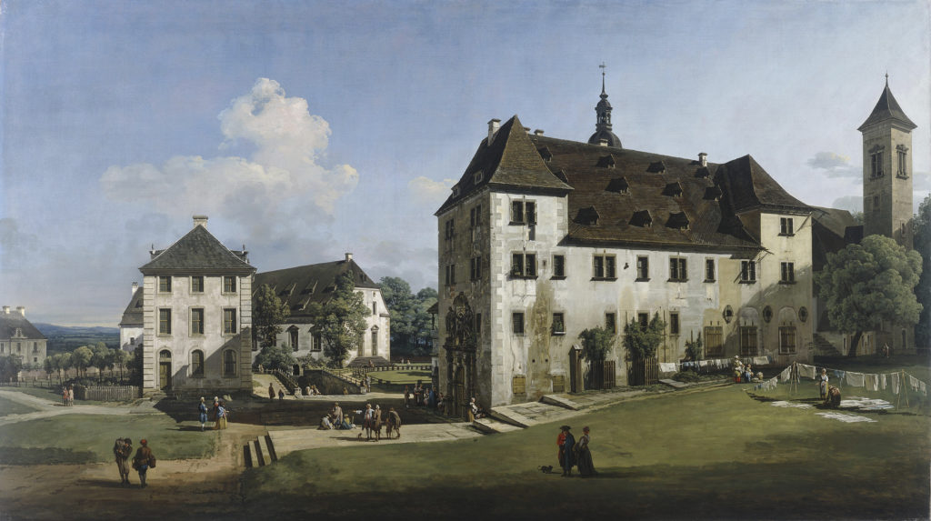
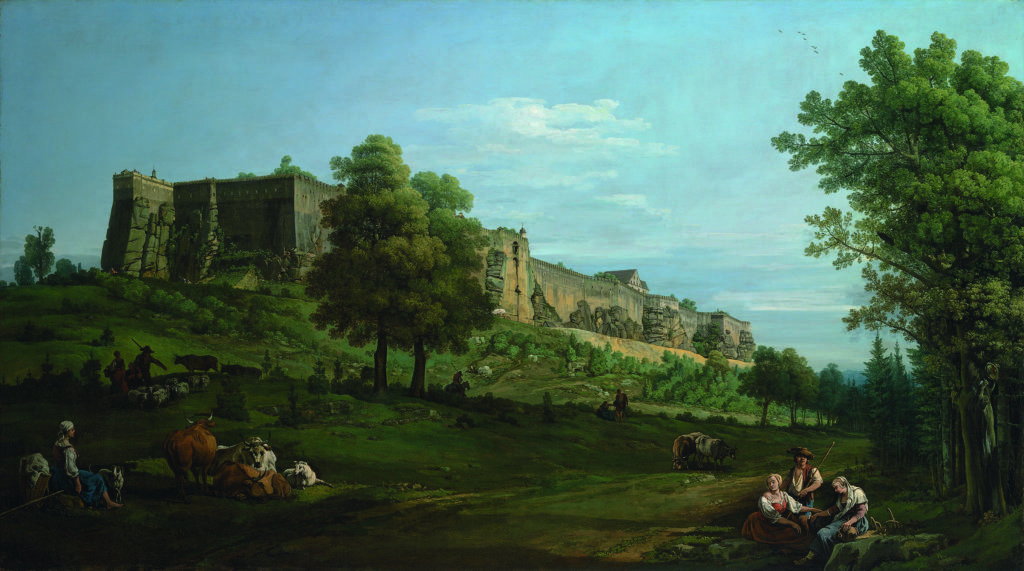
Through October 31, 2021, the National Gallery (London) will reunite five views of the fortress of Königstein for the first time in 250 years. These were painted by Bernardo Bellotto (1722–1780) at the peak of his career, when he was court painter in Dresden.
Once overlooked in favour of his more famous uncle and master Canaletto, with whom he trained in Venice, Bellotto is today recognised as one of the most distinctive artistic personalities of his age. This Room 1 exhibition will shine a spotlight on the National Gallery’s 2017 acquisition, “The Fortress of Königstein from the North” (1756-8) – the first 18th-century German view to enter the Collection.
August III (1696–1763), Elector of Saxony and King of Poland, commissioned these five paintings in about 1756 as part of a larger series of thirty views of Dresden and its surroundings. Bellotto received payment for the pictures in 1758 and, although completed, they were almost certainly never delivered to the elector due to the escalation of the Seven Years’ War. All five views were probably imported into Britain during Bellotto’s own lifetime and, until 1991, were to be found in three different British collections.
Today, “The Fortress of Königstein from the South” is in The Derby Collection, Knowsley Hall, Merseyside (the collection from which the National Gallery’s own view of the fortress also came), “Fortress of Königstein from the North-West” is in The National Gallery of Art, Washington D.C, and both “The Fortress of Königstein: Courtyard with the Brunnenhaus” and “The Fortress of Königstein: Courtyard with the Magdalenenburg” are in Manchester Art Gallery.
The fortress of Königstein, which is situated approximately 25 miles south-east of Dresden, appears largely unchanged from Bellotto’s own time. The five paintings – each of them 2 ½ metres wide – show the ancient fortress from outside its walls as well as from within. Bellotto succeeds in capturing both the drama and detail of this commanding site. Stand back and you can see the sharp, angular forms of the fortress but look closely and you can make out the crumbling stone walls, tiny soldiers on the ramparts and women hanging washing in the courtyard.
Applying what he had learnt in Venice to highly original panoramic depictions of northern Europe, Bellotto took the tradition of view painting in an entirely new direction. The works all demonstrate his outstanding technique and innovative approach to painting views, including the use of a camera obscura – the precursor of modern cameras – that helped Bellotto plan his compositions in minute detail.
Visitors to this Room 1 exhibition will be encouraged to take part in a dynamic viewing experience of the five paintings, moving from one monumental view to the next, as if moving around the site of the fortress itself, and will be able to appreciate the contrast between the fortress’s forbidding walls and the pastoral calm of its surroundings, with the hustle and bustle of everyday life on the inside, as seen in the courtyard views.
The exhibition is curated by Letizia Treves, the National Gallery James and Sarah Sassoon Curator of Later Italian, Spanish, and French 17th-century Paintings. She says: “In 2017 the National Gallery was finally able to acquire a painting that shows Bellotto’s exceptional skill and originality as a view painter. Since then, I have dreamt of reuniting his five views of the fortress of Königstein which, in their magnificence and grand scale, rightfully point to Bellotto being among the greatest view painters of his age.”
After London, a version of the exhibition will travel to Manchester Art Gallery, November 20, 2021 – February 27, 2022.
> Visit EricRhoads.com to learn about more opportunities for artists and art collectors, including retreats, international art trips, art conventions, and more.
> Sign up to receive Fine Art Today, our free weekly e-newsletter
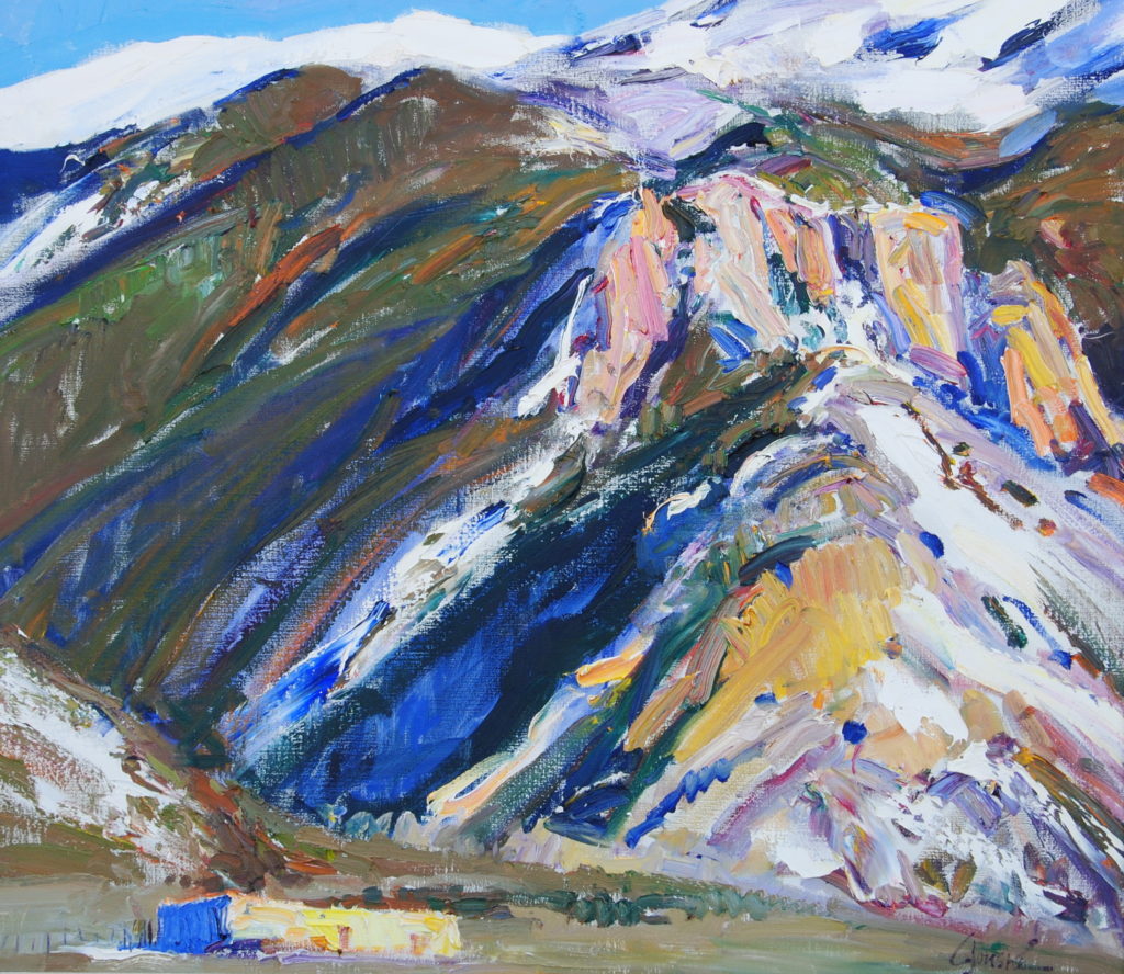
Walt Gonske, "Teewinot," 1987, oil on linen, 36 x 34 in.
Oil Paintings by Walt Gonske: “My best work comes when I’m able to give up control … Then the painting takes on a life of its own.”
Walt Gonske Looks Back
BY KELLY COMPTON
Born in Newark, New Jersey, Walt Gonske grew up in Irvington nearby. After three years of art school in Newark, he worked for advertising agencies in New Jersey before another three years of study, this time in Manhattan with the legendary painter-illustrator-muralist Frank J. Reilly (1906–1967). Reilly advised his pupils not to expect to make a living as fine artists until, in his words, “you have a few gray hairs.”
Rather, he suggested they become illustrators to keep their skills sharp, so Gonske duly began freelancing in men’s fashion advertising in 1967. He recalls picking up garments at the agency or store one day and delivering his illustrations of them the next morning. This may not have been “high” art, but it was, in Gonske’s view, “a good experience of working under pressure.”
In 1971, Gonske visited his sister in Taos and promptly fell in love with New Mexico: “Having grown up in New Jersey,” he recalls, “I was fascinated by the quality of light at 7,000 feet.” He was also surprised that galleries in Santa Fe and Taos were selling so much representational art — something nearly impossible to find back in Manhattan. (Traditional modes never fully disappeared in the American West, fortunately.)
“I thought about how wonderful it might be to live in Taos and paint landscapes, maybe even sell some,” Gonske recalls. In Taos he took photos of the spectacular scenery all around, brought them back to New York, and painted watercolors from them. His sister found an Albuquerque gallery willing to accept them on consignment, and soon “I received a check for $66.67, my two-thirds share from the sale of a full sheet watercolor. Hot damn! A fine art check: that was all it took. I said, ‘I’m out of here!’” The timing was fortuitous, as fashion illustration was rapidly being replaced by photography.
So, early in 1972, when he was 29, Gonske moved to New Mexico, and began the new life he still leads today. At first, he was not prepared for the slower pace: When an Albuquerque gallery wanted him to mount a solo show, “I assumed the owner would want 30 works by the end of the week.” Happily, he had much longer to create them. Gonske continued to paint watercolors from photos, which sold very well, but in 1974 he shifted to oils, refusing to supply his (suddenly unhappy) galleries with more watercolors. This was a difficult phase, but he survived it.
The Switch to Oil Paintings
Gonske’s first oil paintings were made in the studio, but at some point he got a French easel and began working outdoors. “In 1985,” he says, “I bought a van with an extended fiberglass top that allowed me to stand inside and paint out one of the three opened windows. After making that first painting, I remember thinking, ‘This is terrific. I’m out of the wind, rain, and snow, my eyes are protected from the sun’s glare, and nobody bothers me.’” Gonske is now on his fourth “paintmobile,” in which he creates both studies and larger, finished canvases.
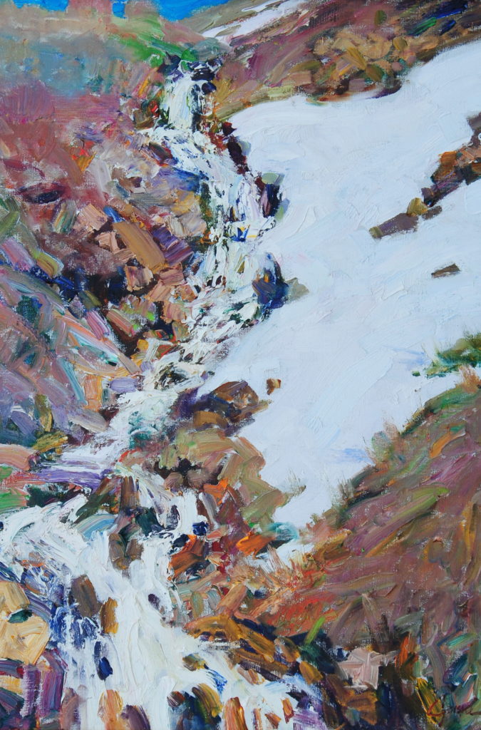
Walt Gonske, “Along the Sangre de Cristo Range,” 1991, oil on linen, 35 x 40 in.
FEELING INTO PAINT
When admiring Gonske’s oil paintings, many viewers struggle to describe what they see, or who his work reminds them of. It is brilliantly colored, highly expressive plein air imagery, of course, yet there’s something faintly recognizable about the handling — not derivative at all, just somehow connected to the past.
The answer eventually becomes clear — Nicolai Fechin (1881–1955), the great Russian-born painter who lived in Taos during the late 1920s and early 1930s. In 1966 Reilly had sent Gonske and other students to see a Fechin show in New York, an experience that made a powerful impression on the young man.
That visit occurred six years before Gonske settled in Taos, where the Russian’s home and studio are now the Taos Art Museum.
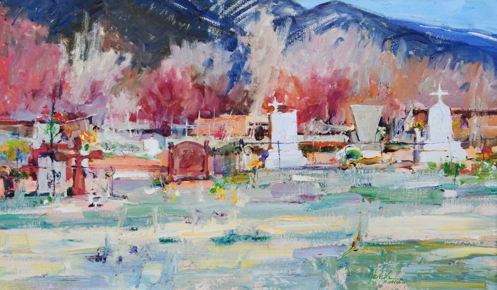
Walt Gonske, “Campo Santo,” 1979, oil on linen, 18 x 30 in.
About his technique, Gonske muses, “I went to art school to learn the rules of drawing and painting. After many years of developing skills and acquiring knowledge, I know what I will get as a finished product if I control the process. What I don’t know is where it will lead if I give up control. Now the idea is just the first impulse. From then onward, improvisation takes over.
“The end result is not about that first idea, but instead a record of all those impulses along the way. Each stroke of paint carries emotion and power. I work in a loose, painterly style in part because I want the viewer to see the process and not hide it behind ‘finish’ —for the viewer to maybe even feel how a particular piece of paint was put down. My goal is not to show what I know, but what I feel.
“The more intensely I can express emotion through paint about the subject, the more likely the viewer will respond. My best work comes when I’m able to give up control, to trust my impulses. Then the painting takes on a life of its own.”
Walt Gonske, “Spring,” 1986, oil on linen, 32 x 22 in.
> Visit EricRhoads.com to learn about more opportunities for artists and art collectors, including retreats, international art trips, art conventions, and more.
> Sign up to receive Fine Art Today, our free weekly e-newsletter featuring contemporary oil paintings, pastels, acrylics, and sculptures for art collectors
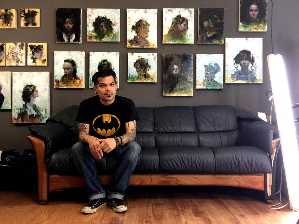
John Wentz, Untitled, 13 x 17 inches, Oil on canvas
“How do they do that?” Enjoy a behind-the-scenes look into how the process of creating art, including the “unfinished” pieces, becomes the finished work for this portrait / figure painter.
More Than Process
BY JOHN WENTZ
At some point I realized I have always had a preconceived idea of how I wanted a painting to look. Even before I bought or stretched the canvas, I knew what I was trying to achieve with the finished result. Sketches were really just for placement and values. None of the linear elements, or the graphite medium for that matter, would make it into the painting. It was just shorthand. After all, it was how I was taught and what I thought painting was.
In school, we were taught by copying the old masters and appropriating the new ones. By this method, you were painting with an end game in mind. This, of course, is by no means easy, but the process involved is really just the road to getting somewhere. This was fine for awhile, but in time I began to feel that my experience in painting was lacking something.
One day, feeling unsatisfied with my work, I turned to an old sketchbook. On the first page I read some words I had jotted down: “Style is embedded in process.” This was a quote from Chuck Close that I had completely forgotten about, and it couldn’t have found its way back into my life at a better moment. It wasn’t that I was looking for a style, but I realized that maybe I was putting the cart before the horse. Maybe it would be interesting to focus only on process and see where the painting went.
With this shift, I found myself looking only at abstract art. Non-objective and Abstract Expressionist artists can be very process oriented and experimental with their tools and mediums. Their works are treasure troves of inspiration in mark-making vocabulary for us representational artists.
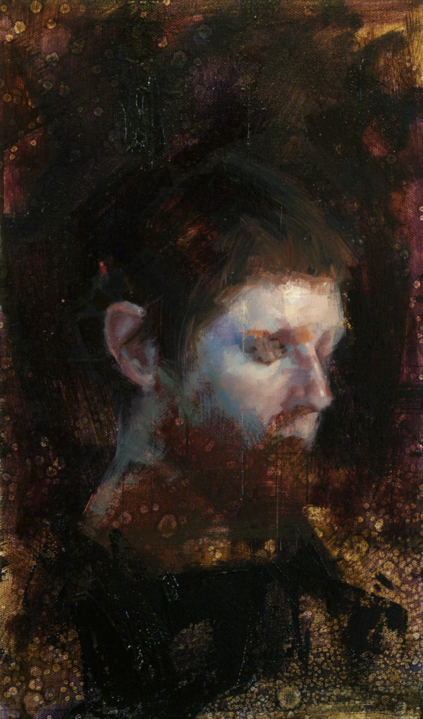
John Wentz, “Archetype,” 9 x 16 inches, Oil on canvas
I quickly became obsessed with my materials and their possibilities in a way I never had before. Standard brushes were set aside for more unconventional tools. I even began working with paintings on the ground as opposed to on an easel. At first, it was a total disaster. However, I experienced something I hadn’t in a long time: fun, and a sense of exploration and discovery.
I began with portraits and went in with the idea of economy. I wanted to use as little as possible to get a result. I limited my palette to primaries and some earth tones and only allowed myself two brushes and a palette knife. With limited choices, I found that each step in the process was creative exploration and problem solving.
I started with my familiar approach, toning the canvas an earth tone, but tried adding textures to make just that one stage interesting. I dropped medium onto the wet surface of umbers and siennas as little pools of splotches appeared, making the canvas look like a topographic map. Because these initial layers were transparent paint, my preliminary drawing and compositional grids showed through like a ghostly blueprint.
This stage alone began to look like an interesting abstract painting, with each step of the process adding depth and design. As I began painting the figure, I found that I wasn’t as much concerned with the model and likeness as I was about enjoying the interplay between the opacity of this new layer and the transparency of the first layer. In this sense, it became very abstract—the process and the materials predicated every decision I was making, rather than the end game of depicting a human in paint. Because of this, it didn’t seem necessary to paint the model in her entirety. In fact, it seemed more interesting to leave features out or to abstract them.
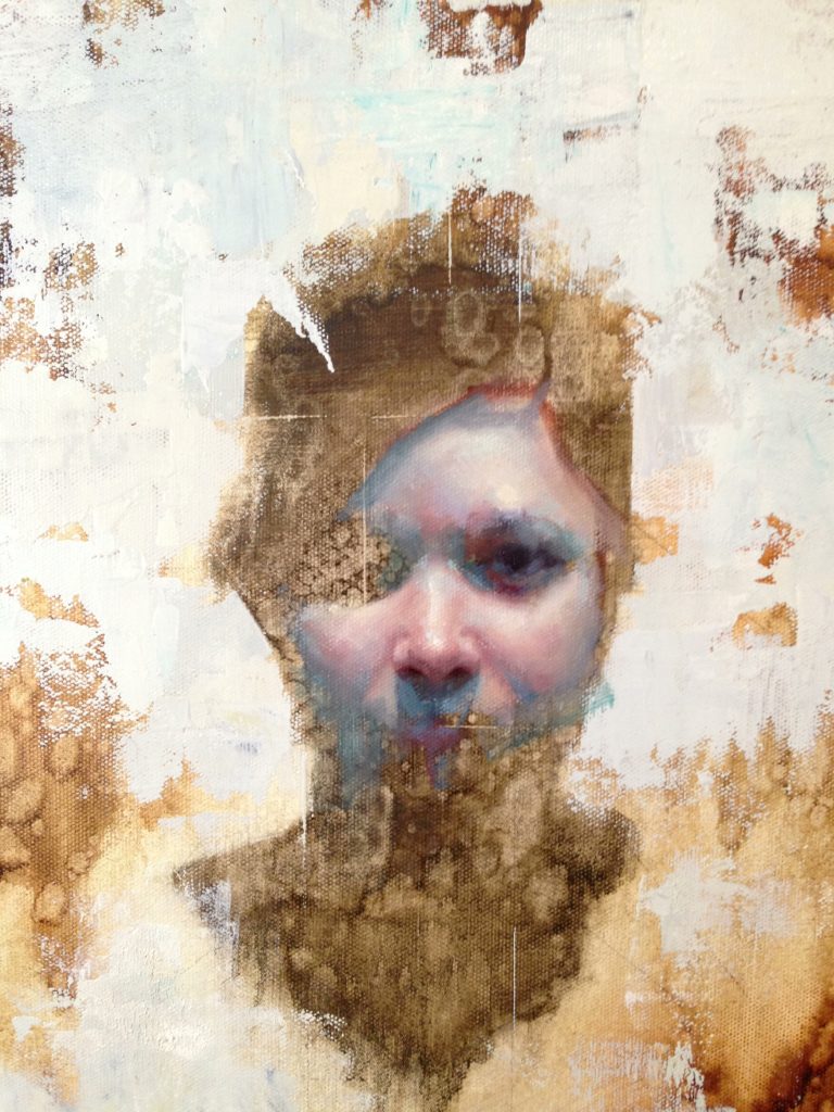
John Wentz, “Becca,”14 x 8 inches, Oil on canvas
This was a matter of repeatedly stepping back to judge all of the information as a whole, taking into account all of the formal qualities of balance, value pattern, focal point, etc. The composition grew and evolved with each new mark and passage.
I later came to believe that leaving information out, unfinished or abstracted, invites the viewer to participate in the image, just as simplifying does. But also disclosing less information allows the viewer to project themselves onto the picture, in some sense making them “vulnerable” and open to experience something more personal and emotional.
As I continued painting, the process evolved into this routine of establish, lose, re-establish. In continuing to measure, I found myself needing a line from the compositional grid, so I would “redraw” with a palette knife. This resulted in a few sharp lines like notes on a staff paper, which added to the picture in some way that I knew I just liked. It was later that I realized what I enjoy is to have the history of the process as the final image, with each mark having a purpose or intention.
Abstracted painting by John Wentz, 12 x 12 in.
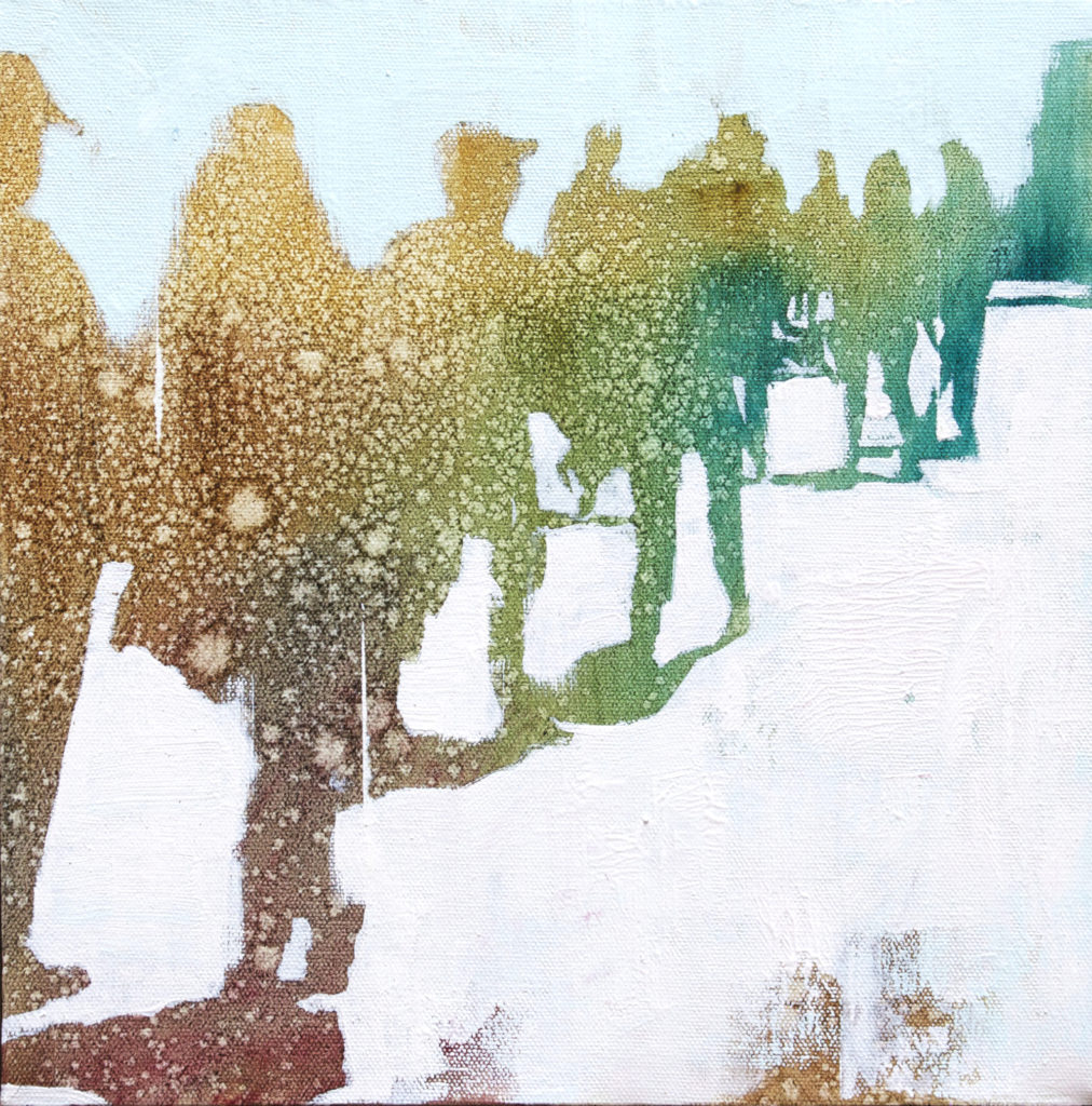
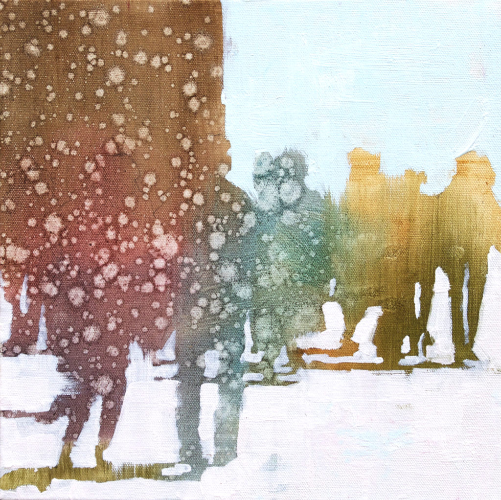
After experimenting with painting the head, I found that I really wanted to work with more of the figure, especially multi-figure. People in groups have always fascinated me both psychologically and as form. I thought the cluster of shapes would lend itself to interesting compositions with this process and allow for more experimentation with materials and paint application.
The experience with multiple figures was quite a challenge, but the process was much the same. So I tried to play around again. This time for the initial layers, I tried using a variety of colors. I had many tubes of paint that I had never used so I thought, why not? Fully saturated blues and greens found their way in with the umbers and siennas.
Abstracted painting by John Wentz, 12 x 12 in.
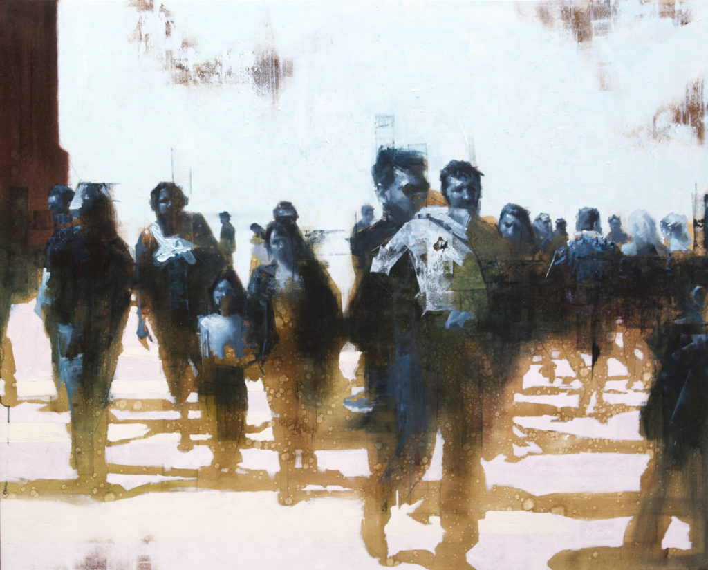
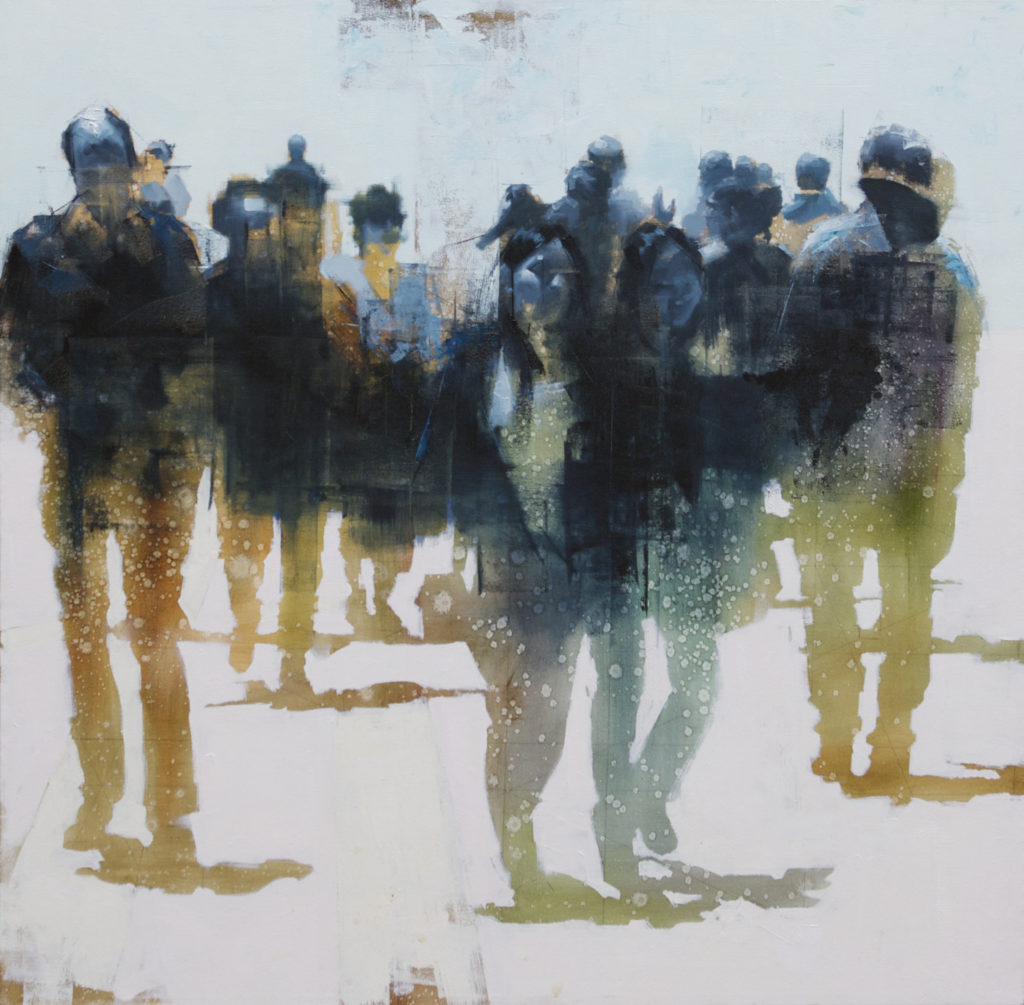
I worked first with some small studies, a palette knife and a house painting brush. I enjoyed the look of this stage so much I couldn’t bring myself to paint over the figures. Instead, I just painted the background in heavy impasto layers of gray-greens, which contrasted nicely with the transparent negative shapes of clustered figures weaving in and out of each other on the city streets. It seemed to reflect the feeling of losing one’s identity amongst a big crowd in a city. We are no longer the individual, but just a part of a group. This led to a series of paintings I titled “Abstractions.”
Since the “Abstractions” were small—12 x 12 inches—I decided to see how this would translate to larger pieces. 40”x40” seemed like a good starting place. With the variety of colors in the toning stage, standard flesh tones didn’t seem to work as well on this larger scale. Again, in the spirit of simplification, I limited my palette to a cool blue-black. The warm undertone had a very appealing contrast against the cool foreground of figures.
It also had this quality of “illumination” that I really liked. Still, the idea of color in the figures still appealed to me, so I switched the first layers back to earth tones and let the process grow from there. This built into a series of works I called “Passages.” Here are some examples:
John Wentz, “Passages 4,” 58 x 47 inches, Oil on canvasJohn Wentz, “Passages 2,” 43 x 42 inches, Oil on canvas
At the same time, I was taking this new approach of toning in saturated color back to portraits. The intimacy and quietness of portraiture has always appealed to me. But what’s really interesting to me about a portrait is that not only is it a portrait of a person, but also a portrait of an emotion, so to speak. There’s something about the modesty of a solitary person that can be very powerful.
Due to the variety of colors and their strengths in the initial toning stage, it was still difficult to see my preliminary graphite drawing. Instead of redrawing with a paintbrush, I decided to use a palette knife and pure black. The harsh, razor-sharp lines were fascinating and abrupt. It felt more like sculpting than drawing. I then tried using oil pastels to find quick gestures, which further evolved the process of establish, lose, re-establish—adding something new and interesting every time.
For the figure itself, I found my favorite brushes were brights. The rectangular strokes they left were harshly geometrical and a great contrast to the circular splotches in the undertone and the curvilinear liveliness of the gesture lines in oil pastel. If not applying with a brush, then passages were applied with the scraping of a palette knife, building thickness and texture. In building up the figure, I was more interested in the physicality of the paint and its tactile sensibility.
The fact that it was a person was almost secondary; a likeness, tertiary. The idea of how much detail or information to disclose was determined by the relationship of each stage to the other, building everything up like an abstract painting.
Each stage of the process became its own passage with line playing against tone, transparency against opacity, texture against smoothness and warm against cool. This led to another body of work: “Imprints.”
With each piece I really began to appreciate and trust pure process. It felt that in each stage there was an honest form of expression. In a sense it’s constructing rules for yourself. You create your own problems, and then find your own solutions. The process became part of the finished work; each stage left “unfinished” is a history of the process. Yet it all comes together in some sort of symphony of contrasts. And as finished pieces, I suppose there is a certain “style” that has been found, but that was almost incidental. At least, it wasn’t the goal. As the journey can be the destination, the process can be the art.
> Visit EricRhoads.com to learn about more opportunities for artists and art collectors, including retreats, international art trips, art conventions, and more.
> Sign up to receive Fine Art Today, our free weekly e-newsletter
Fill your mind with useful art stories, the latest trends, upcoming art shows, top artists, and more. Subscribe to Fine Art Today, from the publishers of Fine Art Connoisseur magazine.