Home Blog Page 473

Watercolor Takes Flight

0

Fine Art Today traveled to rural eastern North Carolina for a chat with accomplished watercolorist Pat Holscher, whose pictures of seagulls, pelicans, and more feel right at home next to the Pamlico River.
 
The character and individuality of birds have fascinated and inspired some of history’s greatest minds. John James Audubon sought to meticulously categorize all the birds of America, while Leonardo da Vinci was nearly obsessed with how birds take flight. For artist Pat Holscher, the maritime birds native to eastern North Carolina have provided endless enjoyment and, more recently, artistic inspiration.


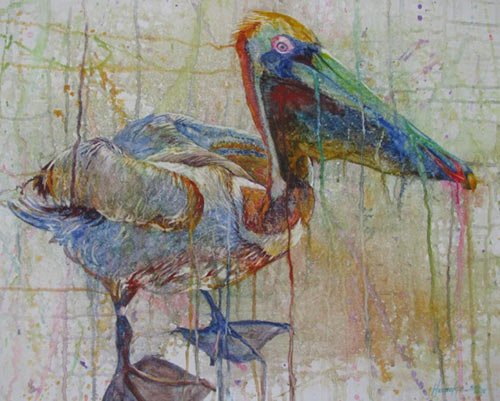
Pat Holscher, “Harvey,” watercolor on gessoed paper, (c) Pat Holscher 2015.


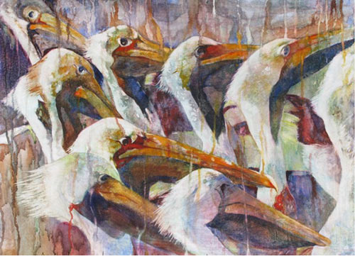
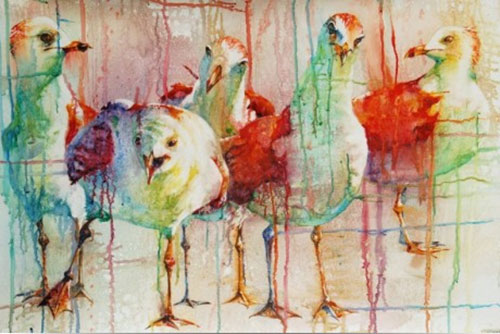
Pat Holscher, “Heads Up!,” watercolor on gessoed paper, 20 x 30 in. (c) Pat Holscher 2015.
 

Immediately noticeable in Holscher’s work is the fluidity of the watercolor’s application, which displays a vibrancy and vivid saturation of blended, runny color. Holscher prefers working on gessoed paper, which allows her to achieve this desired effect. The gesso, in addition to reducing the absorbency of the paper, allows the colors to sit on the surface, resulting in stronger hues. The gesso also leaves a textured finish on the paper, a feature Holscher loves to use to enhance her subjects’ naturalism.


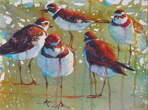
Pat Holscher, “Plover Playtime,” watercolor on gessoed paper, 11 x 15 in. (c) Pat Holscher 2015.

 
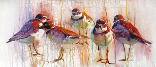
For Holscher, a watercolor begins with a connection. Using photography as a means to capture a bustling flock of birds, Holscher selects one bird that displays a certain individuality of character and pose, whom she calls “the show stopper.” This bird could be used a number of times in different pictures, but typically forms a vital part of the composition, inviting the viewer into the piece. Holscher also includes a number of other birds in her paintings, creating a rhythmic play and kinetic movement that adds vitality and visual interest. One truly gets a sense of the coordinated movements that birds can make as they eagerly await the next piece of bread or fish to come their way.


Pat Holscher, “Running in Circles,” watercolor on gessoed paper, 15 x 35 in. (c) Pat Holscher 2015.


Pat Holscher, “Family Dynamics,” watercolor on gessoed paper, 26 x 41 in. (c) Pat Holscher 2015.
 

 Although the birds within paintings such as “Geese Headed South” and “Heads Up” haven’t always been her subjects, they have gripped the regional market and earned Holscher national and international recognition. Works by Holscher can be found up and down the North Carolina Intracoastal Waterway. The Village Gallery, The Carterate Contemporary, and The Lemonade Gallery are only a few of the establishments that carry Holscher’s work. In 2008, Holscher won first place in the Watercolor Society of North Carolina’s Annual Exhibition. The American Watercolor Society awarded the Gold Medal to Holscher’s “Family Dynamics” in 2009. Works by Holscher have also been juried into the Shenzhen Watercolor Biennial in China the last two years.
 
To learn more, visit Pat Holscher.
 
This article was featured in Fine Art Today, a weekly e-newsletter from Fine Art Connoisseur magazine. To start receiving Fine Art Today for free, click here.

Big Game Safari

0

Capturing the magnificent beauty of big game in Africa does not require bullets or cameras, only paint and canvas.
 
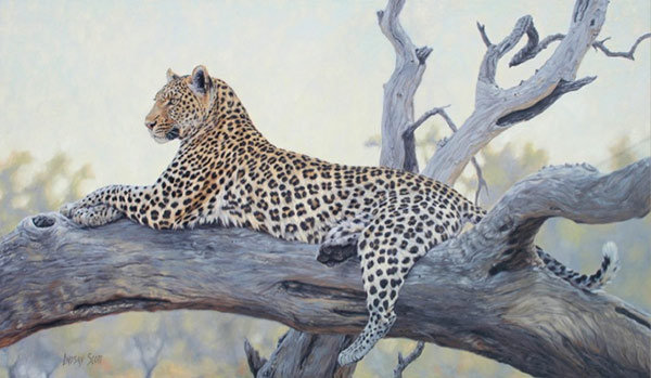
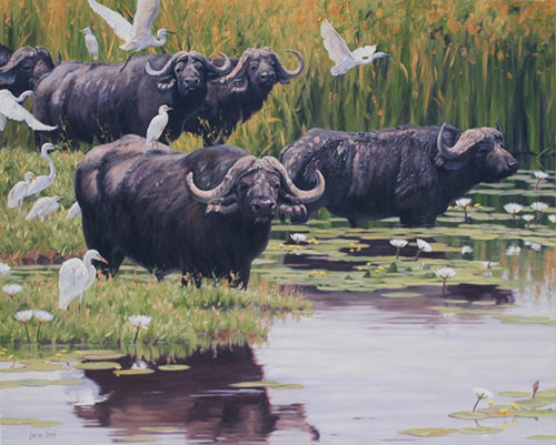
World-renowned wildlife painter Lindsay Scott has an uncanny ability to capture the majestic beauty of Africa’s biggest game animals. Collectors now have a chance to own one of Scott’s pictures through Insight Gallery in Fredericksburg, Texas. Scott, born and raised in Zimbabwe, cultivated an early love for Africa and its wildlife, a sensitivity and appreciation that surfaces in her paintings. “Anticipating the Night” features a noble leopard — one of the most rare of the big game animals — reclining on a large dead tree branch.


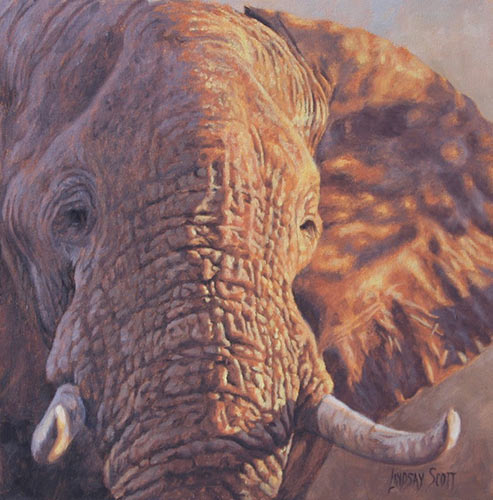
Lindsay Scott, “Dappled in Light,” oil on canvas, 12 x 12 in. Insight Gallery


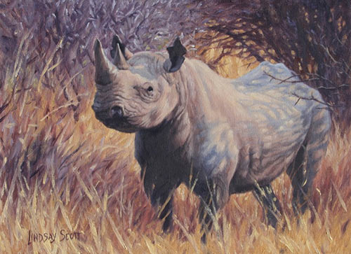
Lindsay Scott, “In the Thicket,” oil on canvas, 11 x 15 in. Insight Gallery
 

There is a photographic exactitude with Scott’s works, but she does not lose her painterly touch, reminding the viewer of the artwork’s production and heightening one’s appreciation of Scott’s talent. “In the Thicket” is another outstanding example, which displays more of Scott’s brushwork. Large, full strokes characterize the grasses in the foreground, which move up the composition with a fiery energy. The subject — a brooding rhinoceros — stands at center, its piercing gaze meeting ours.
 

Lindsay Scott, “By Still Waters,” oil on canvas, 40 x 50 in. Insight Gallery

 
Scott has been the recipient of numerous awards, including the Award of Excellence from the Society of Animal Artists and Best of Show at the Pacific Rim Wildlife Art Show.
 
To learn more, visit Insight Gallery or Lindsay Scott.
 
This article was featured in Fine Art Today, a weekly e-newsletter from Fine Art Connoisseur magazine. To start receiving Fine Art Today for free, click here.
 

August 2: A Trip “Down Under”

0

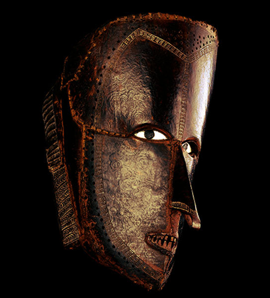
The British Museum is currently showing the first major exhibition of Austrailian aboriginal artifacts in the United Kingdom.

“Indigenous Austrailia: Enduring Civilization” opened on April 3 and will be on view until August 2.

To learn more, visit The British Museum.

July 20: Emile Vernon and Others

0

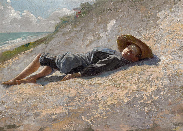
Paintings by Emile Vernon, Antonio Gargiullo, Emille Van Marcke, and J. Charles Arter feature in an upcoming auction.

Bonhams presents the “Art + Decor” sale on July 20 in San Francisco, beginning at 9 a.m. pacific.

To view the full catalogue, visit Bonhams.

Antiquity Uncovered

0

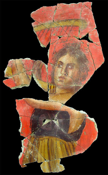
Archaeologists in Arles, France, have exposed an intact Roman mural, the first of its kind ever discovered outside the Italian peninsula.
 
The massive eruption of Mt. Vesuvius in 79 CE is known for the destruction and loss of life it caused within the Roman settlements of Pompeii and Herculaneum. Yet this natural disaster also provided a wealth of knowledge about 1st-century Roman culture due to the remarkable preservation of everyday objects and, more specifically, murals that adorned the cities’ public and domestic structures. Indeed, a large portion of what historians know about Roman painting comes directly from Pompeii and Herculaneum.
 

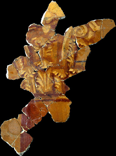
Fragment of Roman mural displaying Corinthian capital, circa 70-20 BCE, Arles Museum of Antiques

 
Roman murals have also been discovered, in varying degrees of preservation, throughout the Italian peninsula, but it is rare to find them, let alone in good condition. That story evolved recently when a team of archaeologists in Arles, France, exposed a full mural within a large villa near a parking lot in the Trinquetaille district of the historic city. Experts have compared its quality and size to those preserved in Pompeii.
 
After being buried for nearly two millennia, fragments of the mural were photographed and released by the Museum of Ancient Arles. A beautiful example is shown here, displaying a dressed female plucking the strings of a harp. She contrasts with the sharp vermilion-red background, which has retained its vibrancy. Also noticeable are the blue and purple hues in the woman’s blouse  — expensive pigments for the period. Other images released show the painted capitals of ornate Corinthian columns  — a popular practice in Roman mural painting.
 
Equally as exciting is the fact that a villa nearby remains unexcavated, leaving archaeologists eagerly wondering what treasures remain there. A new dig is scheduled for 2016.
 
To learn more, visit The Telegraph.
 
This article was featured in Fine Art Today, a weekly e-newsletter from Fine Art Connoisseur magazine. To start receiving Fine Art Today for free, click here

From the Surreal to the Classical

0

The figure takes center stage as a range of artists  — each with his or her own style and medium  — participate in a tantalizing group exhibition.
 

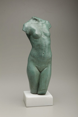
Julia Levitina, “Spring,” bronze, 14 1/2 x 6 1/2 x 3 1/2 in. Axelle Fine Arts Galerie


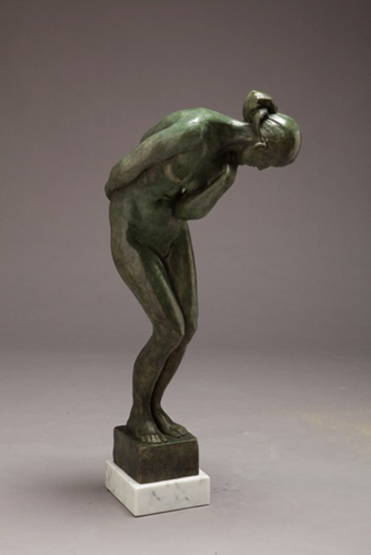
Julia Levitina, “Caryatid,” bronze, 32 x 6 1/2 x 8 in. Axelle Fine Arts Galerie

 
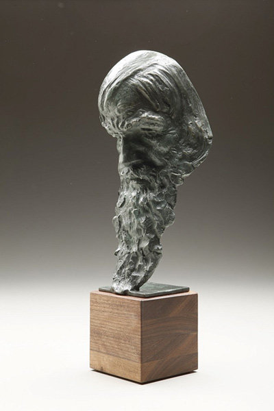
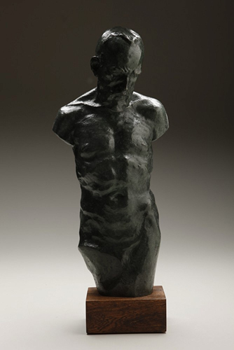
Ukrainian sculptor Julia Levitina is introduced as the newest addition to the Axelle Fine Arts Galerie roster of artists during its annual “Summer Group Show” in New York City. Her piece titled “Old Man & Sea” has a physiognomic attention and expressive modeling that would leave Auguste Rodin smiling. There is a sense of bodily discovery  — what the artist terms “insight”  — also evident in works such as “Spring” and “Caryatid,” which have a classical simplicity of pose. Particularly attractive is Levitina’s range of technique, from the irregular, expressive surface of “Heraclitus” to the smoothed, polished finish of “Spring.”
 

Julia Levitina, “Heraclitus,” bronze, 18 x 7 x 5 in. Axelle Fine Arts Galerie


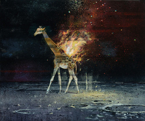
Ric Roux-Fontaine, “Souvenir de l’inconnu,” mixed media on canvas, 26 1/4 x 31 1/2 in.
Axelle Fine Arts Galerie

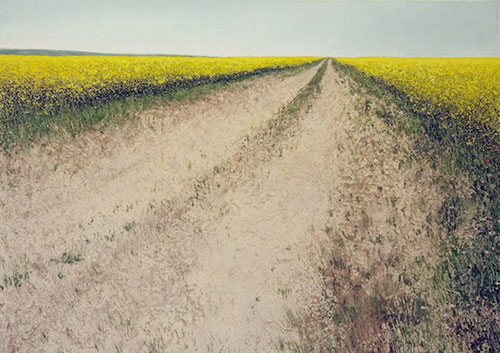
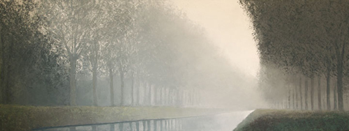
The classical features of Levitina’s sculptures are counterbalanced by the paintings of Ric Roux-Fontaine. Pictures such as “Souvenir de l’inconnu,” a mixed media painting displaying a flaming giraffe walking on a moon-like surface, and “Goya’s Dream,” have a surrealist element that adds a bit of fun and playfulness to the show. The range of work continues within the gorgeous naturalistic landscapes of Frenchman Benoît Trimborn.  While the figure is absent in much of Trimborn’s art, the presence of humanity is often implicit. In “Chemin au colza,” the viewer stands on the edge of a long dirt road that slices through a well-groomed field of yellow flowers. The perspective and scale have been imagined so that the road encompasses most of the canvas. Similarly, we are drawn into the composition by a man-made canal in “Canal dans le brouillard,” a quiet scene that plays with our perception of rhythm as the pattern of trees recedes into the distance.
 

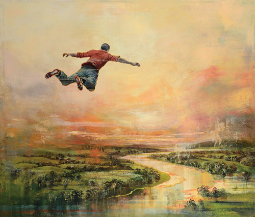
Ric Roux-Fontaine, “Goya’s Dream,” mixed media on canvas, 47 1/4 x 55 in. Axelle Fine Arts Galerie


Benoît Trimborn, “Chemin au colza,” oil on canvas, 45 x 68 in. Axelle Fine Arts Galerie


Benoît Trimborn, “Canal dans le brouillard,” oil on canvas, 30 x 79 in. Axelle Fine Arts Galerie

Other artists featured in the show include Albert Hadjiganev, Quentin Garel, Patrick Pietropoli, Beth Carter, and Goxwa.

“Summer Group Show” opened on July 1 and will be on view until September 13.

To learn more, visit Axelle Fine Arts Galerie.

This article was featured in Fine Art Today, a weekly e-newsletter from Fine Art Connoisseur magazine. To start receiving Fine Art Today for free, click here.


Freedom of Expression

0

Artist Jan Dilenschneider and France’s Galerie Pierre-Alain Challier team up for a show of her newest oils.

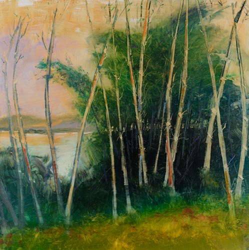
“Sun Through the Trees” has a beautiful iridescence and arrangement of color relationships that characterize well the paintings of Jan Dilenschneider. With a high horizon line, the artist has focused on the subtle nuances of reflected light at the bookends of the day. Dilenschneider also employs a sophisticated range of touch, juxtaposing soft and dry horizontal strokes with an upper layer of pronounced, expressive knife work.
 

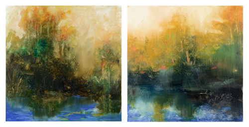
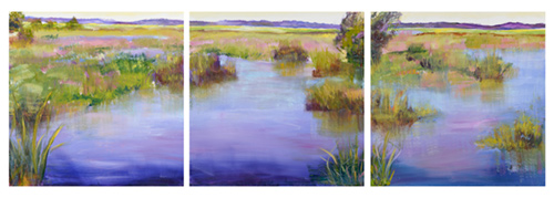
Jan Dilenschneider, “Green Trees in Golden Mist 1 & 2,” oil on canvas, 36 x 36 (each), (c) Jan Dilenschneider

 
Thirty paintings hang in Dilenschneider’s current exhibition, “Freedom of Expression,” at Galerie Pierre-Alain Challier in Paris. Through this body of work, the artist celebrates the artistic independence and capability afforded by pure expression. For Dilenschneider, color interactions are key to conveying her emotions during artistic experiences. “If words could say everything, there would be no need for painters,” writes Dilenschneider. “Painting is expression, making visible my emotion, sharing that emotion without words  — only paint. The sensibility and mood in my work are expressed via color relationships either sharply contrasting or close in hue. I put color next to color and hope you can see them sing together.”


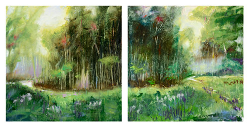
Jan Dilenschneider, “Sun Awakening 1 & 2,” oil on canvas, 36 x 36 in. (each), (c) Jan Dilenschneider


Jan Dilenschneider, “Bamboo Trees on Golden Skies,” oil on canvas, 36 x 36 in. (c) Jan Dilenschneider

 
“Green Trees in Golden Mist 1 & 2” are striking in this regard. The artist has painted two separate canvases of equal size, adding a new element to her creative equation. Although her forms appear less defined here, the viewer notices more directly the play of stroke, variety of tools used, and broader balancing of warm and cool hues. Further, the canvases seem to combine as one scene, but closer inspection reveals intelligent details that distinguish the pictures.


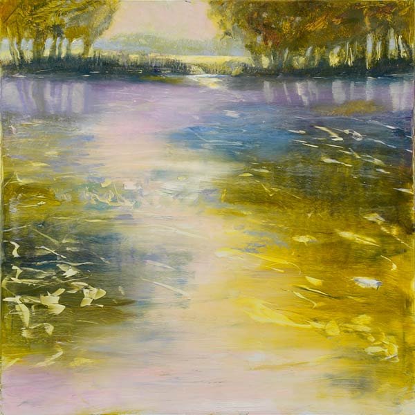
Jan Dilenschneider, “Gently Moving Waters 1, 2, & 3,” oil on canvas, 30 x 30 in. (each), (c) Jan Dilenschneider

 
Dilenschneider also imbues her work with political connotations, which reflect her passions for nature conservation and democracy. The freedom of choice, seen through her expressive mark-making and ability to hover between representation and abstraction, is a vital current that runs beneath each of her pictures.
 
“Freedom of Expression” opened on July 7 and will hang until July 28.
 
To learn more, visit Galerie Pierre-Alain Challier or Jan Dilenschneider.
 
This article was featured in Fine Art Today, a weekly e-newsletter from Fine Art Connoisseur magazine. To start receiving Fine Art Today for free, click here.

Thomas Jefferson Kitts

0

Fine Art Today recently caught up with the painter for an in-depth inquiry into the man, the artist, and his paintings. His responses were attentive, complete, and sure to intrigue our readers.

Fine Art Today: Share with us a little about your creative process, what inspires you, and how a subject is chosen. Is there a moment as you’re hiking or out in nature when a painting’s subject presents itself to you?

Thomas Kitts: For the most part I paint directly from life, so what I usually respond to first is not so much the scene or subject itself but the quality of the light that illuminates it. Thus, the same subject will feel alive or dead to me depending upon the time of day, or year, or existing environmental conditions. Over the years, I have become interested in natural light because color is light, and the interaction of color is what ultimately becomes my subject. In truth, I am as happy painting the harbor in Vernazza, Italy, as I am painting a free-range herd of pigs rooting through a pile of garbage in a Third World country. The essential thing is that the light is interesting, and most of the time the best light occurs on the margins of the day. In addition, I find the ephemerality of natural light endlessly fascinating, so I will often choose a scene or subject knowing there is little time to capture it. I don’t know why I do this to myself except that I want to keep challenging myself with new ways of working and with new ideas; and all of that comes from the world, not me.
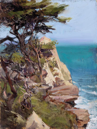
 

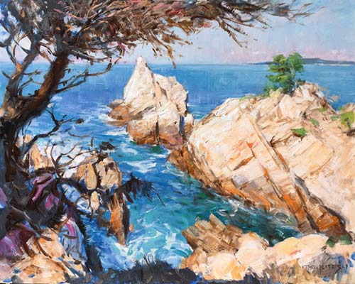
Thomas Jefferson Kitts, “On Point,” oil on linen panel, 16 x 12 in. (c) Thomas Jefferson Kitts

 
Fine Art Today recently came across a telling quote from art critic and historian Jean Stern discussing Kitts’s use of light. Stern does a superb job of encapsulating how Kitts employs and manipulates light, so we felt it deserved quotation in full:
 
“No matter what the location of the landscape is, or the climate under which it is painted, Kitts’s work captures the true, natural feel of the light that encompasses that landscape. As it has been with the plein air painters of the past, Kitts has had to endure numerous challenges and difficulties in his determination to get the true effect of fluid, natural light in his paintings. The result is for us the viewer to enjoy, and that is simply the monumental beauty of his work.”

From the foreword in the artist’s monograph:
“Painting the Light” by Jean Stern,
Executive Director of the Irvine Museum
 
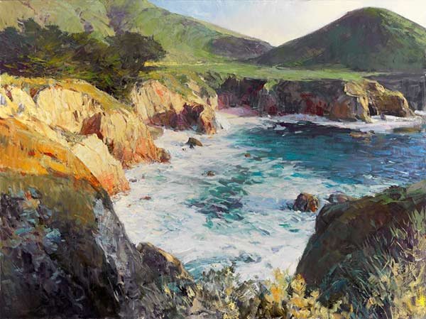
Thomas Jefferson Kitts, “The Pinnacle,” oil on linen, 16 x 20 in. (c) Thomas Jefferson Kitts 
 

FAT: How do you react or respond to these moments of inspiration?

TK: Honestly, most of the time somewhat frantically. When I see or stumble across a moment that resonates with me, I rush in and immediately begin to paint, often with little planning or forethought. Some deliberation and calculation would be helpful, of course, but I view both to be a luxury when I am working at the speed of life. My best paintings result from being reactive or, as I also describe it, when I enter a flow and just start pushing the paint around. However, having said that, if I do run into trouble, I drop out of the flow and try to resolve the issue before returning to the flow. Or that painting dies right then and there and I move on.

FAT: What is your primary goal in art-making?

TK: Any goals are hard to explain, but I will try. You will rarely find an explicit message or narrative in my work. I am more interested in discovering and exploring the unexpected and even prosaic moments when the world reveals itself. This can be a risky way to find a subject because you must walk around until you see something engaging  — which can be utterly uplifting when you find something, or a complete waste of time when you don’t. Yet, as a technician and craftsman (and I try to be both), there are goals and challenges I set and pursue with every painting, and I hope like hell I can meet or surpass them. So if anyone evaluates my oeuvre by subject matter alone, they can become distracted because the thread that ties it all together isn’t so obvious.

FAT: What artists, historical or contemporary, have influenced your work the most and why? Is it purely aesthetic, or conceptual? Both? 

TK: I’ve had the good fortune of being inoculated with an extensive dose of art history as an undergraduate, both with classical and modern content, and I remain interested in learning about more artists and movements as I go. I once had a friend who was a painter, a published art historian, and the chair of an influential MFA painting program tell me, “I know a lot about art, but I don’t know what I like,” and I’ve always taken that comment to heart. So knowledge is good, and I have developed a wide range of tastes. My problem has become more about staying focused on the artists who can help me directly. I can be moved to tears by a Bouguereau or Motherwell, excited by the bravura brushwork in a Sargent or Kline, or become analytical upon seeing a Velásquez or Holbein. But no artist or single group of painters excites me more than the Russian Itinerants: Levitan, Repin, and Shishkin, to mention a few.
 
Ultimately, I look for the things that bind an artist’s work together. I then look for things that bind a group of artists together in a movement or school. Then, I focus on the universals, as they may appear, as much as possible. Because when a formally trained painter paints, he is having a conversation with the artists who preceded him, and hopefully, the artists who will come after. 
 
There are contemporary painters I admire, but I try not to spend too much time looking at their work. Not because I think any less of them, but because I want to retain the clarity of my own voice and the direction I have chosen. Every day I discover yet another amazing contemporary painter, and there are times when there seems to be an infinite supply. So now I feel it is best to hunker down and produce my own work and follow my own path in my own way.
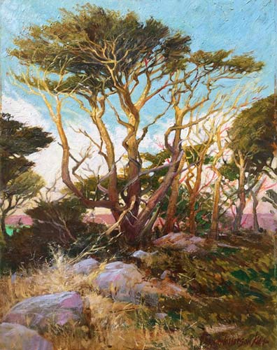


Thomas Jefferson Kitts, “Lit from Below,” oil on linen, 20 x 16 in. (c) Thomas Jefferson Kitts
 

FAT: Your surfaces are entrancing, with undulating troughs and ridges that communicate such energy.  How important is the surface/mark-making to you and what do you try to communicate with your work that is independent of composition, value, color, etc.? 

TK: Thank you. You have hit on two points that have become increasingly important to me as I mature. Paint handling is unpredictable, and I think of how I push it around the same way a jazz player thinks about improvising a solo. You have to train and become skillful yet open to the vagaries of the media, and things rarely happen the same way twice. I want the surface of my work to remain lively, and I want the gestural movement created by the push and pull of the paint to convey an emotional immediacy. However, I am not poking at the canvas willy-nilly. There is thought and intent and conscious control as I try to surprise the viewer. Brushwork can be compared to calligraphy. It is personal and should reveal the hand of the artist. Most paintings by mature artists can be properly attributed by brushwork alone.
 
Here is a statement prepared by Kitts recently:
“When people view my work I want them to see a painting, not a photograph. I want them to experience a surface rife with color, texture, and movement, but also feel connected to the reality that gave birth to the art. Up close, I want the surface to visually explode. From a distance, I want it to reassemble into a whole and create a plausible sense of space and form. But most of all, I want my audience to appreciate why I try to paint from life as much as possible  — and thus share our wonder at the world.” 

FAT: You mentioned in your teaching philosophy that one must never underestimate how much you can learn from your students.  Can you share with us an important moment when teaching led to a profound learning experience for you?

TK: I had the privilege of teaching painting and drawing and chairing a department at a small private art school from 1990 to 2000; while it didn’t pay much, it was a wonderful life experience. It was a time and place when I could test artistic ideas with hundreds of students and assess the success. In addition, I was able to work with those students over a considerable period of time, over three years, actually, and this encouraged me to look at art with a longer perspective. I felt honored that my students let me help shape their voices and not simply copy or emulate mine.

FAT: Where will Thomas Jefferson Kitts and his art be in 10 years?  How do you see your evolution continuing and what do you hope to achieve in the future?
 
TK: That is difficult to predict with any degree of confidence, but if my present interests and trajectory hold, I expect to keep taking risks with my work. One of the nicest things a fellow professional has ever said about me is that I take risks. Meaning, I will chance making a major change to a painting without knowing if it will lift or crash the work. (How do you know unless you give it a try?) Or I will invest significant time in a subject without knowing if it will appeal to a collector. (Who am I painting for, them or me?) Or simply, I will start something without knowing if it can be completed in the time available. (Others have done it, can I?) I took my friend’s statement to heart because I know it is tempting to develop a routine, method, or shtick that will permit me to crank out manneristic work lacking much meaning or substance.
 
But to try and answer your question more directly, let me share one final artist quote. This one comes from Hokusai at the age of 95: “If Heaven granted me another five years, I could have become a real artist.”
 
You never stop. You keep on and let everything else settle behind you in your wake.
 
Thomas Jefferson Kitts has a new exhibition showing from August 1 through September 30 at James J. Rieser Fine Art in Carmel, California.
 
To learn more, visit Thomas Kitts.
 
This article was featured in Fine Art Today, a weekly e-newsletter from Fine Art Connoisseur magazine. To start receiving Fine Art Today for free, click here.

Celebrating a Genius

0

The largest exhibition of Leonardo da Vinci ever organized in Italy continues to inspire in the waning days of its magnificent four-month run.

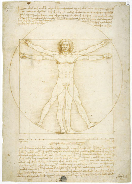
Highlighting Da Vinci’s ability to combine scientific thought with creative talent, art, and technology, the Palazzo Reale in Milan has brought together the largest exhibition of the artist’s paintings, drawings, sculptures, and manuscripts ever assembled in Italy. Included is arguably the most famous drawing in the world: “The Vitruvian Man.” This drawing, which displays a nude male with four arms and legs inscribed within a circle and square, has long symbolized Renaissance ideology. Completing it in 1490, Da Vinci sought to create the perfect human form based on ideal proportion and the “golden ratio” (1.618). The drawing is rarely shown in public or even loaned by the Gallerie dell’Accademia in Venice.
 

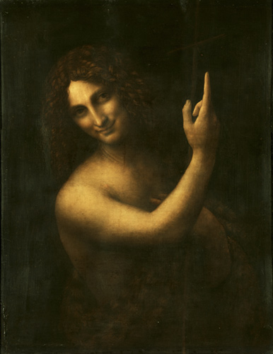
Leonardo da Vinci, “Saint John the Baptist,” circa 1513-1516, oil on walnut panel, 27 x 22 in. Musée du Louvre

 
Also featured in the exhibition are three masterpieces from Paris’s Musée du Louvre: “St. John the Baptist,” “The Annunciation,” and “La Belle Ferronniére”  — all of which have recently been restored.
 
“Leonardo Da Vinci” opened on April 15 and will be on view until July 19. 
 
To learn more, visit Palazzo Reale.
 
This article was featured in Fine Art Today, a weekly e-newsletter from Fine Art Connoisseur magazine. To start receiving Fine Art Today for free, click here.

Waves of Hokusai

0

A comprehensive exhibition seeks to survey the legacy and career of the first Japanese artist to be internationally recognized.

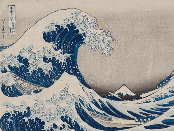
Perhaps best known for his iconic “Under the Wave Off Kanagawa (Great Wave),” Katsushika Hokusai (1760-1849) produced a corpus replete with countless exquisite paintings, woodblock prints, dioramas, and illustrated printed books. The rich Hokusai holdings of the Museum of Fine Arts, Boston have positioned it uniquely to offer an expansive exhibition that touches on themes and moments throughout the artist’s 60-year career, with galleries dedicated to landscapes, nature, fantasy, and the “Floating World” of urban culture.
 

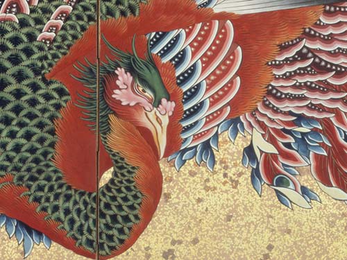
Katsushika Hokusai, “Phoenix” (detail), 1835, eight -panel folding screen, ink, color, gold leaf, sprinkled gold on paper. William Sturgis Bigelow Collection

 
In addition to “Under the Wave Off Kanagawa,” a highlight of the exhibition is the breathtaking “Phoenix” of 1835.  This brilliantly colored multi-paneled folding screen is absolutely magnetic. Using ink, pigment, cut gold leaf, and sprinkled gold on paper, this piece encapsulates Hokusai’s transcendent talent and craftsmanship. 
 
“Hokusai” opened in April and will hang until August 9.
 
To learn more, visit Museum of Fine Arts, Boston.
 
This article was featured in Fine Art Today, a weekly e-newsletter from Fine Art Connoisseur magazine. To start receiving Fine Art Today for free, click here.
WEEKLY NEWS FROM THE ART WORLD

Fill your mind with useful art stories, the latest trends, upcoming art shows, top artists, and more. Subscribe to Fine Art Today, from the publishers of Fine Art Connoisseur magazine.

  • This field is for validation purposes and should be left unchanged.