
For art collectors, a behind-the-scenes look at how one contemporary artist creates a still life painting helps us appreciate even more the vision and skill it takes to do this, and makes us even more informed about why we buy art to enjoy at home.
Endless Inspiration! How I Create a Still Life Painting
by Pat Fiorello
I recently completed a series of paintings that I thought might be an opportunity to share a bit of the thinking process behind how I create my still life paintings.
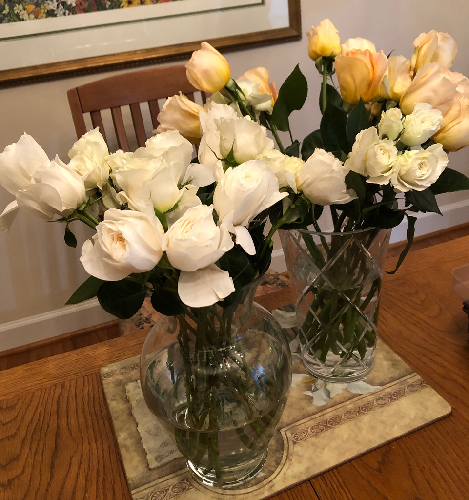
I started with a couple of bouquets of white/blush/peachy roses as the initial spark to get things going. Once I had them on hand, cut them, put them in fresh water and let them set for a day to open up a bit more, I started the process of arranging them as inspiration for a painting.
I arrange the flowers in a way I would find pleasing as an arrangement in my own home, mindful of which flowers will be the main flowers or focal area and which are supporting cast to provide contrast in terms of size, orientation (i.e. facing front, sideways, down), texture, direction, etc.… I group flowers to create bigger masses of shape and color rather than separate things too much. Leaves can also be used to add contrast and define edges, especially near the main flowers.
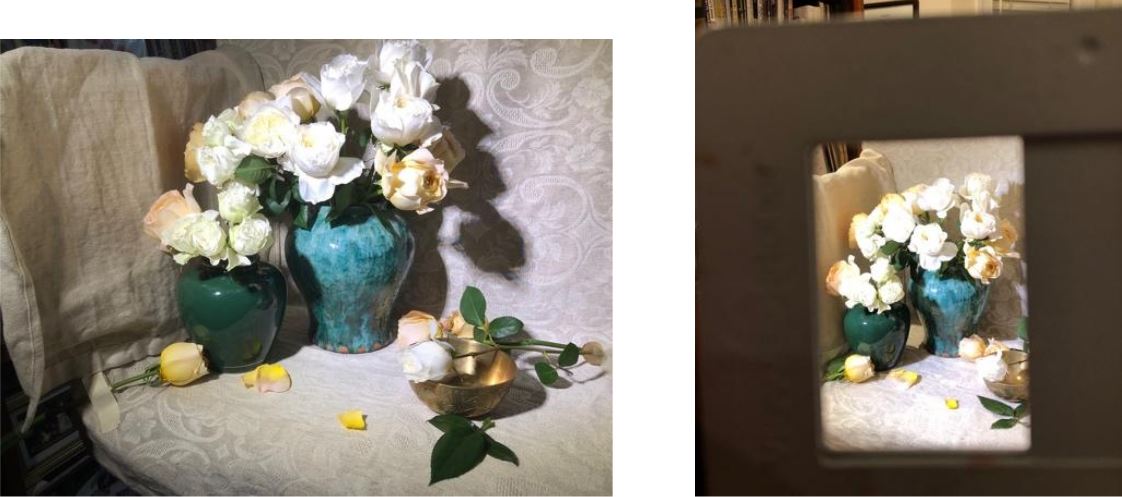
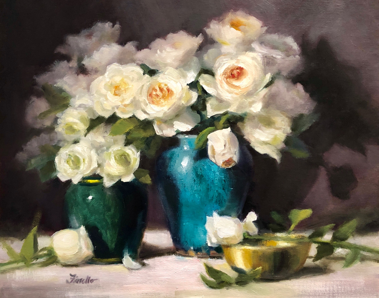
Since there were quite a few flowers, I split them into two containers of different sizes and still had some I didn’t use. Sometimes I go into a painting with a specific idea of the mood or feeling I want to convey and select items that support that and other times I just play around with different props to see what sparks my interest. For the first painting, I chose some darker, more colorful containers as a contrast to the light flowers.
In my studio, as I’m creating a still life “setup” that will serve as inspiration, I will often take lots of photos, changing the background from dark to light which dramatically alters the mood and degree of contrast in the painting to come. The background is one of the most powerful tools you have to set a mood and often students will leave that as an afterthought, (later asking, “What should I do with my background?”), but it’s an integral part of the overall painting design and must be considered upfront, before the brush ever hits the canvas.
To me, having a darker, classical background projects a more dramatic mood, emphasizing the big shape of light against dark, while having a light background can feel a little fresher and contemporary, more upbeat with emphasis more on color than value. I’ll take photos both ways and see which one I have a greater personal response to that day. I follow my instincts on which one excites me more. I have to be excited to paint it. I want my paintings to have a sense of aliveness. If I’m feeling energized, that will show up on the canvas and vice versa. What artists choose to paint and how they choose to paint it are both part of the personal and authentic artistic voice.
I’ll often take photos in different formats – vertical, horizontal, even square, again paying attention to what feels most exciting. I might even look in a viewfinder (see below) to consider a different format. As I narrow down the mood, background, and format, I continue to add props (like smaller dishes, fruit, flowers on the tabletop, fabric), to add interest, contrast, or repetition of color, but also importantly provide a path of light, and eye movement throughout the painting.
I’ll also adjust direct lighting to make sure it emphasizes what I want. Objects will be added in, taken out, moved until the movement, spacing, and balance feel just right. This could take some time, but it’s worth it because, unlike a landscape or portrait, with a still life you are creating your composition from nothing, rather than just editing what’s already there. That can be a little intimidating, but also empowering, freeing, and fun once you get into it.
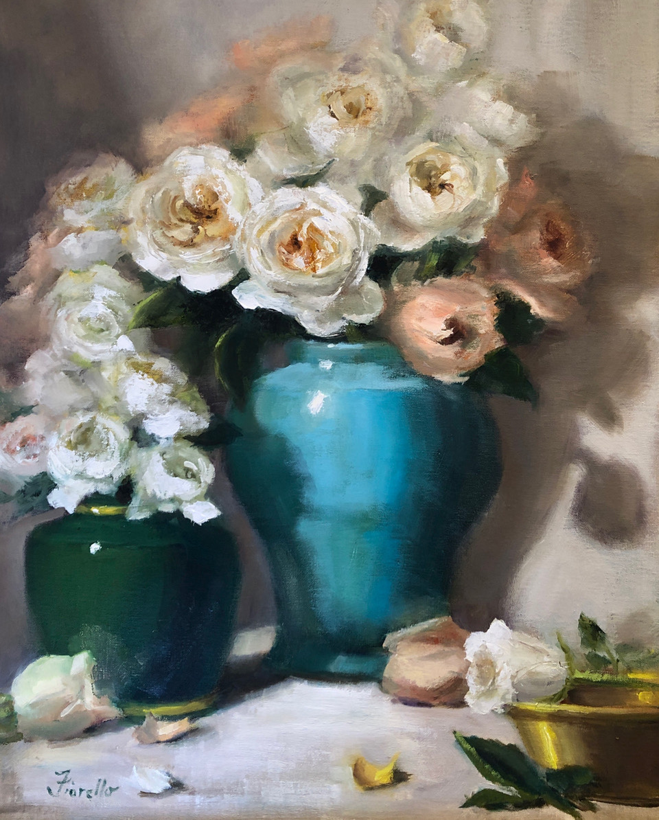
The first painting I did was in a vertical format, which reinforced the height of the primary vase. I was envisioning light coming in from the top right flowers, traveling down the main bouquet through the smaller bouquet, and then over to the gold dish and white flower on the table in somewhat of a figure “S” pattern. I simplified the texture on the containers since I wanted more detail on the main flowers and not too much competition from other areas of the painting. The title is “Wonderland,” based on the name of the flower bouquet I ordered.
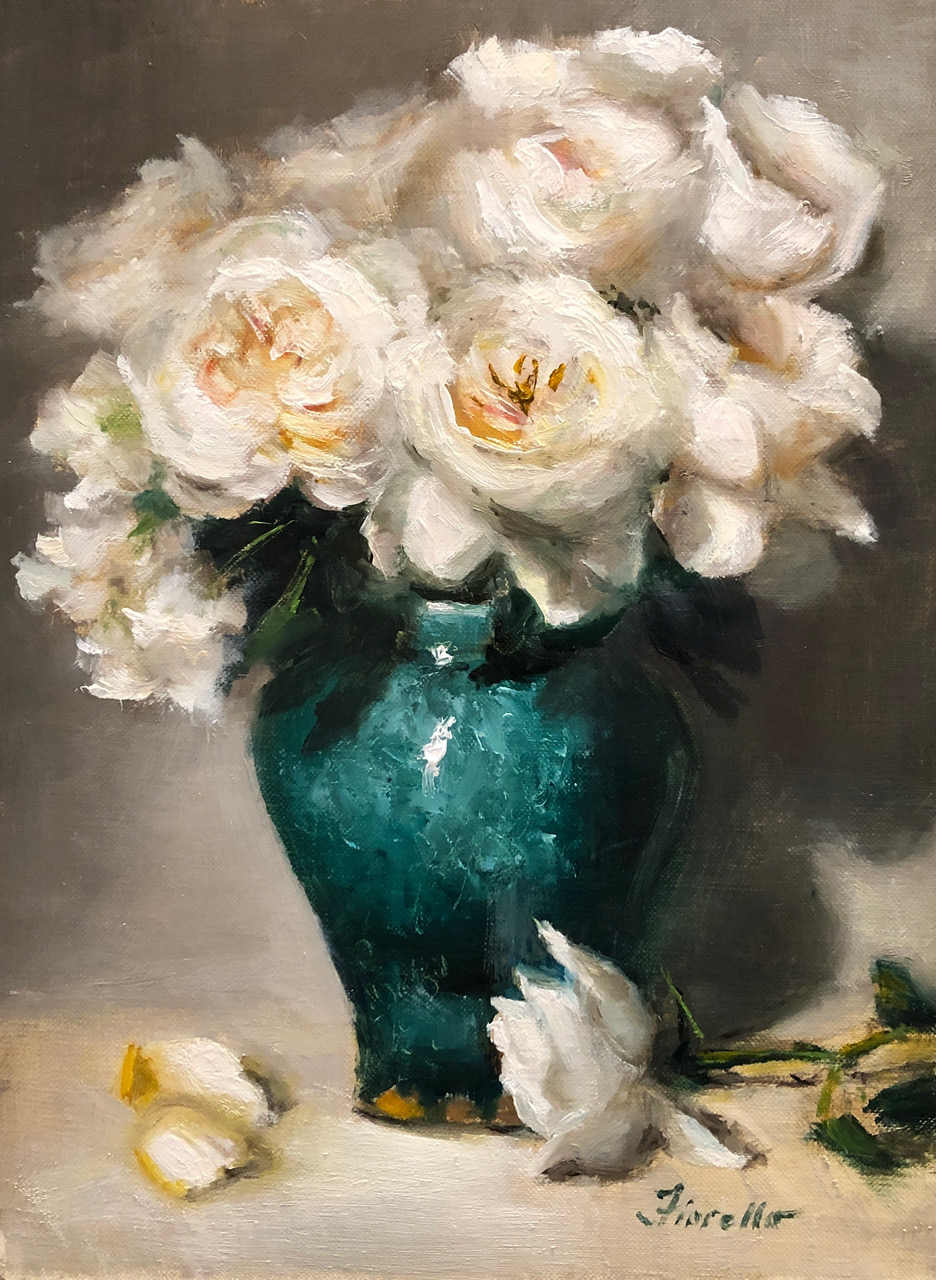
While the flowers were still fresh, I decided to do a second painting – a simpler scene that allowed me to have greater detail on the vase itself. The composition has fewer elements and while the background is light, the shadows still hold the bouquet in and offer some contrast.
In this one, I think the vase is more of the story and I have called it “Emerald.” I had a lot of fun figuring out how to convey that beautiful pottery with a palette knife (while holding my breath at first).
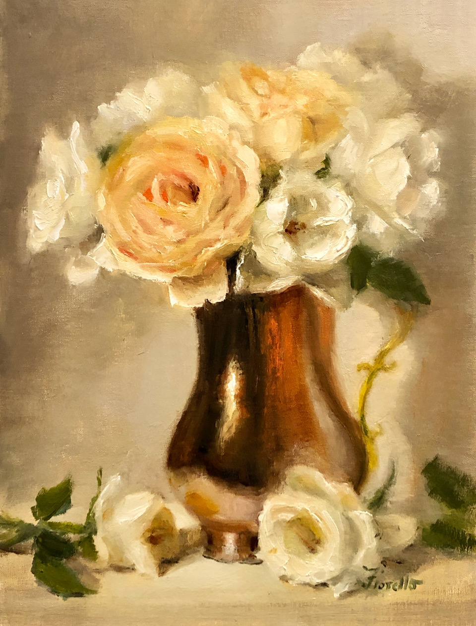
After about a week, the flowers were starting to die off, but I pulled the surviving ones out and rearranged them in a copper pitcher for a totally different look and color palette, with warmer lighting. This painting is titled “Copper Tones.”
All three of these paintings were in a vertical format, but I also was attracted to the horizontal format with more drama, so did a fourth, larger painting in that type of composition. For this painting, I used photographs I took the first day since the real flowers were long gone. The result was “Winter Wonderland” which clearly has a different feel from the first painting, even though most of the elements were the same, except for the background and format of the canvas.
These four paintings started with the same bunch of flowers but ended up in very different places. I think I could have done 100 paintings based on that one bouquet. The opportunities are endless!
Yes, what they have in common are the same flowers – but that is just one element in a painting. As I am designing a still life, I am thinking beyond “things” (i.e. flowers) and considering all the tools of art: shape, value, color, edges, paint application. Plus considering the more intangible aspects of mood, energy, emotion. Making different choices in those tools, which make up the language of art, can evoke different feelings. And of course, the viewer brings his or her own lens and experiences resulting in their own personal emotional response.
As an artist, my aim is to go beyond merely reporting and describing the details of the flowers to transcending my subject – creating a feeling, capturing a moment of beauty.
You can see more of Pat’s art at patfiorello.com or follow her on Instagram @patfiorello. Pat’s instructional video, “Vibrant Flowers” is available at PaintTubeTV.com in DVD or digital format.
View more artist and collector profiles here at FineArtConnoisseur.com.


